Sunday, 31 January 2016

Captain Character: Model Sheet

Before creating my turnaround it was important that I created a coherent model sheet to lay out my poses and get the proportions of my character right. I had to include a 2/3 pose of my character along with a T-pose, a front and profile view as outlined in the brief. It was important to keep the proportions and linework of each consistent with the previous one in order to ensure continuity, as I will be using these poses as a basis for the keyframes in my character turnaround. One thing I made sure to keep consistent across all poses was the shadows, particularly under the chin and around the knees, as these give the character extra dimension and depth.


I also made a few final changes to the design of the character before finalising my model sheet. Most notably, the character is now wearing short dungarees with wellington boots. She is also holding in her hand a pair of gloves. These additions more obviously reflect the character's occupation as well as balance the design of the character. While before the upper half of the character was more intricately detailed and authored in it's design, by including muddied wellington boots and gloves, the lower half has just as much going on.


Once completing the linework I applied a colour scheme based off one of Jamie Hewlett's drawings of Tank Girl. I chose tank girl as a template for the colour scheming as my character is in some ways based off the aesthetic of the character of Hewlett's Tank Girl. Both base their fashion choices off 90s grunge/post-punk era fashion trends, with the dungarees and striped patterns. The greens I chose for the wellies and dungarees, while applied digitally, was chosen to emulate the effect of slightly faded ink on paper, an aesthetic of Hewlett's Tank Girl artwork.


Saturday, 30 January 2016

Captain Character: Creating a character and Initial Character Designs

As a part of our Visual Language brief we were given a short bio, detailing certain characteristics and relevant character information and tasked with developing a character around it, which will form the basis for the rest of the work we produce as a part of this module. 

Bio:

Name: Cornelia
Age: 24
Occupation: Works in a garden centre
Personality: Grumpy, Quiet, Cynical, Misanthropic 

Cornelia is a misanthropic young 24 year old single woman, just out of University with a degree in Fine Arts, who is reluctantly working in a garden centre for a boss she hates. Her general attitude is world-weary and cynical. She has little time for anybody else, spending most of her spare time either smoking or complaining on her blog. Cornelia blames the world for her lack of direction in life, but is reluctant to change anything. She is very much at a transitionary point in her life and despite how she may see it, still has more room to grow and mature as a person.
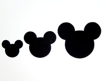

The key to a strong character design is in the primitive shapes. A character made up of the most basic primitive shapes which can be distorted and moved while still retaining the essence of the character, makes for a stronger design. In many cases a strong shape and silhouette can make for a timeless character design, just look at a character like Mickey Mouse, a character synonmyous with the entire Disney brand, who is universally recognised despite being constructed from just a few basic circles.
Some of strongest character designs can be identified from the silhouette alone, a design philosophy used often in multiplayer video games such as Valve's Team Fortress 2, to differentiate the different player classes. Taking all this into account I wanted to ensure my character was as recognisable as possible from the silhouette alone…


Cornelia's fashion sense and aesthetic features, for the most part are influenced by characters such as Daria, a spinoff character from MTVs Beavis and Butthead and Enid from Daniel Clowes' Ghost World. For the design of my character I blended and lifted design elements from Daria and Enid, particularly the circular glasses which I feel emphasise the grumpy facial expressions. However, to ensure I wasn't just remixing a character by lifting and swapping design elements from pre-existing characters I opted to include a unique element of the costume that would make her immediately unique and recognisable, the french beret. I chose a beret because I felt it complimented the striped design of the character's upper half, an aesthetic often attributed to mimes. The decision to homage the mime aesthetic also plays into the personality of the character, whom is quiet. often expressing her feelings through body language and facial expression over words.


(Design sketches featuring Cornelia expressing her feelings through body language and facial expression alongside her boss, a wheelchair-bound old man with a hook for a hand.)


(Early concept drawing or Andrea, later changed to Cornelia, smoking a cigarette)


(Early expression sheet featuring all manner of expressions)


(Early T-Pose)


(Early design of Cornelia  in a more formal setting without her now trademark glasses or beret. The point of this drawing was to see if the character could still be portrayed without their some of their trademark features.)


(Development drawing of Cornelia in her traditional outfit, fists clenched with a grumpy posture. The dungaree jeans would later be changed to shorts in order to better reflect her occupation.)


(Early concept drawing scanned in and cleaned up in Photoshop. I just like this drawing.)


Formalised Model Sheets for development drawings


Friday, 29 January 2016

Captain Character: Constructing Character Designs from Primitive Shapes

The foundation of strong character design is in the primitive shapes. The strongest designs tend to consist of just a few shapes which can be reshaped, moved and distorted to no end without breaking the illusion of the character. The key is simplicity. I have decided that my character will be tall and gangly, reflective of characters such as Daria from Beavis and Butthead, at a later stage, but all while retaining a sort of child-like wardrobe aesthetic reminiscent of a character such as Coraline.


As always, I have started by designing the head and hairstyle, as this is the area in which I am most comfortable in conveying character through facial expressions and gestures. Here I tried experimenting with bowl cuts and straight fringes which reflect my character's rigid, uncompromising personality. To portray her as uptight I tried a design in which she had her hair tied back in a bun, but eventually I settled on a sort of spiky punk fringe, as I feel this best reflected her 'prickly' personality.


Next was designing the body. I decided early on that my character should be wearing dungarees, in order to highlight this innocent-childlike wardrobe aesthetic to contrast with the character's prickly personality. The dungarees incorporate primitive shapes in the buttons, name-tag and pockets, but the sleeves are also quite blocky and straightforward.


In order to emphasise the lankiness of my character I made her sleeves overlong and exaggerated in proportion to the rest of her body. Her neck is also extended to resemble that of a model in a piece of fashion illustration. I also tried giving her more of an hourglass figure, but I feel this takes away from the simplicity of the character, making her look too glamorous and slightly sexualised.


The key to a strong design is the ability to change around features without losing the essence of the character, so here I changed around the positioning of the facial features. Though I do not see them representing my character all that much its nice to experiment with form in order to gain a greater understanding of what makes a strong character design.


Here I also experimented with body type to see if a smaller, stumpier design would fit my character any better, though upon reflection, I feel a lanky design is the way to go going forward.

Thursday, 21 January 2016

Introduction to Visual Language

If I could say it in words, there would be no need to paint.


-Edward Hopper, American Realist Painter and Printmaker


Visual language covers a lot of things in regards to animation. Staging, composition, framing, balance, depth, colour, all of these are important elements in Visual Storytelling, something Animation, a medium in which the creators have absolute control over each of these elements to their fullest, can excel at.

The aim of the visual language module is to demonstrate an awareness of these disciplines in the context of animation and to explore these processes in relation to set tasks and briefs relating to character design and sequential imagery. Some of the brief's for this module include...

Producing Character Model and Expression Sheets, complete with T-Poses and 2/3 perspective based on our own original characters.

Producing a 4-second long 24fps turnaround animation of said character in a pose of our choice, presented in a 1080p format, quicktime .mov using a h264 video codec.

Producing a series of 24 images based around a random word given to us, along with a 12 frame storyboard based around one of the 24 images.

I would like to take more risks experimenting with different media and stepping out of my comfort zone when it comes to processes. I also hope to address some of the issues discussed in the evaluation for my previous module, such as in the presentation and documentation of my pre-production work. This seems achievable, as a lot of the deliverables for this module are of design sheets which usually need to go through several incarnations before being finalised. 

Thursday, 14 January 2016

Animation: Process and Production Evaluation

Animation: Process and Production, with 'The Other Side' studio brief has really allowed me to showcase the best of my abilities when it comes to practical work in animation. It has been a enjoyable experience from start to finish and the work produced, I feel is the best yet and while there is definitely still room for improvement I feel a lot of the issues I had from my previous module were addressed this time around. My time management, while still not perfect, has improved since the previous module, as I finished my animation a full week before the deadline allowing me time to go back and catch up on my documentation.  Documentation in this project has played a bigger part in this module than the last and thus required more attention. One thing I will take away from this module is the importance of documenting my production as I go along.

The Other Side has allowed me to showcase my knowledge of the animated medium and the things I have learned on the course so far. As a result the final animation produced is a step above my previous animation, addressing a lot of the issues pointed out by my lecturers and peers. However, while the final product I feel is satisfactory, showcasing a high standard of work, I do feel there are places where I cut corners to ensure I finished my work on time. For example, the opening shot, where the boy kicks the football, originally was supposed to be a frame-by-frame animation composited in After Effects. However in the final animation it was achieved using a tween with motion blur. While this was the easier option of the two I'm still happy with the final effect. Another area in which I took shortcuts was in the character's walk cycles, opting to only show them from the waist up to save time animating the legs moving.

An area I feel I could improve in is in the presentation of me pre-production work, specifically my storyboards and animatic. I produced my storyboards in a sketchbook, so the dimensions of the sketches were not consistent leading to the animatic having an inconsistent aspect ratio. My animatic, while I feel it got the job done, could have used more frames to make movements more clear when I was producing the animation. I used the same process of scanning in Keyframes which I had drawn in my sketchbook and drawing the in-betweens using a graphics tablet as I did on my previous animation, but I incorporated more hand drawn assets into the backgrounds and props to lend to the hand-made aesthetic, which is something I will carry over to future projects, as it allowed for an efficient and flexible workflow.

One area that I definitely feel needs to be addressed is my use of colour in my animation. This is the second animation I have produced for this course that I have struggled to find a coherent colour scheme. While I do feel for this animation, the lack of colour and sepia tone fits the tone and aesthetic I was going for (I was inspired by the works of Don Kenn after all) I really need to experiment more with colour and get to grips with colour theory.

A lot of the feedback I received towards my final animation was critical of the use of sound or lack of, with fellow peers suggesting there be a change in music when the animation takes a turn for the darker. Though by that time it was too late to implement the changes, for my next animation I will be taking suggestions for what to change during the development stages and documenting feedback more often on my blog. 

In conclusion this project has seen me grow and develop as an animator but there is still much to learn and room for improvement. While I do feel I stuck mostly to a style well within my comfort zone I will make an effort to produce something radically different for one of my future animations. I will also continue to add to my blog with more posts documenting development of my work.

Sunday, 10 January 2016

Pixar, Digital Animation and the Contemporary era

Since the advent of cinema few Animation studios in history can boast the reputable filmography of Pixar Animation Studios. Founded in 1979, originally as an arm of Lucasfilm collaborating on special effects with special effects company Industrial Light and Magic, the company didn't really gain it's now international notoriety until it's acquisition by Disney and the success of Toy Story. Pixar pioneered digital technologies in the mid 90s, while other major studios such as Dreamworks were riding the wave of 2D animation, which had seen a resurgence thanks to the popularity of contemporary Disney films such as The Lion King, Aladdin and Beauty and The Beast, Pixar broke new ground in 1995 with the first fully digitally animated feature film, Toy Story. John Lasseter, the director of Toy Story, who originally worked as a 2D animator for Walt Disney Feature Animation, famously criticized 101 Dalmatians as the film 'where Disney had reached its highest plateau' stating the films often repeated themselves without adding any new ideas or innovations. Part of Toy Story's success can be attributed to the way animators took what were simple and established animation and storytelling techniques from Classic Disney animation and presenting them through this new and exciting technology.


Hand Painted Background from The Jungle Book (1967)


Imaginative staging, detailed backgrounds and accessible characters, all hallmarks of Classic Disney are prominent in much of Pixar's work. The hand painted mattes of Golden Age Disney era animation have been swapped out for meticulously rendered 3D backgrounds. Both serve the same purpose of drawing us into these fictional worlds, and both have their own benefits, but where 3D really triumphs over traditional 2D in this regard is in the depth of the image. With 2D animation, drawings and backgrounds are layered on top of one another, and while it is not impossible to achieve depth in an image, depth is much easier to achieve in a 3D workspace. Assets are not simply overlaid on a background, they are a part of the background and can more easily interact with it and there are less restrictions as to where the perspective can change to in the staging of a scene, granting more access to the repertoire of film language and allowing storytellers to be more flexibility in telling their stories.

3D Rendered Background form Wall E (2008)


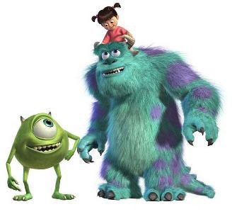
Pixar's character designs more often than not also subscribe to the Disney school of Anthropomorphic creatures and everyday objects, such as toys and cars. What digital animation allows for though is a level of detail in these sorts of characters never before seen. Pixar's 2001 film Monsters Inc was heralded at the time as the absolute cutting edge in fur technology with the character of Sulley. During the production of Monsters Inc, Pixar's engineers had to figure out how to animate over 2 million hairs on Sulley efficiently and realistically with shadow and texture, for which they set up their own Simulation department to create a new program exclusively for rendering fur.  Such a level of detail would be near impossible to do in 2D without thousands of man hours to achieve the same effect and its not like the character's design is particularly complicated, but the character is meticulously detailed in it's rendering.


To compare, if you look at a similar character form classic Disney, for example Baloo from The Jungle Book is the same stock archetype as Sulley in essence, with the same posture, similar features and role in the story, but the level of detail is significantly skewed in Sulley's favour. That's not to say Baloo's design isn't a timeless classic, but it shows the benefits of what 3D has to offer and what John Lasseter mean't when he said he thought Disney had reached it's 'highest plateau.'


Over the past 20 years, Pixar has consistently delivered on a technical and storytelling level with their films, but every aesthetic runs its course and Pixar's more recent outing have not had the same impact or critical acclaim that the first few films (Toy Story through to Up) had upon their release and this is partially because other major animation studios, such as Dreamworks have finally caught up. Nowadays, while no longer the tech pioneers they were back in the mid-90s, the name Pixar is still synonymous with quality visual storytelling.

Pendelton Ward and the Appeal of Adventure Time


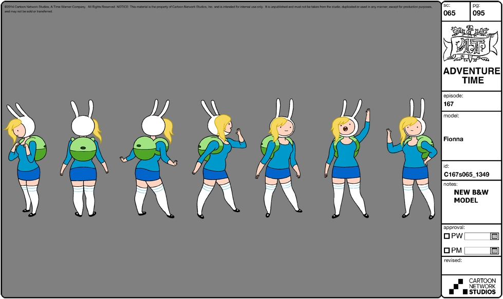
Adventure Time is a unique specimen in the world of animation. The Cartoon Network show which premiered in 2010 boasts a broad fanbase made up equally of children and adults. It's success can be attributed to the aesthetic of the world Pendleton Ward has created and the appeal of the characters which inhabit it. Ward's designs have a charming simplicity to them. His main characters are often made up of rounded shapes with curved edges, which lends them an accessible, non-threatening aesthetic, which is an important part of their appeal.


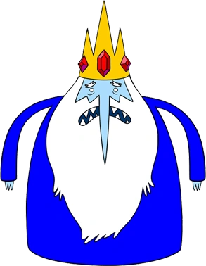
In contrast, characters which are supposed to be identified as being 'bad' have shaper edges and features. For example, while there is more to his character than being simply evil, Ice King has a sharp pointed nose and spiky crown, giving off the impression he is the villain in the Land of Ooo, but at the same time his body is rounded much like the other characters, hinting at an additional layer of depth in his design. 


This principle is also applied to the environments the characters inhabit. The Land of Ooo is made up primarily of rounded hills which contrast with the steep geometric shape of the mountains in the background. These design choices reflect the dynamic and alignment of the characters, whether you notice it or not, which is part of why the show is so broadly appealing to all ages.


Many of the friendly characters in Adventure Time follow a primary colour scheme and the relationships between characters are shown in the use of colour. Finn and Jake's primary colours are Blue and Yellow respectively. These are complimentary on the colour wheel and reflect the relationship between the characters, showing them together in a visually appealing way to show they are friends.


Similarly, the backgrounds and world they are presented against adhere to complimentary colour theory. The Land of Ooo features numerous colourful landscapes, often times with complimentary colour schemes, such as Jake and Finn's treehouse, which is green and often depicted against an orange sky backdrop.


Pre-Film Animation processes

The Magic Lantern

While Animation is now, in the contemporary era, almost universally associated with film, early forms of the practice predate film by several centuries, dating back to the 1600s with 'The Magic Lantern', a precursor to the modern day projector consisting of a piece of limestone squirted with oxygen and hydrogen which once lit projected hand-coloured slides on a screen. Slides showcased a sequence of images that changed every 30 seconds, depicting illustrations set to a soundtrack performed live by musicians in concert halls and theatres.


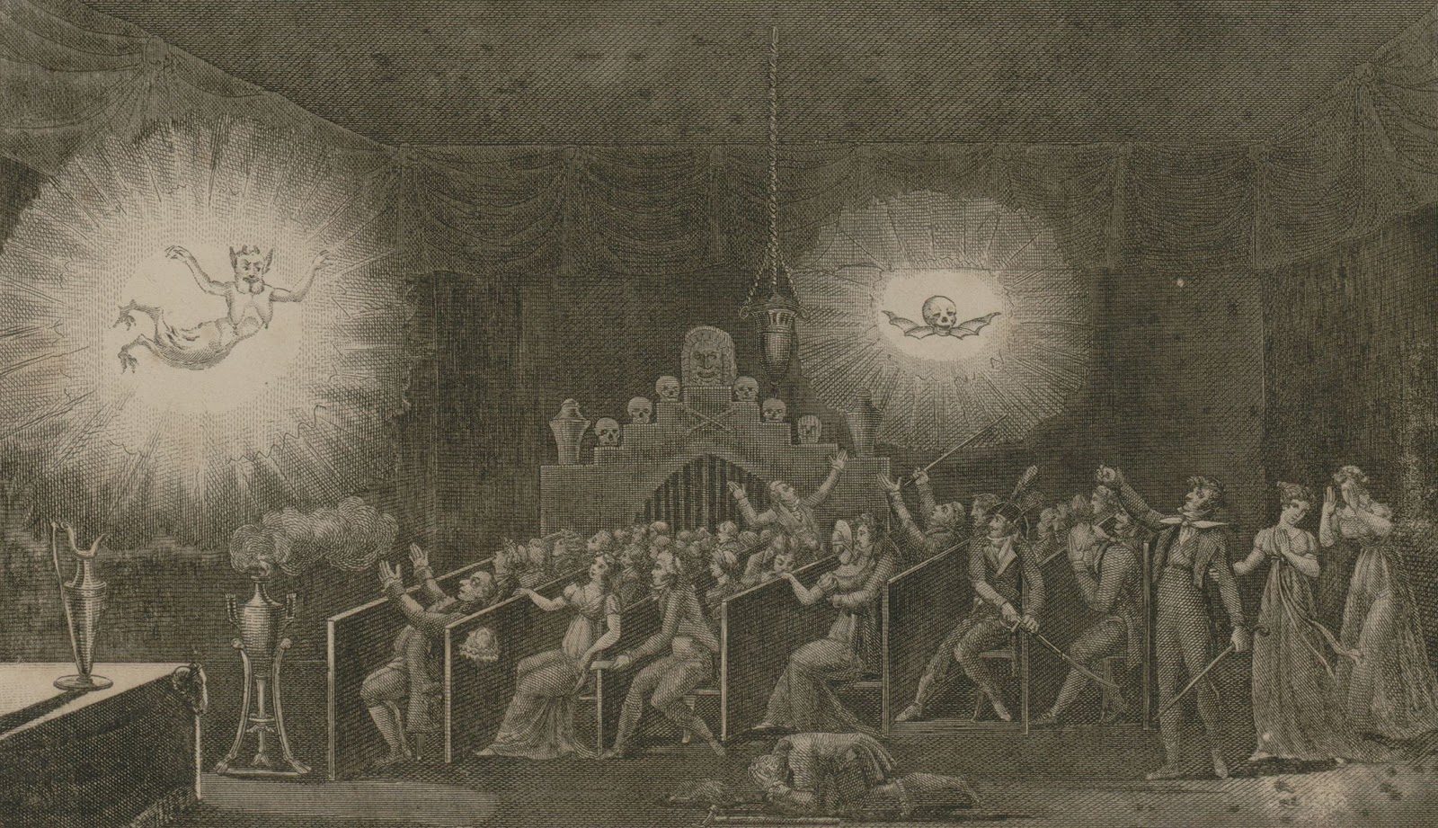
While initially invented centuries before, Magic Lanterns saw a resurgence in popularity around the Victorian era, where they became a popular source of entertainment. One of the most popular shows during this era was E'tienne Gaspard Robert's 'Phantasmagoria', a forerunner to the Halloween Show, which was held in an old convent that was converted into a magic lantern theatre.


Phantasmagoria soon evolved into its own form of theatre designed to terrify audiences by projecting frightening images, onto walls and semi-transparent screens, of ghosts, demons and other frightening imagery. Robertson's first Phantasmagoria was shown at the Pavillion de L'Echquier in 1797 in Paris, which elicited a strong response, with many audience members being so convinced of the reality of what they were seeing, to the point that police had to temporarily halt the show.

Phenakistoscope

Also in the 1800s, Joseph Plateau's Phenakistoscope paved the way for more traditional forms of classical animation, consisting of a disk with a series of images drawn evenly spaced apart, which is placed in front of a mirror and spun to give the illusion of motion. The invention was popular with the Middle Class of society and was successful commercially.


Zoetrope

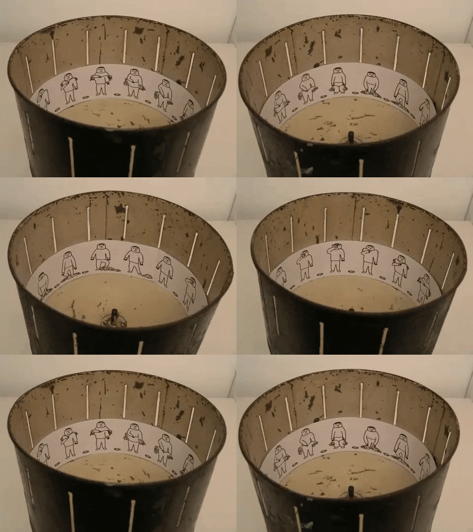
A Zoetrope, similar to a a Phenakistoscope, consists of a series of images that depict varies phases in a motion which are displayed in a cylinder with vertical slits cut in the sides which the user looks through as the cylinder spins to give the illusion of motion. A Zoetrope works much the same way as the Phenakistoscope, but is more suited to being viewable by several people at once. Instead of being displayed on a disc, images are displayed on a paper strip which is placed inside the lower half of the inside of the cylinder.


In 1980, Artist Bill Brand created a linear Zoetrope in an unused New York subway platform he deemed the 'Masstransiscope', popularising use of the techinque as a means of advertising, with works being installed on transit systems throughout the US and beyond from San Francisco to Kiev.

Saturday, 9 January 2016

Previsualisation in contemporary animation

Pre-visualisation is the process of planning out complex scenes ahead of time. Processes such as storyboarding fall under this category, as does the process of creating an animatic for animated productions. As the technology evolves and proliferates, so too do the methods which artists and creators have at their disposal for pre-visualising their projects. Most animated productions nowadays employ digital methods of pre-visualisation, which vary from production to production. These processes can range from 3D software for visualising complex scenes in a 3D environment to digitally produced hand drawn sketches for character concepts, animatics and storyboards.


In animation in particular, the pre-visualisation process is important to ensure an efficient workflow. With animation being such a labour intensive, time consuming process, studios often divide large teams into specialist areas for efficiency sake. Usually this starts with the concept phase of production, depending on the nature of the project, most projects begin with artist sketches based off some sort of treatment or project briefs. These may include things like character designs, environments or prop designs. Before a character design can be used by a group of animators, they must be formalised, in the case of 2D animation, with model sheets depicting a turnaround of the characters drawn to scale.


Storyboarding is also important in the case of film animation, as a storyboard artist plans out ahead of time the staging of a scene and any directorial decisions such as camera movements. The storyboards are then often converted into an animatic, where the pace of the editing is decided upon. Depending on the production, the animatic can either consists of a set of storyboards set to sound or some early design assets, such as keyframes or backgrounds played in a sequence to act as placeholder until the assets have been finalised. This allows animators and directors to notice and pre-emptively iron out any problems in the pacing of a scene or timing of a motion and minimise the construction of unnecessary components. 

Cinematic Techniques and The Unique Language of Animation

In the cultural consciousness there is a common misconception that Animation is a subsidiary or genre of film and as a result somehow the lesser of the two art art-forms. However, while the two do share a common visual language, animation also has a language all of its own. 

Every Frame A Painting highlights this in it's episode on the editing style and sense of time and place in Satoshi Kon's works. Kon makes use of Animation's unique form in his transitions between scenes and the way he stages inserts. Kon famously stated that he had no desire to direct live action due to his editing style being too fast, which is certainly the case in Paprika. While Live Action directors such as Wes Anderson have tried to implement similar techniques with quick inserts that display visual information in a simplified way, they do so to the detriment to the overall aesthetic while Animation does not have this problem.


Unlike live action film, animation is not a lens through which we see the world, but an entirely artificial world created from the ground up by artists and animators. This grants the director total control over every aspect of a sequence from the lighting to the staging of characters to the overall design and aesthetic unburdened by the shackles of the human form. Animation allows animators to play with proportion and a sense of space to create experiences unique from film. There are certain aesthetics and sequences which can be achieved in animation, that would be impossible to do in live action film due to limitations. What makes animation unique from film is the way it can depict things from visuals alone. As every frame is hand drawn this makes for more potential for storytelling through visual design, whether that be design of characters or the design of the environments they're in. 

Friday, 8 January 2016

Final Animation: The Other Side


Here I present my response to studio brief: The Other Side and my final animation for the module Animation: Process & Production. 

Tuesday, 5 January 2016

Storyboard changes during development of animation

Animation is a difficult and labour intensive progress and sometimes in the pre-visualisation stage, certain things work on paper that have to be changed before they are put onto screen. As I have been putting the finishing touches on my final animation I have made numerous small changes which have deviated from my storyboards in order to convey the story better and get the animation finished on time to a standard I am happy with. The most notable change I have made to my animation is the wide shot of the boy and girl standing oppose each other with the fence between them to depict a divide between the two characters.

Originally storyboarded as a single shot, once I got to actually producing my animation I came to the conclusion that with the pace of the editing before and after this shot, a single shot seemed too long to depict this scene, especially with the editing being almost set by the pace of the song in the background. The children's choir singing 'Cuckoo' sets a certain pace in the scene which must be reflected in the editing, and so I decided to split this scene up into two shots. One the boy walking to the right of the screen and one of the girl picking up the ball and walking to the left. This has much the same implication as the single shot and shows the two characters coming together in a more visual way, but in an way consistent with the rest of the editing, ensuring the pace of the scene flows.