Thursday, 8 December 2016

Potential and Limitations: Advantages of using Vectors for Animation


Digital Images can fall into two categories, bitmap or vector, each with their own advantages and disadvantages. For this animation I chose to go with Bitmap assets, as I was inexperienced with using Vectors in the context of animation. However, Vector art does have it's advantages, specifically in regards to motion graphics and rigged animation. 

One of the main advantages of using Vector assets in Animation is that Vector files are mathematical definitions, made up of set points with lines and bounds interconnecting them, defined in terms of width, height, ratio and proportion and not dependent on the resolution space assigned to them like Bitmaps are. This means that they can be scaled without effecting the quality and edited with ease, as components can be individually manipulated without effecting the rest of the image. File sizes are also generally smaller as the size is dictated by the intricacy and detail of the points on the graphic. 

Vector based art lends itself to certain styles more than others, and this is no different in animation. Vectors are most prominent in motion graphic animations and more commercially oriented work where efficiency of workflow and market viability is prioritised over artistic merit and expression. Often you will find assets created to be vectors are designed around the tools in Illustrator. Illustrator's toolset prioritises simple shapes, curves and lines, and is less suited to more complex drawing. 

Potential and Limitations: Pixar's Storyboarding Process

'I will never let something go into production unless it is working fantastic in that version with the still drawings . Because no matter all the great animation you can do will never save a bad story. We will work and rework and rework and rework these reels-sometimes thirty times before we let it go into production. We're really adamant. We'll even slow the production down or stop production to get the story right because we believe its the story that entertains audiences. It's not the technology. It's not the way something looks. It's the story.' 

-John Lasseter, Chief Creative Officer 

Pixar is an animation studio renowned for it's characters as well as telling emotionally resonant stories with well-written narratives. Their approach in regards to the pre-production is unique in that they approach narrative from the emotional perspective of their characters. The storyboard artists at Pixar receive a 'beat outline' which provides the basic guidelines for the character's emotional journey through a scene. Artists then pitch their ideas going by these basic outlines to the director who will then finalise and approve them.


According to John Lasseter, Chief Creative Officer at Pixar, the reason the storyboard process is so important to them is because unlike in live action, the animators cannot have coverage, every asset has to be constructed from scratch , so what they do is edit the movie before they start production, for which they use storyboard drawings. Essentially the animators create their own rough cut of the film from the still drawings, complete with their own scratch track, voices and temp music. It is only after that, when everything has been approved and finalised that full production can begin.

Potential and Limitations: The Success and Sustainability of CG

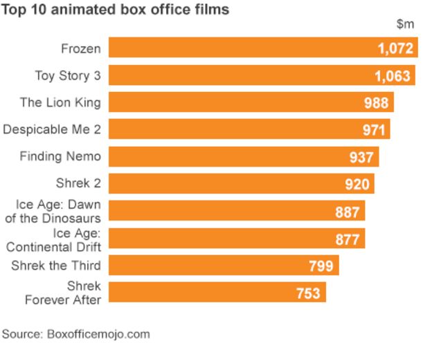
CG is the most prominent commercial form of mainstream animation. A quick look at the highest grossing animated films of any given year after 1995 and you'll more than likely see that they are primarily CG animated, family friendly affairs produced by large studios such as Disney, Pixar or Dreamworks.


The demand for family friendly never slowed down, evidenced by the popularity of late 2D animated features such as The Lion King, but with advent of CG in the mid 90s, animators were granted a new set of tools to better express their ideas. While CG is considered a large financial and technological investment, on large scale productions it's workflow generally allows for projects to be churned out faster than their traditional 2D contemporaries and is thus the less risky option. In much the same way tools such as DUIK save time on 2D animated projects by allowing animators to animate pre-existing assets, CG cuts down on asset creation and grants the animator more flexible control of elements such as lighting and camera in a scene. 2D animation, while still popular in parts of Europe and Japan, seems unviable in the current Hollywood, profit-oriented landscape.

CG's proven formula generates profit precisely because it is so deeply entrenched in the hollywood system of profit-oriented, family-friendly feature films. Smaller scale CG productions are a lot less common because audiences expect a certain level of technicality, and due to the monopolisation of the medium by Disney and Dreamworks, a particular, family-friendly style.

Studio Practice Weekly Production Diary: 4/12/2016-9/12/2016

Editing and Title and Sound Design
After we finished compositing the individual shots in After Effects we exported them as TIFF sequences. We chose to export as TIFF sequences over H.264 videos because TIFFs retain the image quality which is lost in the conversion to video due to compression and artifacting. At first we tried editing our animation to the pacing of our animatic, but after reviewing the footage we had composited in After Effects we decided to re-edit some things. The final edit of the animation is a lot slower pace than the animatic we created, as it gets off to a much slower start allowing the soundtrack to set the tone of the scene before we abruptly cut to the establishing shot. Compared to the animatic, we also allowed some shots to linger longer while other, were cut entirely. The two shots where the the Succubus picks up the bed were condensed into one longer shot as the profile view seemed redundant. Overall I am more satisfied with the final edit of the animation than I was with the animatic, partially because we strayed away from the animatic.


I also created the end title card design in After Effects. For this I wanted a simple modernist, sans-serif typeface which looked sleek and presentable. After trying out various different fonts such as Tahoma and Helvetica I eventually went with 'Avenir Next Ultra Light' for its slick simplicity. I animated the text by keyframing the tracking between characters so that they move farther apart, and applied a gradual Gaussian Blur and changed opacity so that the text faded out as the letters drifted apart, tying in with the themes and title of the animation.


As for the sound editing and design we used a combination of sound effect Vlad created and creative license sounds. For Vlad's character coughing and yawning, Vlad recorded that himself, as he did with the sound of the lighthouse collapsing which was achieved by shaking a table and adjusting the pitch. Other sounds, such as the sound of the waves and the flames were sourced online from free sound effect websites. The music track used in our animation was created entirely by Vlad himself. For the editing of the sounds, I did a rough cut of the animation which determined the timing of the sound effects and cues while Vlad tided it up, mixed the sounds and overall had final say as he is the sound expert, though it was very much a collaboration, with me having at least some input.


The final render of the animation was done on my Macbook as it had the most RAM and all the assets were already stored on it. We exported the final animation as an H.264 .mp4 video file as per the brief at 24 frames per second.

Wednesday, 7 December 2016

Studio Practice Weekly Production Diary: 28/11/2016-4/12/2016

Compositing Shots in our animation


Arguably the second most important stage of the animation, besides the actual animation, is the composition of shots. For this task we split the shots between us equally, although I ensured that I was to composite all the shots in the animation that involved my character. We created a shared pool of assets which we would use for our animation. Vlad created the background skybox as a timelapse which we colour corrected and applied an echo effect for the background layer of each shot. Vlad also created the waves we applied wave-warp to in order to simulate a dreamy oceanscape. However, once i imported these assets into After Effects to use for the shots I was tasked with compositing, I found out that the dimensions were not 1920 x 1080, so I had to change the composition settings and thus stretch the assets. The dip in quality wasn't a deal breaker, but in future I will make sure to address technical specifications with my partner beforehand.

In order to ensure continuity with the waves between the shots I would be compositing and the shots my partner would be compositing, we outlined things such as wave speed and wave height.


We also conversed back and forth about placement of props within the scene to ensure continuity. In hindsight it would have been easier had we created an environmental layout highlighting where certain props were in the scene in order to amend any inconsistencies.


As we were compositing an equal number of shots between us, inevitably I would have to composite Vlad's character into some shots, as his character is a much more prominent part of the animation. However, it would have proven difficult to transfer all of Vlad's After Effects and Photoshop assets over to my computer so I could composite his rig into my shots, so instead we green-screened his character and exported his animations as .movs. I then imported these into After Effects and then, using Keylight, keyed the background to make it transparent. In order to make sure we didnt lose any quality in the transfer I made Vlad export his animations at a higher resolution so they could be scaled down, especially for the closeups.


There are also a lot of small environmental details which were added in the compositing process. Objects floating in the water bob up and down depending on their size, assets in the foreground and background are blurred accordingly to simulate depth of field and I applied lighting effects and lens flares to the lighthouse in order to serve as visual cues to direct the audience's attention to specific events in the scene. For example, for the shot where the Succubus character's head is peeking out from the water, I gradually blurred the waves in the foreground to the background in order to simulate depth of field but also to guide the audience's eye from Vlad's character to the Succubus in a subtle way. Another example of me applying this technique was with the shot of the lighthouse, where a lens flare lights up the scene before gradually fading out. The composition of the shot is laid out in a way that the important assets are presented diagonally. The eye is drawn from Vlad's character to the lighthouse via the Succubus in a diagonal motion which is mirrored by the movement of the Lens flare.


For the splashes featured in our animation I also created some water effects using the Particle Systems plugin in After Effects. I used the explosive physics preset with the faded sphere particle, then applied a vector blur and cartoon shader so to connect the particles so they looked more like water. I used this effect in two shots, for the shot where the Succubus rises from the water and for the shot where she throws Vlad's character back into the ocean. For the first one, I used particles which a small birth and large death size to simulate water bubbling and for the second one I adjusted the size cone of particle generator. I also applied a box dissolve to the animation for when the water disperses after the splash, although I am not completely satisfied with the overall effect. My tutors actually showed me a plugin package for After Effects for creating more detailed particle animations called Red Giant which I will look into using in the future.

Creating additional 3D assets in Maya


Before I composited the scenes for my animation however, I created a few last minute assets in Maya to use in my animation. After seeing the pills that my partner had made for our animation I opted to recreate them as a CG render, as I felt the contour-heavy style my partner had gone with clashed with the smooth edges of the waves. In order to create the simple pill shape I used a polygonal primitive of a cylinder as the base and extruded the faces on either side inwards until each side met in the middle. I then applied a subtle lighting effect to the pill in order to give it more depth and dimension. Then I applied a lambert texture to half of the polygon and coloured it a aqua green.

Saturday, 3 December 2016

Study Task: Puppet Master

For one of the study tasks we were required to produce a short animation using the pin tool in After Effects. We were tasked with this earlier on in the module, but I kind of left it until the last minute. I've spent the past couple of weeks animating in DUIK so reverting back to using the simple pin tool and animating with that was a bit of a challenge, as I had gotten used to the features at my disposal in DUIK.


I took a picture of myself mid-stride so I could animate a walk cycle. I wanted the walk cycle to exaggerate the lankiness of my legs for maximum comic effect, and for it to be keyframed in time with the beat of the song. Ultimately, I chose a song with the walk cycle in mind and vice-versa, I ended up going with the opening instrumental to Run The Jewel's 'Blockbuster Night Part 1' as I felt in the context of the walk cycle, it enhanced the humour of the animation.

Friday, 2 December 2016

Studio Practice Weekly Production Diary: 21/11/2016-28/11/2016

Character Animation
Having rigged my finished character, this week the bulk of my time was spent animating my character in DUIK. With tweened animation, as an animator you're at an advantage, as the nature of your toolset allows you to block out key poses as keyframes ahead of time and go back and add the detail later. Pose-to-pose was the approach I have chosen to take with my animation, not only because the tools I am using necessitate it, but also its a way of working that plays to my own strengths as an animator.

One of the core design principles I took on board when animating was to make sure that components were always in motion as to lend the motion more realism and the character a proper presence on screen. This design philosophy is something that is adopted by most CG animators, to compensate for the more mathematically calculated and rigid motion which comes with tweened animation as opposed to traditional or hand drawn animation. Secondary motion and overlapping action are also core animation principles which are key to realistic and convincing motion, so for me it was important to include these at this stage of the animation as much as possible.


Secondary action can also place emphasis on a motion, for example in my animation when my character moves her head one way, her strands of hair sway in the other, to and fro, before coming to a gradual stop. The way I achieved this was by placing the hair strands on their own individual IK chains, meaning I simply had to tween the controllers and the strands would behave accordingly. I also parented the bones at the top of the hierarchy to the rest of the head so that they were not misplaced when the head moved and rotated.


In the beginning I had expected to use at least one of the two rigs I had created for every shot in the animation. However, in practice I ran into a few snags, which lead me to create an entirely separate individual hand rig for the shot where my character picks up Vlad's character. This was for numerous reasons, including the fact that the original side-rig which I was intent on using, was not to the required resolution, as well as the fact that simply the animation did not fit the standards I wanted ot hold myself to when using the assets from the side rig. So I quickly created new assets in Photoshop to construct a hand rig with fully moveable fingers and a thumb.


In fact, for the final animation I didn't really end up using the side rig all that much at all, instead I repurposed some of the assets to solve a problem I was having with the scene where my character is supposed to take a drag from her cigarette. Originally the plan was to have her simply bring the cigarette up to her mouth using the IK chain I had created for the arm, however in practice this proved problematic as the arm contorted into an unnatural position when I tried to bring the controller up to my characters mouth. I tried changing the orientation of the IK chain mid-motion, however this lead to the motion feeling unnatural and janky. So, after much contemplation, I came up with a solution to change the head mid motion from a front view to a side view (the head asset from my unused side-rig) so that the controller could reach the mouth without contorting the mesh in a way which seemed unnatural. There is also a scene in our animation where my character is supposed to rise from the water, with the camera positioned behind her, which required me to produce a version on the back of the character's head which could be used in a simple tween. 

Strike A Pose Study Task
For this study task we were required to manipulate a character rig (Moom) in Maya into a series of poses which reflected various actions and emotional states, using reference imagery we produced ourselves. Reference imagery is something that is very important in animated performance. As the actions of animated characters are entirely produced artificially by an animator as opposed to by a performer (in most cases outside of performance capture) sometimes the smaller nuances which lend depth to the character are lost in the translation. I am yet to work on a project in which I am animating in Maya (unfortunately), however this exercise proved useful as a pointer for future reference in how to translate reference imagery into a convincing animated character.

Moom's controllers make manipulation fairly simple, he has IK chains for his legs, FK chains for his arms and a separate controller for manipulating the face mesh. The way Moom's controllers are laid out also provide me with a pointer for how to structure my own character rig in Maya, which is something I most definitely want to try in the future. One thing I would like to keep note of in the future is how the attribute editor can be used to manipulate the fingers of the Moom rig, something I was not aware of at the time I was creating these Moom renders.

Anxious
Exhausted
Happy
Pride

Sad