Moodboards and Design Inspiration
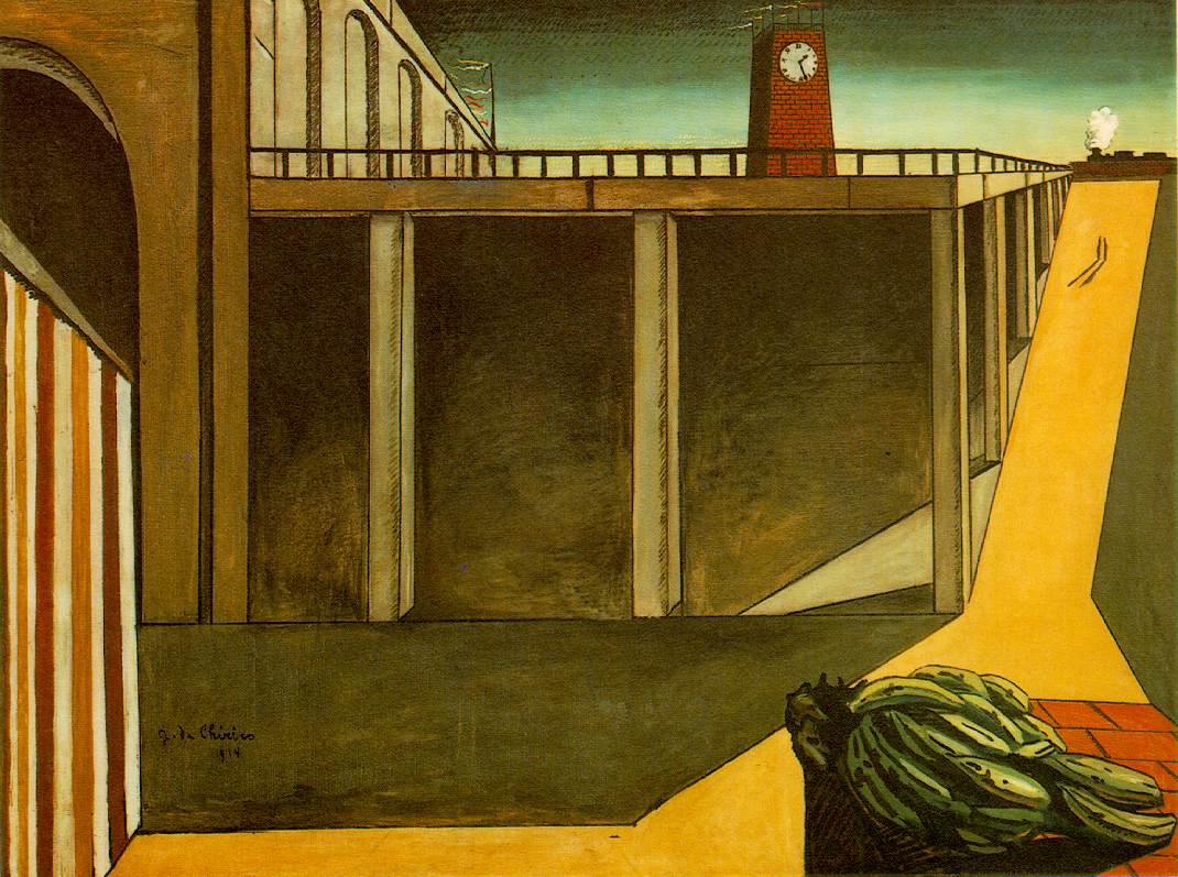
Over the weekend we each compiled a moodboard of design inspirations. For this project I have decided to look at illustrators such as Marie Bretin, Rebecca Clarke and Kristin Lidstrom, who all have a more hand-crafted, tagible style as opposed to the more digital styles I usually take my inspiration from. I am hoping to use this project as a way of broadening my aesthetic, trying new things, using new processes and refining my existing skills. Having watched a handful of animated documentaries in preparation for creating my own, a common visual motif I have picked up on was this tangible aesthetic, often using pencils, paints and paper textures to give the impression of a more hands-on, handmade aesthetic, which is a notable trait of my collaborative partner's work.
Some of the animated documentaries I watched in preparation include...
The Chaperone 3D
I'm a big fan of this style of rotoscoping as well as the use of colour, which I think pertains well to the setting and period. There is also a lot of texture to the animation, which I feel lends to the imperfect, handmade aesthetic, which was obviously constructed digitally to appear more hand drawn.
Mr Madila
Mr Madila was a favourite of mine from MAF; the style of humour and focus on larger than life characters is definitely something reflective of the comedic tone we are going for with our animation.
Fat Pants
Similar to The Chaperone 3D in it's design, but far simpler in it's rotoscope and execution, Fat Pants owes a lot of it's comedic appeal to it's slightly haphazard animation, mix of digital imagery and real life pictures, as well as it's witty script.
Character Designs
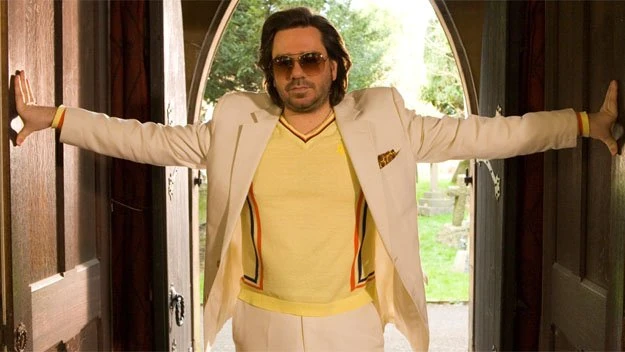
As a group we worked on the character design alongside one another, building off each other's ideas and drawings until we settled on a rough idea for how the character should look. We used Matt Berry's character Douglas from The IT Crowd as visual inspiration for our character's personality to start with, as we felt he represented, in broad strokes, the essence of what we wanted to distill with our character.
The character's facial structure, shape and overall aesthetic is a far cry from my usual style of drawing and more in line with how Tess draws characters, often without chins, with large curves, small facial features and exaggerated posture. This was something I had to pick up on quickly if we were to co-develop the character. It took a little trial and error, but I eventually learned to adapt to this style and help mould the character to our liking.


My main input was the eyes and mouth, inspiration for which I took from CollegeHumor's caricature of Kim Jong Un in their web series 'The Adventures of Kim Jong Un'. Below is my interpretation of the character, who is a little more slender than either of my collaborative partner's interpretations, which are a little rounder and more pot-bellied, which I feel is more appropriate for the character. I gave the character simple, almost pipe cleaner-like arms and legs, similar to how Pendelton Ward draws characters, though inquiring with my group, future designs will probably have thicker thighs and calves.
Character Profile
While working on the visual aspect of the character we also made a profile to define our character's personality and backstory. This also helps inform the visual element of the character as it gives us a backstory to draw from so we can cater the character's wardrobe, facial expressions, posture, mannerisms and general design more closely to the character.
Name: Keith(Queef) Gotyӗ
Age: 48
Occupation: Self proclaimed entrepreneur, used to be a very successful businessman but got caught up in some legal troubles and now is only a husk of his former professional days. Still lives a lavish lifestyle but is in millions pounds of debt.
Family: 2 ex wives, one divorced him when he lost his money, the other died with suspicious circumstances surrounding the incident. Is re-married now with expected child. Hasn’t spoken to the rest of his family since he stole a large fortune from them.
Likes: Likes luxury dining, fine wines but most of all, himself.
Dislikes: Fox Hunting (his hands are too small to hold the gun), Liberals, poverty, lactose, copper coins.
Hobbies: Finding his next business adventure, spreading the word of queef, has an addiction to shitty mobile games (farmville, candy crush, draw something).
Defining Character Traits: Has a lazy eye which becomes obvious when he is bored, has a sensitive gag reflex, speech impediment (keith is pronounced Queef), Lactose intolerant, has tiny baby hands, is triggered by copper coins because of a traumatic childhood experience.
Thumbnails
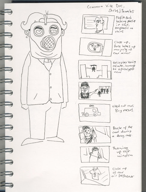
We each also came up with a few rough thumbnails depicting various scenarios for our character. This is a good way of visualising scenes and visual jokes ahead of time, deciding which ones are good enough before moving forward with the more formalised storyboards, which will have a more definitive and refined art style. The idea is that we'll decide on the strongest thumbnail sequences and hopefully arrange them into a coherent narrative befitting of a 2-3 minute mockumentary.
With this animation we want to emphasise visual sight gags as much as the script in order to make the most of animation as an art form. We have discussed various sight gags already relating to the character's wardrobe, such as wearing protective gear as if he were in a war zone, or a gas mask to protect himself from vape smoke.
I also watched a handful of short form Vice documentaries to analyse and pick up on some of the cliches and visual motifs present in them, either to be used as filler during the narrated segments or just to more clearly emulate the style of a documentary. In order to really sell our animation as a documentary, we really want the camera to have more than a passive presence in the scene, maybe even going so far as to make the cameraman a character in and of himself.

There is however subject matter we would prefer to steer away from in our animation. While we are trying to make a statement about class and the nature of the documentary medium, we would prefer to stray away from touchy subjects such as racism and specific politics, as this is not really the tone we are going for. I had planned a series of thumbnails for a scene where our character gets in a taxi and is shocked to find the driver is a foreigner, fearing for his life due to his own internalised bigotry, he reacts by frantically trying to get out of the car and throwing up in a panic. While I did think this was funny, I do agree with my collaborative partners that this doesn't really fit the tone of comedy we are aiming for here as it seems to paint our character in an exceptionally despicable light and we want him to feel at least moderately humanised; laughable rather than despicable.
Background Design Test
Over the weekend I also did some background tests for the animation while Tess and Brogan worked on Characters and Thumbnails. As we are going for a rough, simple but tangible aesthetic I have opted to interpret the backgrounds as simple as I possible can, forgoing a lot of the details in favour of a broad-strokes interpretation. I wanted to keep the number of landmarks in the background to a minimum in order to emphasise certain details, both in the long shots as well as the more close up shots. I will probably do some style tests for different types of shots next week also, for more close up and medium shots in order to flesh out the style a little more. As this was a simple style test, I just traced a Jpeg I found on Google Images and will do some location scouting around certain areas of Leeds next week when I get the time.


