Monday, 7 May 2018
Friday, 4 May 2018
Production Blog- Animation Breakdown
- The bulk of my time spent on production of my animation was in the realisation of the animatic.
- Animatic is arguably the most important stage of realisation as it is the key framing and body language of the characters which is the most important aspect of the animation, as it is this which conveys the story to the audience. The animation is entirely non verbal.
- I initially contemplated using TV Paint but settled on Photoshop as I am most familiar with it and this would optimise my workflow.
Preliminary Animatic/ Storyboards
Animatic
Final Animation
- My preliminary animatic served as the framework upon which I built my more refined animatic and subsequently my finished animation.
- My keyframes would served essentially as the first pass of my animation, determining the timing of character action and pace of a scene.
- After constructing an animatic of the scenes as they play out in Key poses, my second pass was dedicated to adding in-betweens, overlapping and secondary action as well as filling in the characters and some of the foreground and background elements (depending on the scene).
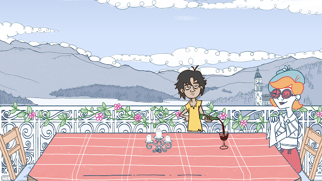
- The final pass was dedicated to recolouring the linework on characters, (characters have differing colour motifs for their linework) additional colouring, line cleanup as well as adding finer details such as the shadow cast on the table in the example above.
- A bulk of the time was spent ensuring linework of initial keys were of a high quality to minimise cleanup and subsequently optimise workflow.
Animatic: Scene keyed out, background/foreground elements added, lighting keyed.
Final Animation: Colours filled in, linework refined, details (more blood) added, elements which didn't work (bones too small) removed based on peer feedback
Thursday, 3 May 2018
Production Blog- LoopDeLoop: 'Lucky' - Evaluation
Evaluation
Overall, I like the look of the animation but do feel it could have been more polished, incorporating more movement on the character and more detail in foreground elements in order to give the set a bit more life, as the setting seems almost sterile, though maybe that works for the subject matter. It was something I hastily threw together not long before the deadline in order to fulfill the brief and so I do wish I could have spent more time on it as the idea, I feel, does have some legs. Perhaps the core concept is something I can develop and build upon in the future, incorporating secondary characters perhaps who react to the situation etc... As it stands I feel I could find a way of incorporating parts of the work into my showreel as aesthetically I feel it stands on its own due to it's pleasant primary colour scheme.
Strengths
- The aesthetic fits the mood and tone of the scene quite nicely.
- Simple primary colour scheme is aesthetically pleasing.
- Theme is communicated fairly clearly.
- Sound mixing is decent.
Weaknesses
- Little pre-production/preparation leaves the piece feeling a bit thrown together at the last min.
- Animation only Loops 3 times. Would have benefitted from some sort of workaround/seamless integration.
- Minimal animation in the scene leaves it feeling a little lifeless. (Though that is the point.)
Wednesday, 2 May 2018
Production Blog- LoopDeLoop: 'Lucky' (Study Task 2)
As for the final live/competition brief I am required to produce as a part of Extended Practice I opted to create a Loop De Loop again, this time based around the word ‘Lucky’. It depicts a man in a hospital bed just as his bpm monitor is about to flatline, who is struck by lighting through the window, restarting his heart. It's a fairly simple concept which I threw together in a fairly short space of time. My main source of inspiration for the design was the illustrator Casey Burns who has worked on numerous indie gig posters and whose work I have drawn upon in the past with my final major project at Foundation level at Newcastle College.
What I took away from Burns and applied here was primarily the linework, which gives the impression of a rough inking. Much of Burn’s posters also incorporate a frame within a frame in order to lend to this handmade aesthetic. The colour scheme was also kept to a minimum, incorporating mainly washed-out primary colours. The character design however was a lot simpler as I wanted to try out a style of character drawing which deviates from my usual house style.
Sound design was a key aspect of the animation as it plays a large part in setting the scene, which is key to communicating the point of the animation. I used a collection of royalty free sounds which I mixed together in Premiere to build a stormy ambience to provide the backdrop for the scene. The video I submitted to Vimeo (and to competition) loops three whole times, with sound effects overlapping with the beginning and end of certain loops.
Sound design was a key aspect of the animation as it plays a large part in setting the scene, which is key to communicating the point of the animation. I used a collection of royalty free sounds which I mixed together in Premiere to build a stormy ambience to provide the backdrop for the scene. The video I submitted to Vimeo (and to competition) loops three whole times, with sound effects overlapping with the beginning and end of certain loops.
Subscribe to:
Comments (Atom)


