Tuesday 29 November 2016

Potential and Limitations: The Feasibility of 2.5D Hybrid Animation

3D Animation is something that has interested me for a while, but it was not until I first starting using Maya at the end of last semester, and observed some of the work other people in my class were doing, that I fully appreciated the artistic potential of the medium. So, for this project I wanted to push for using as many 3D tools as possible, though this proved difficult due to my partner's reluctance to engage with the Maya tools. So to compromise, I opted to create 3D assets for our animation in Maya and then export them as 2D Renders, to later be composited in After Effects, something more along the lines of a 2.5D Animation. I didn't want to skimp on the 3D aspect of my animation, as Maya is something I hope to use for future animations.


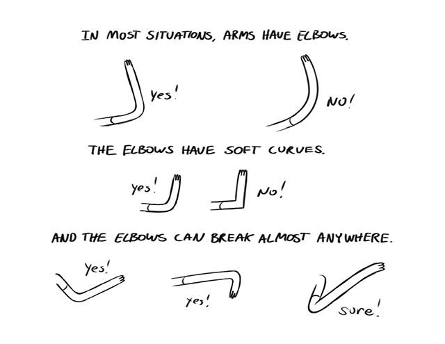
One of the key examples of 2.5D animation I hoped to emulate at the beginning of this project was the Gorillaz Music Videos designed by Jamie Hewlett. Videos such as 'Clint Eastwood', and 'Feel Good Inc' incorporate fully 3D backgrounds and assets in their animation, alongside live action footage. This creates a sort of montage aesthetic, reminiscent of the zine culture from which Hewlett's early work on Tank Girl emerged. This style, while proving that 2.5D animation can be visually appealing and work across a variety of different art styles, is a little ambitious for the limitations that have been placed upon me. Environments in many Gorillaz videos are fully rendered in 3D with camera movement and lighting that is just not possible to replicate with 2D Assets, or at least not possible to replicate to the standard required for a well produced animation. In the 'Feel Good Inc' music video, grass flutters in the wind as the camera orbits the character Noodle playing a CG rendered acoustic guitar as light bounces off the windmill in the background. This shot represents a perfect fusion of the two mediums of 2D and 3D, light on the character is moves with the light of the environment. It's a beautifully conceived shot made possible only by the animators fully embracing the tools at their disposal.


This style of animation, while appealing, is incredibly expensive and time consuming however, and not necessarily a feasible undertaking for every project. For music videos as well as other more artistically oriented endeavours where strict deadlines and marketability are less important, this approach works, but it is not a style or technique you see often in more commercial work. Feel Good Inc's music video is clearly a labour of love from the animators involved in the project and it shows in the densely detailed animation. It is also clear that a relatively large team of animators worked on this video, which is another limitation of 2.5D animation. This level of detail, both in the 2D and CG animation is something that could only be achieved by a sizeable studio, due to the artstyle and sheer number of individual unique assets. It is probable that a smaller team looking to apply this technique would have to drastically alter the artstyle and possibly tone down the detail of the animation if they were tasked with this project or else risk missing the deadline, no matter how lenient. 


Test Render I did early on in production of what the animation might have looked like using the Ocean Shader.

With this project I can't help but feel a little restricted by my collaborator (as well as my lack of knowledge of the tools), however, since the beginning of the module I have been determined to make the most of it. Originally for the water, which plays a huge role in our animation, I wanted to create it in Maya, generating an oceanscape using the ocean shader tool. The plan was to use a script which my tutors has shown me in Maya which allows for objects to interact with the movement of the waves, to animate the bed/boat floating across the ocean while making the most of Mayas tools. Then we would produce a skybox dome for the more abstract environmental details of the dreamscape. There is even a plugin for creating skyboxes in Maya, so a lot of this wouldn't have been too much hassle. Ultimately, none of these ideas came to fruition, and I can't help but feel a little disappointed. Using Maya as the primary workspace would have allowed for realtime lighting, realistic wave physics and generally would have pushed me as a practitioner more than the process I ended up settling on with my partner. 

Sunday 27 November 2016

Responsive: Final Submission for LoopDeLoop-Breakfast

My final LoopDeLoop submission was created using Photoshop assets assembled in After Effects using the DUIK plugin. Throughout my Character and Narrative module I have been using the plugin to animate my character, so my pre-existing knowledge of DUIK has served me well when it comes to creating a LoopDeLoop animation for Responsive. I did toy around with the idea of creating the assets for this animation in Illustrator, due to the many advantages using vectors has over bitmaps (smaller file size, more resizable...) however I opted to use Photoshop in the end as I am overall more experienced using it's toolset. While a lot of what I was doing would be accomplishable in Illustrator, Photoshop's brushes proved to be the deciding factor for me, as I prefer using them to Illustrators more technical vector based approach.

Each of the moving parts on my rig was created in a separate layer in Photoshop using the concept image from the previous post as reference. While generating the assets for my character I was taking into account the tools in which I would be using to animate. I have been having trouble with animating certain types of characters in DUIK in the past due to the artstyle I used and the way they were constructed, so for this character I looked to more simplistic character designs for inspiration. One of the main inspirations I took was from the characters from Pendelton Ward's Adventure Time, whose characters for the most part have long, almost pipe cleaner-like arms and legs which facilitate working with the IK chain tool in DUIK.


I imported the PSD file into After Effects as a composition retaining layer sizes and rigged the model within said composition. Initially I was going to have the character in my animation walk back and forth as he flips the pancake, however due to time restraints and the limited mobility of the assets I had created for the legs, I opted to cut the character off at the hip. As for the animation of the pancake itself I created three variations of the asset, one for when it was resting in the pan, one when the pancake is in mid air and one where it is resting on my character's head. In DUIK I would go on to animate the pancake using a 2-point IK chain so the pancake would flop slightly when being thrown in the air. In order to animate the pancake batter filling the pan, I simply resized the pancake asset.

Having finished my animation and submitted it to LoopDeLoop, I can say I am satisfied with the final product, but at the same time believe that it could have used more detail in the animation. I also feel that I could have simplified the design of my character a little more, and possibly moved away from animating human characters. Character Design is an area I feel I definitely need to branch out in order to diversify my output, as too often I resort to the same two or three character types. Perhaps in the future I will experiment with creating characters based around animals or using more unconventional body types.


Study Task: Strike A Pose

For this study task we were required to manipulate a character rig (Moom) in Maya into a series of poses which reflected various actions and emotional states, using reference imagery we produced ourselves. Reference imagery is something that is very important in animated performance. As the actions of animated characters are entirely produced artificially by an animator as opposed to by a performer (in most cases outside of performance capture) sometimes the smaller nuances which lend depth to the character are lost in the translation. I am yet to work on a project in which I am animating in Maya (unfortunately), however this exercise proved useful as a pointer for future reference in how to translate reference imagery into a convincing animated character.

Moom's controllers make manipulation fairly simple, he has IK chains for his legs, FK chains for his arms and a separate controller for manipulating the face mesh. The way Moom's controllers are laid out also provide me with a pointer for how to structure my own character rig in Maya, which is something I most definitely want to try in the future. One thing I would like to keep note of in the future is how the attribute editor can be used to manipulate the fingers of the Moom rig, something I was not aware of at the time I was creating these Moom renders.

Anxious
Exhausted
Happy
Pride

Sad

Potential and Limitations: DUIK in Industry


I knew from the beginning of this module that I wanted to experiment with rigging a 2D character. Over the summer while I was on work placement at Paper Owl Films, I was introduced to DUIK, an After Effects Plugin which aids in the creation of character rigs in 2D animation. Rigging is a fairly versatile method of animation which is used in everything from children's television animation, including many CBeebies shows such as Sarah and Duck and Hey Duggee, to Academy Award Nominated Independent Israeli Animated War Documentaries such as Waltz with Bashir, and DUIK aids this process by providing the animator a set of tools to construct a sort of easily manipulatable and posable wireframe.


It is important when using DUIK to design your characters around the tools you are given. Most characters animated in DUIK are simple in their design, often with long, pipe-like arms and legs to allow for straightforward manipulation without deforming the mesh. The tools in DUIK are also better served, at least in my opinion, by a vector based art-style, such as the one seen in Studio AKA's Hey Duggee. By using a vector-based aesthetic, deformations in the mesh are less noticeable than with an art-style emphasising line-work, and as a result the final product is a lot cleaner, with the tools used being less apparent to the audience. There are exceptions (see Sarah and Duck) but for the most part, rigged animation generally looks better when it applies a vector based aesthetic. This is why DUIK is primarily viewed in the creative industries as a motion graphics tool, as it is best suited to a specific style of Graphic Design.


With my animation I was hoping to apply DUIK to a more complex rig and character design, which admittedly wielded mixed results. My main influence when creating the rig for my character for this animation was Waltz with Bashir. The characters in the film are made up of an incredibly large amount of moving assets, particularly around the face area, lending an aura of the uncanny to the animation. My whole approach with my rig has been to create as many variations of facial assets such as eyes and mouths, in order to replicate some of this aura but in a more stylised manner. Looking at the character models and overall design of Waltz with Bashir, the characters seem designed to be visually appealing in stills and screenshots, but in the final film, for all the animators' merit, there is something bordering on the uncanny and I think this has to do with the tools the filmmakers use.


In a behind the scenes documentary, it is apparent that the filmmakers are using Flash to animate their characters, and not the DUIK rigging tool as I had originally suspected. While I would still classify the animation in the film as 'rigged animation' the animator's approach has more in line with limited and more traditional forms of 2D animation. While characters are constructed into sort of rigs, there are an extraordinary number of individual and unique assets, vastly more so than is usually the case with rigged animation. One of the reasons for using DUIK and rigging tools in the first place is to cut down on the amount of assets the animator needs to create in order to streamline the animation process, it's an economic decision used to cut costs and produce work quickly and efficiently. This design philosophy stands in stark contrast to the philosophy of the filmmakers of Waltz with Bashir, who you have to keep in mind are producing a very personal, war documentary, purely on artistic merit over a period of years.


This was the first time I used DUIK for an animation, and in hindsight I do feel I should have simplified my design somewhat to better accommodate the tools I would be using to animate, however I also feel that there are elements of my rig that do work and are enhanced by being animated in DUIK, such as the hair and arms. In the future however, I will probably think about what tools I use for my animation a bit differently and design accordingly. I look forward to using DUIK in the future, in particular in relation to Motion Graphics.

Studio Practice Weekly Production Diary: 14/11/2016-21/11/2016

Rendering 3D Models

Having finished modelling lighthouse and bed in Maya last week, this week I had to export them as 2D renders which could be composited in After Effects. For this I chose to use Maya's internal renderer, exporting the images as PNGs, at a resolution of 1920 x 1080 pixels at 300dpi, to allow for the highest quality renders which could be used in our animation. However, as I was rendering the models out as flat 2D images, I had to ensure that the lighting was consistent across all the renders as well as with the storyboards, so I set up a sort of virtual lightroom in Maya, placing several directional lights around my models as well as setting up separate individual cameras, kind of like a multi-camera set up, then rendering from each one individually. I did run into a little trouble when the images I exported came our darker than expected, though this was quickly amended when I figured out I had to co into the colour management settings and tick the checkbox 'Apply Output Transform to Renderer'.


Redesigning elements of my character rig

Last week I redesigned my character rig to fall in line more with my design sheets, however this week while rigging the arms of my character in DUIK, I encountered a few logistical problems which would make animating my rig in the way required for my animation impossible. In our animation, my character is required to take a drag of her cigarette, which requires her to bend her arm in a certain way, something which can be achieved in DUIK my creating IK Chains. Before I made changes to my rig, the way my character's arms looked when I applied IK Chains and manipulated the mesh, looked unnatural due to the way I had drawn the arms. The main problem was that the shoulder blades were too low down when the character had their arms by their side. Body language is key to my character as most of her characteristics are communicated through non-verbal means such as posture, facial expression and mannerisms, so it is important that my rig is both versatile but also tightly constructed, so it doesn't fall apart under scrutiny.


Animating Lighthouse Collapse

After exporting my 2D renders I took to After Effects to create the animation of the lighthouse burning and collapsing which will be featured towards the end of our animation. Originally, I wanted the entirety of the environments in our animation to be animated in Maya and to animate this scene within Maya itself, however after reaching a 'compromise' with my partner I had to settle for compositing in After Effects. In order to create the fire effects I applied the Particle World plugin to a solid orange matte then began manipulating the physics and velocity of the particles, applying blur effects and echoing in order to simulate flames and smoke.

Sunday 20 November 2016

Studio Practice Weekly Production Diary: 6/11/2016-14/11/2016

Formalising my Design Sheets, Revisiting my Storyboards and things I could have done better

One concern I have been having my handling of the project so far is the lack of any formal design sheets for my characters and environmental design. In a professional context, design sheets are important in developing ideas, as they serve as sort of visual mind-maps, for comparing, contrasting and finalising ideas in the pre-production stages of an animation. Animation, as opposed to photography or film, is a medium in which the essence and aura of the work is created primarily in the pre-production phase, and so as such it is important to meticulously plan every element of the design of the production in order to ensure a high quality final product. This is one area I feel that so far with the production of this animation I have been slacking, so I went back this week, accumulating my work on character designs from my sketchbooks in order to create some more formalised design sheets that better reflected my though process in the creation of my character.

In my initial designs for my character I toyed around with the idea of having her wear a burlesque mask, with a feather on it, in order to lend a mysterious and somewhat erotic aura to the design. I created several variations of how the character's face might look, but ended up ditching that idea in the end as I felt it took away from the expressiveness of the character's face. With my rig, I wanted the eyes and eyebrows especially to serve as the primary mode of expression in my character's face, and with the mask, this would have been difficult to achieve. 


One of the biggest problems I ran into with the creation of my character was simplifying the design in order to better suit the tools I would be using to animate with, in this case DUIK. One thing I have learned so far, which I would reconsider if I were to work on this project again, is that the tools of DUIK are better served to more simplistic, vector based, mo-graph animation, as opposed to the style I was going for, with more moving parts and sophisticated limb and facial movements. This has served as a challenge so far, and is definitely something I will be reflecting on in my evaluation.


For my final character design sheet, I opted for a simpler design with more emphasis on how the character would articulate it's limbs and ensuring proportions were consistent. These two drawings of a front and profile view of the character, served as the basis for two of my final character rigs though in hindsight i really should have distinguished the areas which would be point of articulation in order to ensure the model was as close to the final drawing as possible.


I also produced a design sheet for the lighthouse, however upon completion realised that it would have made the job of modelling a lot easier had I drawn out multiple angles and a floor plan in order to better understand the shape. By only really creating one formalised design sheet, there is a lot of guesswork involved, which I've learned through using Maya is not an efficient or professional way of going about things. 

Which is why when it came to the design sheets for the bed I would be featuring in my animation I included a perspective view, a profile and a front view, to provide me with some sort of framework to work off of when it came to the 3D modelling. As a result, the modelling process was nearly as time consuming as was the case with the island and lighthouse. 


Storyboarding, in a visual medium for a distinctly visually focused story, is perhaps the most important element of preproduction when it comes to producing an animation, which is why I am disappointed with my efforts as it is usually the aspect of production I enjoy the most and put the most time into outside of initial design and the actual production. So, this week I opted to revisit my storyboards and, taking cues from 'The Art of Pixar' book I own, produce something more akin to Pixar's colour scripts, something more presentable and professional.


While far from perfect, I do feel these revised versions of the storyboards do more clearly communicate the atmosphere and aesthetic of the animation a little more clearly, as well as better communicating a few things which were brought up in the crit session, such as the POV shot through the telescope looking out to sea at the lighthouse in the distance.


While I would have liked to revisit the animatic, I do not have time. However, some of the changes I would make, as mentioned by the tutors in the crit session is to not just have it be the storyboard set to sound, but to clearly outline and block out in rough the character's movement and any movements of the camera. These formalities are essential, especially when working as a team of multiple people as a way of communicating one's ideas to the other, otherwise there is just a lot of guesswork. I revisted a lot of this in order to make production a little smoother for me and my partner, but really it is too late, we should have let these design sheets inform our work from the beginning, but we didn't and as a result I can't help but feel a little lost and aimless when it comes to working on our animation. Again, this is something I will bring up in my evaluation at the end of the module.

Re-designing my Character Rigs

As a result of not properly structuring my workflow or meticulously tweaking my designs in the pre-production stage, my character rig is a mess and as a result I opted to scrap it and start over, this time going by my recently formalised design sheets. The problem was that the character, though the limbs especially, was drawn without the articulation in mind, and as a result moved unnaturally and in a way that distorted the character and didn't look aesthetically pleasing or professional. There were not enough layers for the arms or legs and as a result the mesh deformed and distorted in a very unnatural way. So, for my amended designs, I opted to split the leg/arm into three separate layers, the thigh/upper arm, knee/elbow and calve/forearm. This would allow me to create a 2 layer IK chain in DUIK over three layers with the knee/elbow there to hide any irregularities or deforities which may present themselves when articulating the IK chain, by parenting them to the upper arm/ thigh, ensuring that at no point there is a gap between the assets and that it moves in a way that does not compromise the aesthetic of the character's design.


Thursday 10 November 2016

Studio Practice Weekly Production Diary: 31/10/2016- 6/11/2016

Modelling The Rocks and Lighthouse

The bulk of my week was spent perfecting and making changes to the 3D models I will be using as a part of my animation. After spending about a week tinkering around in Maya, getting to know the tools and using Matt's E-studio tutorials as a form of guidance, I finally started on the final models which are going to be used in the final animation, for which I created design sheets to use as reference.

I decided last week against going with a low-poly aesthetic for the lighthouse itself, however the rocks around the lighthouse will remain low-poly as originally planned. The lighthouse took up the majority of the time I spent this week modelling in Maya and consists of 5 main meshes, the cylinder, the railing, the windows, the roof and the windows. For the main cylinder I took a polygon mesh with 8 subdivisions around the side and scaled it along the y axis to create a long cylinder shape. I then scaled down the top face so that the main body of the lighthouse appears thicker towards the base, as most lighthouses do in real life. I then resized and extruded the top face in order to create the ledge and deleted the centre inside of the top face in order to ease the UV mapping process further down the line. 


At the bottom of the cylinder using I also added edge loops I extruded a small rectangle out the base of the cylinder which would act as a doorway, which later I would discover massively complicated things in the UV Mapping stages.


After creating the main body of the lighthouse, I moved on to create the railing which was modelled from a pipe polygon primitive, with faces created using the edge loop tool. The windows were also created from pipe polygon primitives, for which I was required to create multiple new faces using the edge loop tool and use the 'difference' tool, to create holes.


As for the roof of the lighthouse, the process was a lot simpler, using a singe polygon primitive of cylinder and extruding the top face, smaller and smaller several times until it formed a sort of domed roof, on which I added a small spire with more extrusion.


Some of my main visual inspiration for the rocks was taken from the work of painter Ryan Browning whose paintings of geometric rock-formations suits a 3D style quite nicely. I have followed Browings work for years now and have been looking for a way to implement elements of his style in one of my animations for a while now. Observing Browning's paintings I feel this style of rock formation works best when contrasted with more figurative, realistic surroundings, which in the case of my animation takes the form of the lighthouse. 


It required a lot of trial and error in order to get the rocks to look the way I wanted. Originally I tried creating the rocks from a single polygon plane and adjusting the vertices, using the edge loop tool to create more subdivisions which could be extruded, moved and rescaled. However, this approach led to the rocks having much softer edges than I had anticipated, as opposed to the hard edges and defined faces present in Browning's paintings which I was trying to achieve. I attempted to remedy this by experimenting with different lighting in order to bring out the contours of the mesh and more clearly define the shape, but to no avail. So, instead I chose a different approach. 


Instead, in order to achieve the look I was aiming for, I created the rocks individually, or rather clusters of rocks individually, starting from a cube polygon primitive. I then adjusted vertices, edges and faces mould them into more of a rock-like formation. Simplicity was key in emulating Browning's style, as essentially no rock has more than four sides and I wanted the rocks to look a certain way from a certain perspective, so that each side appeared almost triangular and two dimensional. I then strung these clusters of rocks together around the lighthouse on top of a plain brown flat polygonal plane.


I coloured the faces of the rock formations in Maya, opting not to use UV maps. To do this I assigned a lambert texture to the mesh and coloured the faces individually, assigning separate lamberts to different tones of brown. I coloured the faces relative to where I had placed the light in the scene so that it was universally consistent with the light cast on the lighthouse.


As well as the Lighthouse and the Rocks, I wanted the boat in which our character traverses the oceanic dreamscape to be a bed which is modelled in Maya also. Thematically, I chose a double bed in order to reflect the character's mindset. The style is low poly and blocky in keeping with the style established so far with the rest of the CG assets. Logistically it also makes sense to have the bed be CG as we require it from numerous different camera angles and perspective shots, and using a 3D object cuts down significantly on having to redraw art assets. Before I started modelling, much like with the lighthouse, I created a design sheet to use as reference for the modelling with a front, side and perspective view in order to gauge the shape and form of the bed. 

The bars of the bed were created from rescaled cylindrical polygon primitives, but the real challenge for me came from creating the swirls. In order to do this I created a CV Curve and snapped a cylinder to the path of the curve in order to create a curved polygon which follows the path of the curve without clipping and can be resized and reshaped to that path fairly easily. I then duplicated and mirrored the curve to create the top of the bed frame. I did experiment with smoothing out the mesh for the bed frame, but felt that a more angular, cylindrical bed frame was more in keeping with the aesthetic I have established so far.


The rest of the bed was fairly simple to model, consisting again mostly of polygon primitives, manipulated with simple edge loop tools and extrusions. For the bedcovers and mattress I used a simple cube primitive and for the pillows I used the smoothing tool on a rough mesh I created using the polygon creation tool to create flat curved shapes. I was not planning to UV map the bed, so I coloured the faces by assigning lambert textures to the meshes, much like I did with the rock clusters. 


UV Mapping


The initial plan before starting the modelling process was to create UV Maps from the objects I had created and send the UV Snapshots to Vlad to colour and texture in Photoshop to ensure we were evenly and fairly distributing the workload. However, after receiving and applying the UV maps, I was not satisfied with the results. I feel a low poly style for models should be reflected in every aspect of the design, so having low poly models with high quality, highly detailed textures leads to a lot of dissonance and does not really fit the aesthetic as much a more simple design. That said, the textures Vlad created do work well on their own, just for the style we are going for they don't exactly fit.


Instead, I created my own, simpler UV Maps instead, using a flat colour scheme which I feel brings out the shape and form of the models more, extenuating the sharp edges and simple shapes in a more visually appealing way. I only ended up creating  a UV Map for the main Lighthouse Cylinder and opted to colour the rest of the Meshes in Maya by assigning Lambert Textures to objects and colouring individual faces. 


After speaking with the tutor however, I am aware of the pitfalls of using this technique to colour objects, cluttering up the Outliner Window for instance, but I do feel for what I am doing with this project, which is very limited and not a fully 3D animation, it will do for now. I had a lot of trouble applying UV Maps which fit the object, mostly because of my approach to modelling. For future projects I will take into account how I will go about applying the UV Maps before beginning the modelling process, whether this be by creating more design sheets beforehand or simplifying meshes by deleting assets which aren't visible from the outside.


Thursday 3 November 2016

Studio Practice Weekly Production Diary: 24/10/2016-31/10/2016

Tuesday Crit
On Tuesday morning me and my partner presented to our class the idea for our animation, showing off the pre-production work we have so far and garnering feedback for things we need to change in order to properly convey our narrative and define our characters. My main take-away was that we needed to formalise our preproduction work, presenting it in a more professional manner. As it stands, much of our character designs and storyboards are relegated to sketchbook scans, which while functional, would not go down so well in say a pitch meeting or in a more professional setting. Another area we need addressing is in ensuring our animatic clearly conveys the progression of the story. When we showed our animatic, there was a little confusion when the main character pulled out the telescope, something that could have been made clearer in the animatic, but wasn't due to the fact our animatic consisted only of our storyboards set to a soundscape. Our tutor Steve said that while this approach may have suited us for what we were doing, it is important to approach the pre-production process as professionally as possible. An animation is made in the production process, so it is important we present our pre-production work in the most professional and presentable way possible. As a result of this feedback, in the coming week I will revisit some of our pre-production work in order to neaten it up and present it in a more professional way.

Getting accustomed to Maya
I also spent much of this week honing my skills more and more with modelling in Maya. One thing I decided this week was that while still opting for a low-poly aesthetic when it comes to the rocks, I feel the lighthouse would be better served if it was more detailed. After looking at examples of this, notably the Gorillaz music video for 'Feel Good Inc', I have decided a more detailed model would be more appropriate, as the low-poly models I tested with looked a little rough and did not fit with the overall aesthetic of the animation. Having started on the more detailed model which will be used in the final animation, I am hoping to have the model textured via UV Mapping by the end of next week. I also started taking Matt's online character modelling tutorials as a part of PPP in order to get to know more of Maya's modelling and rigging tools.

Tuesday 1 November 2016

Responsive: Developing my ideas for LoopDeLoop

This week I continued working on ideas for one of my responsive briefs, settling on an idea for an animated GIF for LoopDeLoop. The idea is to have a looping GIF of a young boy, somewhat based off my younger brother, flipping pancakes, animated in DUIK. The deadline for this brief is November 27th, which should leave plenty of time, so I might produce another submission if I have time, as I have more than one idea for how to answer the brief. I am hoping this short brief will help me develop my skills in using DUIK as well as developing my skills in a more motion-graphics style of animation. I am actively trying to explore different styles with this module, so moving away from a linework-based illustrative style is important to me, as it has been my default, got-to drawing style for a while now. I came up with a quick concept illustration in Photoshop and hope to begin working on the rig next week.