Thursday 8 December 2016

Potential and Limitations: Advantages of using Vectors for Animation


Digital Images can fall into two categories, bitmap or vector, each with their own advantages and disadvantages. For this animation I chose to go with Bitmap assets, as I was inexperienced with using Vectors in the context of animation. However, Vector art does have it's advantages, specifically in regards to motion graphics and rigged animation. 

One of the main advantages of using Vector assets in Animation is that Vector files are mathematical definitions, made up of set points with lines and bounds interconnecting them, defined in terms of width, height, ratio and proportion and not dependent on the resolution space assigned to them like Bitmaps are. This means that they can be scaled without effecting the quality and edited with ease, as components can be individually manipulated without effecting the rest of the image. File sizes are also generally smaller as the size is dictated by the intricacy and detail of the points on the graphic. 

Vector based art lends itself to certain styles more than others, and this is no different in animation. Vectors are most prominent in motion graphic animations and more commercially oriented work where efficiency of workflow and market viability is prioritised over artistic merit and expression. Often you will find assets created to be vectors are designed around the tools in Illustrator. Illustrator's toolset prioritises simple shapes, curves and lines, and is less suited to more complex drawing. 

Potential and Limitations: Pixar's Storyboarding Process

'I will never let something go into production unless it is working fantastic in that version with the still drawings . Because no matter all the great animation you can do will never save a bad story. We will work and rework and rework and rework these reels-sometimes thirty times before we let it go into production. We're really adamant. We'll even slow the production down or stop production to get the story right because we believe its the story that entertains audiences. It's not the technology. It's not the way something looks. It's the story.' 

-John Lasseter, Chief Creative Officer 

Pixar is an animation studio renowned for it's characters as well as telling emotionally resonant stories with well-written narratives. Their approach in regards to the pre-production is unique in that they approach narrative from the emotional perspective of their characters. The storyboard artists at Pixar receive a 'beat outline' which provides the basic guidelines for the character's emotional journey through a scene. Artists then pitch their ideas going by these basic outlines to the director who will then finalise and approve them.


According to John Lasseter, Chief Creative Officer at Pixar, the reason the storyboard process is so important to them is because unlike in live action, the animators cannot have coverage, every asset has to be constructed from scratch , so what they do is edit the movie before they start production, for which they use storyboard drawings. Essentially the animators create their own rough cut of the film from the still drawings, complete with their own scratch track, voices and temp music. It is only after that, when everything has been approved and finalised that full production can begin.

Potential and Limitations: The Success and Sustainability of CG

CG is the most prominent commercial form of mainstream animation. A quick look at the highest grossing animated films of any given year after 1995 and you'll more than likely see that they are primarily CG animated, family friendly affairs produced by large studios such as Disney, Pixar or Dreamworks.


The demand for family friendly never slowed down, evidenced by the popularity of late 2D animated features such as The Lion King, but with advent of CG in the mid 90s, animators were granted a new set of tools to better express their ideas. While CG is considered a large financial and technological investment, on large scale productions it's workflow generally allows for projects to be churned out faster than their traditional 2D contemporaries and is thus the less risky option. In much the same way tools such as DUIK save time on 2D animated projects by allowing animators to animate pre-existing assets, CG cuts down on asset creation and grants the animator more flexible control of elements such as lighting and camera in a scene. 2D animation, while still popular in parts of Europe and Japan, seems unviable in the current Hollywood, profit-oriented landscape.

CG's proven formula generates profit precisely because it is so deeply entrenched in the hollywood system of profit-oriented, family-friendly feature films. Smaller scale CG productions are a lot less common because audiences expect a certain level of technicality, and due to the monopolisation of the medium by Disney and Dreamworks, a particular, family-friendly style.

Studio Practice Weekly Production Diary: 4/12/2016-9/12/2016

Editing and Title and Sound Design
After we finished compositing the individual shots in After Effects we exported them as TIFF sequences. We chose to export as TIFF sequences over H.264 videos because TIFFs retain the image quality which is lost in the conversion to video due to compression and artifacting. At first we tried editing our animation to the pacing of our animatic, but after reviewing the footage we had composited in After Effects we decided to re-edit some things. The final edit of the animation is a lot slower pace than the animatic we created, as it gets off to a much slower start allowing the soundtrack to set the tone of the scene before we abruptly cut to the establishing shot. Compared to the animatic, we also allowed some shots to linger longer while other, were cut entirely. The two shots where the the Succubus picks up the bed were condensed into one longer shot as the profile view seemed redundant. Overall I am more satisfied with the final edit of the animation than I was with the animatic, partially because we strayed away from the animatic.


I also created the end title card design in After Effects. For this I wanted a simple modernist, sans-serif typeface which looked sleek and presentable. After trying out various different fonts such as Tahoma and Helvetica I eventually went with 'Avenir Next Ultra Light' for its slick simplicity. I animated the text by keyframing the tracking between characters so that they move farther apart, and applied a gradual Gaussian Blur and changed opacity so that the text faded out as the letters drifted apart, tying in with the themes and title of the animation.


As for the sound editing and design we used a combination of sound effect Vlad created and creative license sounds. For Vlad's character coughing and yawning, Vlad recorded that himself, as he did with the sound of the lighthouse collapsing which was achieved by shaking a table and adjusting the pitch. Other sounds, such as the sound of the waves and the flames were sourced online from free sound effect websites. The music track used in our animation was created entirely by Vlad himself. For the editing of the sounds, I did a rough cut of the animation which determined the timing of the sound effects and cues while Vlad tided it up, mixed the sounds and overall had final say as he is the sound expert, though it was very much a collaboration, with me having at least some input.


The final render of the animation was done on my Macbook as it had the most RAM and all the assets were already stored on it. We exported the final animation as an H.264 .mp4 video file as per the brief at 24 frames per second.

Wednesday 7 December 2016

Studio Practice Weekly Production Diary: 28/11/2016-4/12/2016

Compositing Shots in our animation


Arguably the second most important stage of the animation, besides the actual animation, is the composition of shots. For this task we split the shots between us equally, although I ensured that I was to composite all the shots in the animation that involved my character. We created a shared pool of assets which we would use for our animation. Vlad created the background skybox as a timelapse which we colour corrected and applied an echo effect for the background layer of each shot. Vlad also created the waves we applied wave-warp to in order to simulate a dreamy oceanscape. However, once i imported these assets into After Effects to use for the shots I was tasked with compositing, I found out that the dimensions were not 1920 x 1080, so I had to change the composition settings and thus stretch the assets. The dip in quality wasn't a deal breaker, but in future I will make sure to address technical specifications with my partner beforehand.

In order to ensure continuity with the waves between the shots I would be compositing and the shots my partner would be compositing, we outlined things such as wave speed and wave height.


We also conversed back and forth about placement of props within the scene to ensure continuity. In hindsight it would have been easier had we created an environmental layout highlighting where certain props were in the scene in order to amend any inconsistencies.


As we were compositing an equal number of shots between us, inevitably I would have to composite Vlad's character into some shots, as his character is a much more prominent part of the animation. However, it would have proven difficult to transfer all of Vlad's After Effects and Photoshop assets over to my computer so I could composite his rig into my shots, so instead we green-screened his character and exported his animations as .movs. I then imported these into After Effects and then, using Keylight, keyed the background to make it transparent. In order to make sure we didnt lose any quality in the transfer I made Vlad export his animations at a higher resolution so they could be scaled down, especially for the closeups.


There are also a lot of small environmental details which were added in the compositing process. Objects floating in the water bob up and down depending on their size, assets in the foreground and background are blurred accordingly to simulate depth of field and I applied lighting effects and lens flares to the lighthouse in order to serve as visual cues to direct the audience's attention to specific events in the scene. For example, for the shot where the Succubus character's head is peeking out from the water, I gradually blurred the waves in the foreground to the background in order to simulate depth of field but also to guide the audience's eye from Vlad's character to the Succubus in a subtle way. Another example of me applying this technique was with the shot of the lighthouse, where a lens flare lights up the scene before gradually fading out. The composition of the shot is laid out in a way that the important assets are presented diagonally. The eye is drawn from Vlad's character to the lighthouse via the Succubus in a diagonal motion which is mirrored by the movement of the Lens flare.


For the splashes featured in our animation I also created some water effects using the Particle Systems plugin in After Effects. I used the explosive physics preset with the faded sphere particle, then applied a vector blur and cartoon shader so to connect the particles so they looked more like water. I used this effect in two shots, for the shot where the Succubus rises from the water and for the shot where she throws Vlad's character back into the ocean. For the first one, I used particles which a small birth and large death size to simulate water bubbling and for the second one I adjusted the size cone of particle generator. I also applied a box dissolve to the animation for when the water disperses after the splash, although I am not completely satisfied with the overall effect. My tutors actually showed me a plugin package for After Effects for creating more detailed particle animations called Red Giant which I will look into using in the future.

Creating additional 3D assets in Maya


Before I composited the scenes for my animation however, I created a few last minute assets in Maya to use in my animation. After seeing the pills that my partner had made for our animation I opted to recreate them as a CG render, as I felt the contour-heavy style my partner had gone with clashed with the smooth edges of the waves. In order to create the simple pill shape I used a polygonal primitive of a cylinder as the base and extruded the faces on either side inwards until each side met in the middle. I then applied a subtle lighting effect to the pill in order to give it more depth and dimension. Then I applied a lambert texture to half of the polygon and coloured it a aqua green.

Saturday 3 December 2016

Study Task: Puppet Master

For one of the study tasks we were required to produce a short animation using the pin tool in After Effects. We were tasked with this earlier on in the module, but I kind of left it until the last minute. I've spent the past couple of weeks animating in DUIK so reverting back to using the simple pin tool and animating with that was a bit of a challenge, as I had gotten used to the features at my disposal in DUIK.


I took a picture of myself mid-stride so I could animate a walk cycle. I wanted the walk cycle to exaggerate the lankiness of my legs for maximum comic effect, and for it to be keyframed in time with the beat of the song. Ultimately, I chose a song with the walk cycle in mind and vice-versa, I ended up going with the opening instrumental to Run The Jewel's 'Blockbuster Night Part 1' as I felt in the context of the walk cycle, it enhanced the humour of the animation.

Friday 2 December 2016

Studio Practice Weekly Production Diary: 21/11/2016-28/11/2016

Character Animation
Having rigged my finished character, this week the bulk of my time was spent animating my character in DUIK. With tweened animation, as an animator you're at an advantage, as the nature of your toolset allows you to block out key poses as keyframes ahead of time and go back and add the detail later. Pose-to-pose was the approach I have chosen to take with my animation, not only because the tools I am using necessitate it, but also its a way of working that plays to my own strengths as an animator.

One of the core design principles I took on board when animating was to make sure that components were always in motion as to lend the motion more realism and the character a proper presence on screen. This design philosophy is something that is adopted by most CG animators, to compensate for the more mathematically calculated and rigid motion which comes with tweened animation as opposed to traditional or hand drawn animation. Secondary motion and overlapping action are also core animation principles which are key to realistic and convincing motion, so for me it was important to include these at this stage of the animation as much as possible.


Secondary action can also place emphasis on a motion, for example in my animation when my character moves her head one way, her strands of hair sway in the other, to and fro, before coming to a gradual stop. The way I achieved this was by placing the hair strands on their own individual IK chains, meaning I simply had to tween the controllers and the strands would behave accordingly. I also parented the bones at the top of the hierarchy to the rest of the head so that they were not misplaced when the head moved and rotated.


In the beginning I had expected to use at least one of the two rigs I had created for every shot in the animation. However, in practice I ran into a few snags, which lead me to create an entirely separate individual hand rig for the shot where my character picks up Vlad's character. This was for numerous reasons, including the fact that the original side-rig which I was intent on using, was not to the required resolution, as well as the fact that simply the animation did not fit the standards I wanted ot hold myself to when using the assets from the side rig. So I quickly created new assets in Photoshop to construct a hand rig with fully moveable fingers and a thumb.


In fact, for the final animation I didn't really end up using the side rig all that much at all, instead I repurposed some of the assets to solve a problem I was having with the scene where my character is supposed to take a drag from her cigarette. Originally the plan was to have her simply bring the cigarette up to her mouth using the IK chain I had created for the arm, however in practice this proved problematic as the arm contorted into an unnatural position when I tried to bring the controller up to my characters mouth. I tried changing the orientation of the IK chain mid-motion, however this lead to the motion feeling unnatural and janky. So, after much contemplation, I came up with a solution to change the head mid motion from a front view to a side view (the head asset from my unused side-rig) so that the controller could reach the mouth without contorting the mesh in a way which seemed unnatural. There is also a scene in our animation where my character is supposed to rise from the water, with the camera positioned behind her, which required me to produce a version on the back of the character's head which could be used in a simple tween. 

Strike A Pose Study Task
For this study task we were required to manipulate a character rig (Moom) in Maya into a series of poses which reflected various actions and emotional states, using reference imagery we produced ourselves. Reference imagery is something that is very important in animated performance. As the actions of animated characters are entirely produced artificially by an animator as opposed to by a performer (in most cases outside of performance capture) sometimes the smaller nuances which lend depth to the character are lost in the translation. I am yet to work on a project in which I am animating in Maya (unfortunately), however this exercise proved useful as a pointer for future reference in how to translate reference imagery into a convincing animated character.

Moom's controllers make manipulation fairly simple, he has IK chains for his legs, FK chains for his arms and a separate controller for manipulating the face mesh. The way Moom's controllers are laid out also provide me with a pointer for how to structure my own character rig in Maya, which is something I most definitely want to try in the future. One thing I would like to keep note of in the future is how the attribute editor can be used to manipulate the fingers of the Moom rig, something I was not aware of at the time I was creating these Moom renders.

Anxious
Exhausted
Happy
Pride

Sad

Tuesday 29 November 2016

Potential and Limitations: The Feasibility of 2.5D Hybrid Animation

3D Animation is something that has interested me for a while, but it was not until I first starting using Maya at the end of last semester, and observed some of the work other people in my class were doing, that I fully appreciated the artistic potential of the medium. So, for this project I wanted to push for using as many 3D tools as possible, though this proved difficult due to my partner's reluctance to engage with the Maya tools. So to compromise, I opted to create 3D assets for our animation in Maya and then export them as 2D Renders, to later be composited in After Effects, something more along the lines of a 2.5D Animation. I didn't want to skimp on the 3D aspect of my animation, as Maya is something I hope to use for future animations.


One of the key examples of 2.5D animation I hoped to emulate at the beginning of this project was the Gorillaz Music Videos designed by Jamie Hewlett. Videos such as 'Clint Eastwood', and 'Feel Good Inc' incorporate fully 3D backgrounds and assets in their animation, alongside live action footage. This creates a sort of montage aesthetic, reminiscent of the zine culture from which Hewlett's early work on Tank Girl emerged. This style, while proving that 2.5D animation can be visually appealing and work across a variety of different art styles, is a little ambitious for the limitations that have been placed upon me. Environments in many Gorillaz videos are fully rendered in 3D with camera movement and lighting that is just not possible to replicate with 2D Assets, or at least not possible to replicate to the standard required for a well produced animation. In the 'Feel Good Inc' music video, grass flutters in the wind as the camera orbits the character Noodle playing a CG rendered acoustic guitar as light bounces off the windmill in the background. This shot represents a perfect fusion of the two mediums of 2D and 3D, light on the character is moves with the light of the environment. It's a beautifully conceived shot made possible only by the animators fully embracing the tools at their disposal.


This style of animation, while appealing, is incredibly expensive and time consuming however, and not necessarily a feasible undertaking for every project. For music videos as well as other more artistically oriented endeavours where strict deadlines and marketability are less important, this approach works, but it is not a style or technique you see often in more commercial work. Feel Good Inc's music video is clearly a labour of love from the animators involved in the project and it shows in the densely detailed animation. It is also clear that a relatively large team of animators worked on this video, which is another limitation of 2.5D animation. This level of detail, both in the 2D and CG animation is something that could only be achieved by a sizeable studio, due to the artstyle and sheer number of individual unique assets. It is probable that a smaller team looking to apply this technique would have to drastically alter the artstyle and possibly tone down the detail of the animation if they were tasked with this project or else risk missing the deadline, no matter how lenient. 


Test Render I did early on in production of what the animation might have looked like using the Ocean Shader.

With this project I can't help but feel a little restricted by my collaborator (as well as my lack of knowledge of the tools), however, since the beginning of the module I have been determined to make the most of it. Originally for the water, which plays a huge role in our animation, I wanted to create it in Maya, generating an oceanscape using the ocean shader tool. The plan was to use a script which my tutors has shown me in Maya which allows for objects to interact with the movement of the waves, to animate the bed/boat floating across the ocean while making the most of Mayas tools. Then we would produce a skybox dome for the more abstract environmental details of the dreamscape. There is even a plugin for creating skyboxes in Maya, so a lot of this wouldn't have been too much hassle. Ultimately, none of these ideas came to fruition, and I can't help but feel a little disappointed. Using Maya as the primary workspace would have allowed for realtime lighting, realistic wave physics and generally would have pushed me as a practitioner more than the process I ended up settling on with my partner. 

Sunday 27 November 2016

Responsive: Final Submission for LoopDeLoop-Breakfast

My final LoopDeLoop submission was created using Photoshop assets assembled in After Effects using the DUIK plugin. Throughout my Character and Narrative module I have been using the plugin to animate my character, so my pre-existing knowledge of DUIK has served me well when it comes to creating a LoopDeLoop animation for Responsive. I did toy around with the idea of creating the assets for this animation in Illustrator, due to the many advantages using vectors has over bitmaps (smaller file size, more resizable...) however I opted to use Photoshop in the end as I am overall more experienced using it's toolset. While a lot of what I was doing would be accomplishable in Illustrator, Photoshop's brushes proved to be the deciding factor for me, as I prefer using them to Illustrators more technical vector based approach.

Each of the moving parts on my rig was created in a separate layer in Photoshop using the concept image from the previous post as reference. While generating the assets for my character I was taking into account the tools in which I would be using to animate. I have been having trouble with animating certain types of characters in DUIK in the past due to the artstyle I used and the way they were constructed, so for this character I looked to more simplistic character designs for inspiration. One of the main inspirations I took was from the characters from Pendelton Ward's Adventure Time, whose characters for the most part have long, almost pipe cleaner-like arms and legs which facilitate working with the IK chain tool in DUIK.


I imported the PSD file into After Effects as a composition retaining layer sizes and rigged the model within said composition. Initially I was going to have the character in my animation walk back and forth as he flips the pancake, however due to time restraints and the limited mobility of the assets I had created for the legs, I opted to cut the character off at the hip. As for the animation of the pancake itself I created three variations of the asset, one for when it was resting in the pan, one when the pancake is in mid air and one where it is resting on my character's head. In DUIK I would go on to animate the pancake using a 2-point IK chain so the pancake would flop slightly when being thrown in the air. In order to animate the pancake batter filling the pan, I simply resized the pancake asset.

Having finished my animation and submitted it to LoopDeLoop, I can say I am satisfied with the final product, but at the same time believe that it could have used more detail in the animation. I also feel that I could have simplified the design of my character a little more, and possibly moved away from animating human characters. Character Design is an area I feel I definitely need to branch out in order to diversify my output, as too often I resort to the same two or three character types. Perhaps in the future I will experiment with creating characters based around animals or using more unconventional body types.


Study Task: Strike A Pose

For this study task we were required to manipulate a character rig (Moom) in Maya into a series of poses which reflected various actions and emotional states, using reference imagery we produced ourselves. Reference imagery is something that is very important in animated performance. As the actions of animated characters are entirely produced artificially by an animator as opposed to by a performer (in most cases outside of performance capture) sometimes the smaller nuances which lend depth to the character are lost in the translation. I am yet to work on a project in which I am animating in Maya (unfortunately), however this exercise proved useful as a pointer for future reference in how to translate reference imagery into a convincing animated character.

Moom's controllers make manipulation fairly simple, he has IK chains for his legs, FK chains for his arms and a separate controller for manipulating the face mesh. The way Moom's controllers are laid out also provide me with a pointer for how to structure my own character rig in Maya, which is something I most definitely want to try in the future. One thing I would like to keep note of in the future is how the attribute editor can be used to manipulate the fingers of the Moom rig, something I was not aware of at the time I was creating these Moom renders.

Anxious
Exhausted
Happy
Pride

Sad

Potential and Limitations: DUIK in Industry


I knew from the beginning of this module that I wanted to experiment with rigging a 2D character. Over the summer while I was on work placement at Paper Owl Films, I was introduced to DUIK, an After Effects Plugin which aids in the creation of character rigs in 2D animation. Rigging is a fairly versatile method of animation which is used in everything from children's television animation, including many CBeebies shows such as Sarah and Duck and Hey Duggee, to Academy Award Nominated Independent Israeli Animated War Documentaries such as Waltz with Bashir, and DUIK aids this process by providing the animator a set of tools to construct a sort of easily manipulatable and posable wireframe.


It is important when using DUIK to design your characters around the tools you are given. Most characters animated in DUIK are simple in their design, often with long, pipe-like arms and legs to allow for straightforward manipulation without deforming the mesh. The tools in DUIK are also better served, at least in my opinion, by a vector based art-style, such as the one seen in Studio AKA's Hey Duggee. By using a vector-based aesthetic, deformations in the mesh are less noticeable than with an art-style emphasising line-work, and as a result the final product is a lot cleaner, with the tools used being less apparent to the audience. There are exceptions (see Sarah and Duck) but for the most part, rigged animation generally looks better when it applies a vector based aesthetic. This is why DUIK is primarily viewed in the creative industries as a motion graphics tool, as it is best suited to a specific style of Graphic Design.


With my animation I was hoping to apply DUIK to a more complex rig and character design, which admittedly wielded mixed results. My main influence when creating the rig for my character for this animation was Waltz with Bashir. The characters in the film are made up of an incredibly large amount of moving assets, particularly around the face area, lending an aura of the uncanny to the animation. My whole approach with my rig has been to create as many variations of facial assets such as eyes and mouths, in order to replicate some of this aura but in a more stylised manner. Looking at the character models and overall design of Waltz with Bashir, the characters seem designed to be visually appealing in stills and screenshots, but in the final film, for all the animators' merit, there is something bordering on the uncanny and I think this has to do with the tools the filmmakers use.


In a behind the scenes documentary, it is apparent that the filmmakers are using Flash to animate their characters, and not the DUIK rigging tool as I had originally suspected. While I would still classify the animation in the film as 'rigged animation' the animator's approach has more in line with limited and more traditional forms of 2D animation. While characters are constructed into sort of rigs, there are an extraordinary number of individual and unique assets, vastly more so than is usually the case with rigged animation. One of the reasons for using DUIK and rigging tools in the first place is to cut down on the amount of assets the animator needs to create in order to streamline the animation process, it's an economic decision used to cut costs and produce work quickly and efficiently. This design philosophy stands in stark contrast to the philosophy of the filmmakers of Waltz with Bashir, who you have to keep in mind are producing a very personal, war documentary, purely on artistic merit over a period of years.


This was the first time I used DUIK for an animation, and in hindsight I do feel I should have simplified my design somewhat to better accommodate the tools I would be using to animate, however I also feel that there are elements of my rig that do work and are enhanced by being animated in DUIK, such as the hair and arms. In the future however, I will probably think about what tools I use for my animation a bit differently and design accordingly. I look forward to using DUIK in the future, in particular in relation to Motion Graphics.

Studio Practice Weekly Production Diary: 14/11/2016-21/11/2016

Rendering 3D Models

Having finished modelling lighthouse and bed in Maya last week, this week I had to export them as 2D renders which could be composited in After Effects. For this I chose to use Maya's internal renderer, exporting the images as PNGs, at a resolution of 1920 x 1080 pixels at 300dpi, to allow for the highest quality renders which could be used in our animation. However, as I was rendering the models out as flat 2D images, I had to ensure that the lighting was consistent across all the renders as well as with the storyboards, so I set up a sort of virtual lightroom in Maya, placing several directional lights around my models as well as setting up separate individual cameras, kind of like a multi-camera set up, then rendering from each one individually. I did run into a little trouble when the images I exported came our darker than expected, though this was quickly amended when I figured out I had to co into the colour management settings and tick the checkbox 'Apply Output Transform to Renderer'.


Redesigning elements of my character rig

Last week I redesigned my character rig to fall in line more with my design sheets, however this week while rigging the arms of my character in DUIK, I encountered a few logistical problems which would make animating my rig in the way required for my animation impossible. In our animation, my character is required to take a drag of her cigarette, which requires her to bend her arm in a certain way, something which can be achieved in DUIK my creating IK Chains. Before I made changes to my rig, the way my character's arms looked when I applied IK Chains and manipulated the mesh, looked unnatural due to the way I had drawn the arms. The main problem was that the shoulder blades were too low down when the character had their arms by their side. Body language is key to my character as most of her characteristics are communicated through non-verbal means such as posture, facial expression and mannerisms, so it is important that my rig is both versatile but also tightly constructed, so it doesn't fall apart under scrutiny.


Animating Lighthouse Collapse

After exporting my 2D renders I took to After Effects to create the animation of the lighthouse burning and collapsing which will be featured towards the end of our animation. Originally, I wanted the entirety of the environments in our animation to be animated in Maya and to animate this scene within Maya itself, however after reaching a 'compromise' with my partner I had to settle for compositing in After Effects. In order to create the fire effects I applied the Particle World plugin to a solid orange matte then began manipulating the physics and velocity of the particles, applying blur effects and echoing in order to simulate flames and smoke.

Sunday 20 November 2016

Studio Practice Weekly Production Diary: 6/11/2016-14/11/2016

Formalising my Design Sheets, Revisiting my Storyboards and things I could have done better

One concern I have been having my handling of the project so far is the lack of any formal design sheets for my characters and environmental design. In a professional context, design sheets are important in developing ideas, as they serve as sort of visual mind-maps, for comparing, contrasting and finalising ideas in the pre-production stages of an animation. Animation, as opposed to photography or film, is a medium in which the essence and aura of the work is created primarily in the pre-production phase, and so as such it is important to meticulously plan every element of the design of the production in order to ensure a high quality final product. This is one area I feel that so far with the production of this animation I have been slacking, so I went back this week, accumulating my work on character designs from my sketchbooks in order to create some more formalised design sheets that better reflected my though process in the creation of my character.

In my initial designs for my character I toyed around with the idea of having her wear a burlesque mask, with a feather on it, in order to lend a mysterious and somewhat erotic aura to the design. I created several variations of how the character's face might look, but ended up ditching that idea in the end as I felt it took away from the expressiveness of the character's face. With my rig, I wanted the eyes and eyebrows especially to serve as the primary mode of expression in my character's face, and with the mask, this would have been difficult to achieve. 


One of the biggest problems I ran into with the creation of my character was simplifying the design in order to better suit the tools I would be using to animate with, in this case DUIK. One thing I have learned so far, which I would reconsider if I were to work on this project again, is that the tools of DUIK are better served to more simplistic, vector based, mo-graph animation, as opposed to the style I was going for, with more moving parts and sophisticated limb and facial movements. This has served as a challenge so far, and is definitely something I will be reflecting on in my evaluation.


For my final character design sheet, I opted for a simpler design with more emphasis on how the character would articulate it's limbs and ensuring proportions were consistent. These two drawings of a front and profile view of the character, served as the basis for two of my final character rigs though in hindsight i really should have distinguished the areas which would be point of articulation in order to ensure the model was as close to the final drawing as possible.


I also produced a design sheet for the lighthouse, however upon completion realised that it would have made the job of modelling a lot easier had I drawn out multiple angles and a floor plan in order to better understand the shape. By only really creating one formalised design sheet, there is a lot of guesswork involved, which I've learned through using Maya is not an efficient or professional way of going about things. 

Which is why when it came to the design sheets for the bed I would be featuring in my animation I included a perspective view, a profile and a front view, to provide me with some sort of framework to work off of when it came to the 3D modelling. As a result, the modelling process was nearly as time consuming as was the case with the island and lighthouse. 


Storyboarding, in a visual medium for a distinctly visually focused story, is perhaps the most important element of preproduction when it comes to producing an animation, which is why I am disappointed with my efforts as it is usually the aspect of production I enjoy the most and put the most time into outside of initial design and the actual production. So, this week I opted to revisit my storyboards and, taking cues from 'The Art of Pixar' book I own, produce something more akin to Pixar's colour scripts, something more presentable and professional.


While far from perfect, I do feel these revised versions of the storyboards do more clearly communicate the atmosphere and aesthetic of the animation a little more clearly, as well as better communicating a few things which were brought up in the crit session, such as the POV shot through the telescope looking out to sea at the lighthouse in the distance.


While I would have liked to revisit the animatic, I do not have time. However, some of the changes I would make, as mentioned by the tutors in the crit session is to not just have it be the storyboard set to sound, but to clearly outline and block out in rough the character's movement and any movements of the camera. These formalities are essential, especially when working as a team of multiple people as a way of communicating one's ideas to the other, otherwise there is just a lot of guesswork. I revisted a lot of this in order to make production a little smoother for me and my partner, but really it is too late, we should have let these design sheets inform our work from the beginning, but we didn't and as a result I can't help but feel a little lost and aimless when it comes to working on our animation. Again, this is something I will bring up in my evaluation at the end of the module.

Re-designing my Character Rigs

As a result of not properly structuring my workflow or meticulously tweaking my designs in the pre-production stage, my character rig is a mess and as a result I opted to scrap it and start over, this time going by my recently formalised design sheets. The problem was that the character, though the limbs especially, was drawn without the articulation in mind, and as a result moved unnaturally and in a way that distorted the character and didn't look aesthetically pleasing or professional. There were not enough layers for the arms or legs and as a result the mesh deformed and distorted in a very unnatural way. So, for my amended designs, I opted to split the leg/arm into three separate layers, the thigh/upper arm, knee/elbow and calve/forearm. This would allow me to create a 2 layer IK chain in DUIK over three layers with the knee/elbow there to hide any irregularities or deforities which may present themselves when articulating the IK chain, by parenting them to the upper arm/ thigh, ensuring that at no point there is a gap between the assets and that it moves in a way that does not compromise the aesthetic of the character's design.


Thursday 10 November 2016

Studio Practice Weekly Production Diary: 31/10/2016- 6/11/2016

Modelling The Rocks and Lighthouse

The bulk of my week was spent perfecting and making changes to the 3D models I will be using as a part of my animation. After spending about a week tinkering around in Maya, getting to know the tools and using Matt's E-studio tutorials as a form of guidance, I finally started on the final models which are going to be used in the final animation, for which I created design sheets to use as reference.

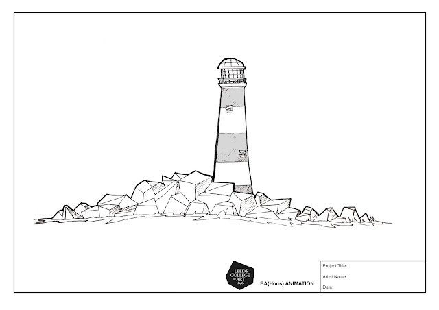
I decided last week against going with a low-poly aesthetic for the lighthouse itself, however the rocks around the lighthouse will remain low-poly as originally planned. The lighthouse took up the majority of the time I spent this week modelling in Maya and consists of 5 main meshes, the cylinder, the railing, the windows, the roof and the windows. For the main cylinder I took a polygon mesh with 8 subdivisions around the side and scaled it along the y axis to create a long cylinder shape. I then scaled down the top face so that the main body of the lighthouse appears thicker towards the base, as most lighthouses do in real life. I then resized and extruded the top face in order to create the ledge and deleted the centre inside of the top face in order to ease the UV mapping process further down the line. 


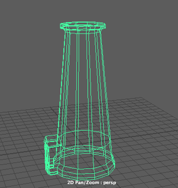
At the bottom of the cylinder using I also added edge loops I extruded a small rectangle out the base of the cylinder which would act as a doorway, which later I would discover massively complicated things in the UV Mapping stages.


After creating the main body of the lighthouse, I moved on to create the railing which was modelled from a pipe polygon primitive, with faces created using the edge loop tool. The windows were also created from pipe polygon primitives, for which I was required to create multiple new faces using the edge loop tool and use the 'difference' tool, to create holes.


As for the roof of the lighthouse, the process was a lot simpler, using a singe polygon primitive of cylinder and extruding the top face, smaller and smaller several times until it formed a sort of domed roof, on which I added a small spire with more extrusion.


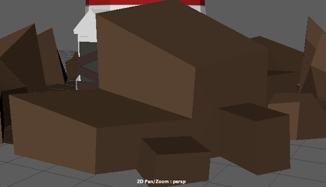
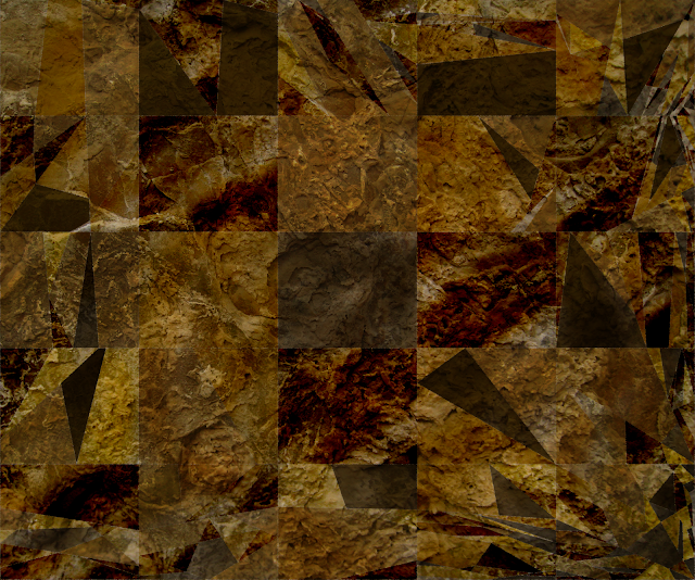
Some of my main visual inspiration for the rocks was taken from the work of painter Ryan Browning whose paintings of geometric rock-formations suits a 3D style quite nicely. I have followed Browings work for years now and have been looking for a way to implement elements of his style in one of my animations for a while now. Observing Browning's paintings I feel this style of rock formation works best when contrasted with more figurative, realistic surroundings, which in the case of my animation takes the form of the lighthouse. 


It required a lot of trial and error in order to get the rocks to look the way I wanted. Originally I tried creating the rocks from a single polygon plane and adjusting the vertices, using the edge loop tool to create more subdivisions which could be extruded, moved and rescaled. However, this approach led to the rocks having much softer edges than I had anticipated, as opposed to the hard edges and defined faces present in Browning's paintings which I was trying to achieve. I attempted to remedy this by experimenting with different lighting in order to bring out the contours of the mesh and more clearly define the shape, but to no avail. So, instead I chose a different approach. 


Instead, in order to achieve the look I was aiming for, I created the rocks individually, or rather clusters of rocks individually, starting from a cube polygon primitive. I then adjusted vertices, edges and faces mould them into more of a rock-like formation. Simplicity was key in emulating Browning's style, as essentially no rock has more than four sides and I wanted the rocks to look a certain way from a certain perspective, so that each side appeared almost triangular and two dimensional. I then strung these clusters of rocks together around the lighthouse on top of a plain brown flat polygonal plane.


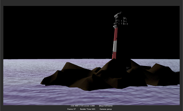
I coloured the faces of the rock formations in Maya, opting not to use UV maps. To do this I assigned a lambert texture to the mesh and coloured the faces individually, assigning separate lamberts to different tones of brown. I coloured the faces relative to where I had placed the light in the scene so that it was universally consistent with the light cast on the lighthouse.


As well as the Lighthouse and the Rocks, I wanted the boat in which our character traverses the oceanic dreamscape to be a bed which is modelled in Maya also. Thematically, I chose a double bed in order to reflect the character's mindset. The style is low poly and blocky in keeping with the style established so far with the rest of the CG assets. Logistically it also makes sense to have the bed be CG as we require it from numerous different camera angles and perspective shots, and using a 3D object cuts down significantly on having to redraw art assets. Before I started modelling, much like with the lighthouse, I created a design sheet to use as reference for the modelling with a front, side and perspective view in order to gauge the shape and form of the bed. 

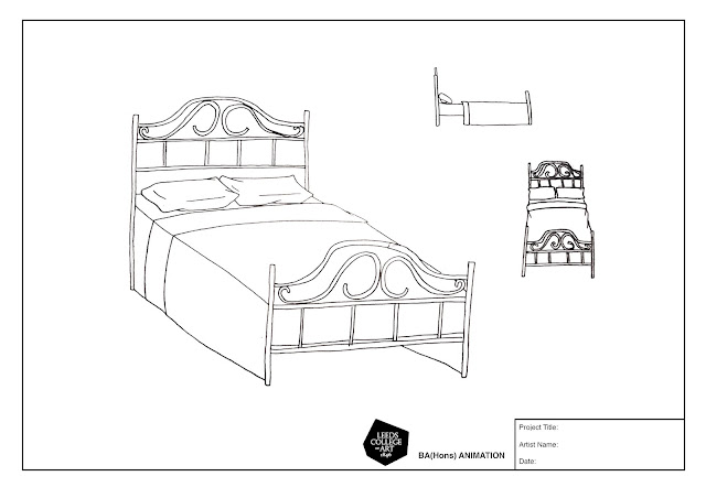
The bars of the bed were created from rescaled cylindrical polygon primitives, but the real challenge for me came from creating the swirls. In order to do this I created a CV Curve and snapped a cylinder to the path of the curve in order to create a curved polygon which follows the path of the curve without clipping and can be resized and reshaped to that path fairly easily. I then duplicated and mirrored the curve to create the top of the bed frame. I did experiment with smoothing out the mesh for the bed frame, but felt that a more angular, cylindrical bed frame was more in keeping with the aesthetic I have established so far.


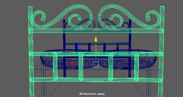
The rest of the bed was fairly simple to model, consisting again mostly of polygon primitives, manipulated with simple edge loop tools and extrusions. For the bedcovers and mattress I used a simple cube primitive and for the pillows I used the smoothing tool on a rough mesh I created using the polygon creation tool to create flat curved shapes. I was not planning to UV map the bed, so I coloured the faces by assigning lambert textures to the meshes, much like I did with the rock clusters. 


UV Mapping


The initial plan before starting the modelling process was to create UV Maps from the objects I had created and send the UV Snapshots to Vlad to colour and texture in Photoshop to ensure we were evenly and fairly distributing the workload. However, after receiving and applying the UV maps, I was not satisfied with the results. I feel a low poly style for models should be reflected in every aspect of the design, so having low poly models with high quality, highly detailed textures leads to a lot of dissonance and does not really fit the aesthetic as much a more simple design. That said, the textures Vlad created do work well on their own, just for the style we are going for they don't exactly fit.


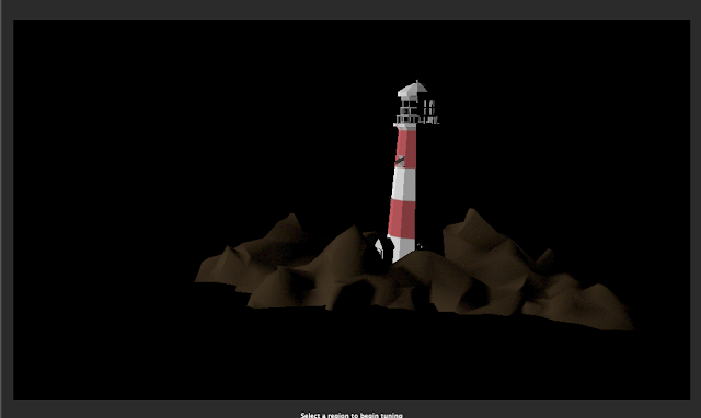
Instead, I created my own, simpler UV Maps instead, using a flat colour scheme which I feel brings out the shape and form of the models more, extenuating the sharp edges and simple shapes in a more visually appealing way. I only ended up creating  a UV Map for the main Lighthouse Cylinder and opted to colour the rest of the Meshes in Maya by assigning Lambert Textures to objects and colouring individual faces. 


After speaking with the tutor however, I am aware of the pitfalls of using this technique to colour objects, cluttering up the Outliner Window for instance, but I do feel for what I am doing with this project, which is very limited and not a fully 3D animation, it will do for now. I had a lot of trouble applying UV Maps which fit the object, mostly because of my approach to modelling. For future projects I will take into account how I will go about applying the UV Maps before beginning the modelling process, whether this be by creating more design sheets beforehand or simplifying meshes by deleting assets which aren't visible from the outside.