Thursday 26 November 2015

Developing my Storyboards and Animatic


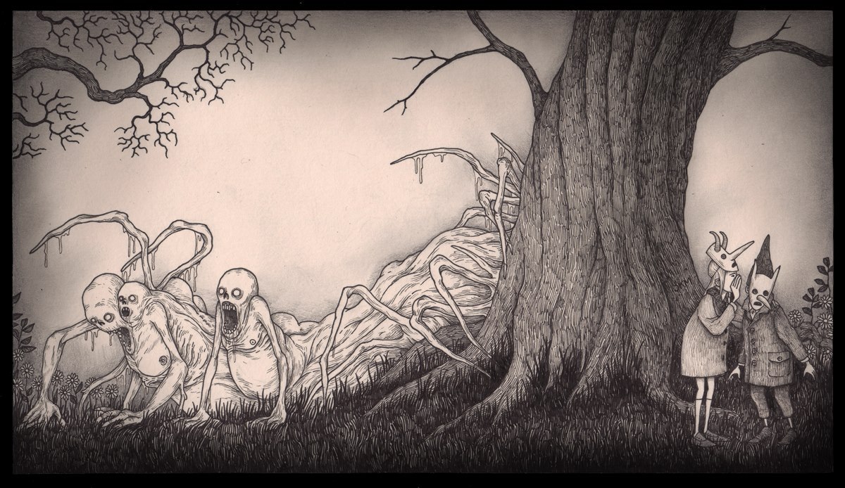
Storyboarding is an integral part of developing any form of narrative-driven moving image, so before developing my animation any further I took the time to finalise my storyboards to ensure the animation told a coherent story within a 30 second time frame.  These drawings do not necessarily represent the final character and background designs which will be used in the final animation, but it is important to get a feel for the composition of the shots and the staging of the characters in a scene in the storyboarding process in order to see what works and what can be changed. This means including facial expressions and the primary movements in a scene to give the animator reference for how the shots will play out. In the final animation, more movement will be added to the scene, such as leaves blowing in the breeze, to breathe life into the world and lend to the atmosphere of the scene. Secondary movements will also be included, such as wind blowing the character's hair in order to connect the characters to the environments they are set against. Camera movements are also planned out at this stage. In my animation, these movements are fairly subtle as to not distract from the traditional style of presentation I am going for with this animation.


When the storyboards are finished they are scanned in and edited together in Adobe Premier where sound and music is added. For this animation, from the get go, I had 'Songs from Friday Afternoons' by Benjamin Britten on my mind when I was coming up with the characters and story for the animation, a song used to great effect in Wes Anderson's film 'Moonrise Kingdom'. The song provides the framework for the pace of editing in the animation, as shots change and flow with the song, with particular sound cues ('Cuckoo') dictating when to cut away to the next shot and the rising intonation of the vocals dictating camera movement. I feel that buy building upon a strong framework for the soundscape, this helps connect the audio to the visual elements of the animation, making for an overall more complete and aesthetically satisfying animation.


Final Storyboards 


Wednesday 25 November 2015

Developing my Backgrounds


My background designs for this animation were directly inspired by the style of Illustrator Don Kenn. While I have been taking cues from other artists when it comes to the character and creature designs, the backgrounds I hope retain their Kenn-esque aesthetic. This means a lot of cross hatching and detailed line-work to convey a sense of texture, which I feel contrasts nicely with the more simple character designs.

Backgrounds were drawn in my sketchbook using a fine liners of varying sizes. For the more intricate details in the woodwork on the fence in this background for example I used a 0.1 pen,while for the outline of the fence I used a 0.8. To add further depth and dimension to the backgrounds I outlined each individual plank of wood that mass up the fence with a 0.5 pen, which I feel adds authenticity to the image.


For close ups of over the fence I drew another section of the fence, this time in more  detail using the same process. This was due to fear that the resolution of the scanned image would not be high enough to allow for me to zoom into a particular section of the fence without it effecting the image quality.


The trees, which are designed to represent the monster's horns were also drawn separately with a similar amount of detail and using similar processes, though due to their larger scale they do not necessarily fit into the final composition without resizing which I feel has a negative effect on the aesthetic. This means I will most likely be redrawing the backgrounds for my final animation to ensure the line work is constant from asset to asset.

Developing my Character Designs

The first stage in the development of my animation this time around was the character designs as it is the characters that are integral to the progression of the narrative in my animation. I decided early on the aesthetic I wished to use for this animation; that of illustrator Don Kenn, so I applied some of the traits of his drawings to the design of my characters. Kenn uses different types of crosshatching to add tone to his drawings as opposed to tonal shading or colouring, working mostly on yellow post-it notes/paper, giving the work a distinctly hand-made and what can best be described as a warm, Autumn-y feel. The colour palette of browns and yellows also lends to this aesthetic. In order to compensate for the insanely detailed and intricate crosshatching I have worked on simplifying my character designs so they are easier to animate. 


An aspect of the design process I felt was most important was the design of the monster. In early designs (see above) the girl transformed into the monster a-la John Carpenter's 'The Thing' as opposed to being used as bait, though I feel the bait idea is more effective from a humour perspective. For these designs I took cues from H.R Giger's Alien as well as some of Manga-artist Junji Ito's work.


Keeping the designs simple was my top priority in the design process, as it was important that the characters were always in motion in the final animation, something I intended as a fix in response to feedback I received on my last project stating that the character seemed robotic and limited in motion. It was also important to keep the character designs fitting with the environment as I wanted to emphasise interaction with the environment wherever possible.

Studio Brief: The Other Side (Initial Ideas)

My Initial Ideas for the brief were a lot more serious in tone than my previous projects. As the title of the brief is 'The Other Side' I was initially throwing around ideas based around 'the ethereal plane' as well as concepts of the afterlife and purgatory. I have a deep interest in forms of media that delve into these sorts of themes, as I am a particular fan of filmmakers such as David Lynch who applies these sorts of concepts in his films. Films like Jacobs Ladder, another favourite of mine, explore these concepts also, as well as Freudian theories regarding Psychoanalysis and the concept of duality. While I would like to explore these concepts in the future, I feel for a 25-second narrative animation, the ideas may be too grand to explore in any meaningful way.

Another idea I had for 'The Other Side' was exploring political issues regarding social, cultural and political divides. The Israeli-Palestinian conflict immediately came to mind, along with the illustrator Joe Sacco who has produced illustrated books on the subject in the past. The current Refugee Crisis in the Mediterranean was another topic I was wishing to maybe explore, with an array of narrative possibilities. However, after receiving feedback from my tutor I decided against the idea of exploring highly political topics and subject matter in a 25-second animation as I would be unable to convey the true gravitas of the situation or do it justice. 


The idea I decided to move forward with and develop is a rather literal and straightforward interpretation of the brief; the other side of a fence. While this may seem fairly mundane, the idea behind it, I feel, is strong enough to stand on it's own. I intend for the narrative to be a bait and switch which catches the audience off-guard somewhat. Stylistically my influences are that of Don Kenn and Edward Gorey, whose dark, yet child-like aesthetic lend their illustrations a sort of unsettling atmosphere while also coming across as reassuringly innocent at the same time. Narratively I am hoping to successfully blend the quirky innocence of Wes Anderson (particularly his film 'Moonrise Kingdom') with the creature design of the likes of Guillermo Del Toro and the shock horror of a director like John Carpenter.


The Narrative I have planned in my head is that of a young boy, playing football on his own. He kicks his ball over a fence in sorrow over his current situation and is about to walk home when he spots another young girl holding his football on the other side of the fence. Feeling he is about to make a new friend he goes over and the two stare deeply into each others eyes, suggesting this may be a happy ending after all, before the girl is pulled up into the air, revealing she is being used as bait by a demonic, Del-Toro-esque monstrosity much like how an Anglerfish uses it's light as bait for it's prey. I find there is an element of humour in this sort of narrative bait-and-switch, as the friendly aesthetic does not make any suggestion to the conclusion the audience gets.

Sunday 22 November 2015

Study Task: Photoshop Animation

Click to view

For this study task we were tasked with creating a pose-to-pose animation in Photoshop of a ball bouncing in more than one direction before rolling to a stop in order to demonstrate a knowledge of how to manage workflow and generate a moving image solution to a studio brief. Animating on twos, the brief states that the final animation must be produced at 24 frames-per-second and presented in a 1920 x 1080 resolution.


Pose-to-pose animation is the process of planning out keyframes ahead of time and then adding in the inbetween frames. This process usually applies to big budget collaborative projects as it allows for larger teams of people to work on an animation at the same time. Here, the ball was hand drawn using a Wacom Intuos tablet, allowing me to squash and stretch the ball and give it a weight. The arc of the ball was planned ahead of time as well in order to calculate where I would be drawing the inbetweens, which I marked along the path of the arc. Sound effects were later added in Adobe Premier Pro in order to punctuate the ball bouncing off surfaces and give it additional weight.

Introduction to Animation: Process & Production

Computers don't create computer animation any more than a pencil creates pencil animation. What creates computer animation is the artist.


-John Lasseter, Chief Creative Officer at Pixar


The aim of this module is to properly explore the process of developing a 2D Animation in order to communicate ideas while also garnering a practical understanding of the fundamental animated production processes.  The Studio Brief for this module is to develop a 25-second animated short using the standard production workflow of Pre-Production, Production, Post Production. The final animation must meet the following technical specifications...

The final animation must be 25 seconds long, excluding the opening and closing titles.

The animation must have an opening and closing title.

The animation must be displayed in 1080p at 24 frames per second.

The animation must be exported as a Quicktime .mov using the h264 video codec.

According to the brief on E-Studio the animation must be an interpretation of the title 'The Other Side', which could mean anything from the other side of a physical space to the more abstract concept of the other side of an ethereal plane.

After evaluating my last project I am hoping to amend some of the problems I faced during my last project, such as time management and keeping my blog up to date. I also hope to garner and document more feedback from my peers and tutors in order to better my work. As it stands right now I am hoping to explore a more serious subject matter and tone for my animation, as opposed to the more humorous and light hearted approach I took to the last brief. This is in order to ensure I have a diverse output and experiment with an array of styles. 

Saturday 7 November 2015

Final Project Evaluation

Animation Skills has been an enjoyable learning experience for me which I feel has definitely broadened my understanding of the processes and fundamental principles of animation as well as how to go about applying them to my own work. Time in this module has given me the opportunity to explore more in-depth the tools used for animation, allowing me to refine my already existing set of skills and apply them to an animation context. Working on the blog, researching Animation from across a range of different mediums, has also given me a broader insight into the industry itself and knowledge of where my own interests lie in regards to animation, which is important to know before I decide what to specialise in. 

I feel my strengths over the course of this module have been in regards to the practical work. While I may not be great at managing my time to ensure I have enough time to produce high quality work, as a whole I am satisfied with most of the actual work I produced, particularly my finished animation. I also feel I have a fairly strong idea where I want to expand my skill set as well as the processes and techniques I hope to refine over the course of the next span of briefs. This module has given me a direction for me to work towards.

For the most part, the work I produced reflects my very best effort, however with this being my first module of the course I feel that I still have a lot of room for improvement, particularly in the areas of time management and experimentation with different forms of media. I've never excelled in managing my time and generating ideas within a manageable time frame, which I feel had a partial effect on my final animation of Studio Brief 4. I struggled a lot in the pre-production phase coming up with an initial idea to use as the basis of my animation and ended up scrapping one of the frames which I storyboarded in the interest of time. In order to amend this in any future projects I will allocate a certain amount of time for each stage of the production process and set mini-deadlines to ensure the final product properly reflects the quality of the pre-production material. 

Another goal I have set myself for the next project is to experiment more with different styles, techniques and materials. A lot of the work I produced over the course of this project was developed digitally, based off scanned sketches and the workflow remained within my already existing set of skills. While i did experiment with different processes for the studio exercises, when it came to the more open ended studio briefs in which we were given a choice I often played it safe, working within the styles and techniques I was comfortable using already. 

In conclusion, I am satisfied with how my first module of the course went. I acknowledge I could have managed my time a bit better, but on the whole I feel it has given me a clear idea of where my strengths lie, where I have room to improve and what my hopes are for the rest of the year. I very much look forward to working on my next brief.

Friday 6 November 2015

Finished Animation and Reflection

After working tirelessly for just over a week on my final animation I am certain in having fulfilled the brief and assessment criteria to a reasonable level. I am particularly pleased with the tone, colouring and the drawings themselves which I feel reflect my ability fairly well. Judging by audience feedback I received from my peers so far, the joke seems to come across clearly also, which as relief, as this was my primary concern during the production.


While I am satisfied with the final animation on the whole, I do feel that there are some areas upon which I could improve in the future, most notably in the number of in-betweens and overall fluidity of the animation. The animation is displayed at 24fps and the characters are animated on twos, making them 12fps, however I lingered on some of the frames for a longer amount of time leading to some areas of the animation at the end to be played at sub 12fps, which for me is disappointing, though not a huge detriment to the finished product.

 There could be more movement or motion to the final product in the first few seconds of the short, which could be achieved through animating some of the background characters or applying line boil to the main child character in order to amend the perceived stillness. I also feel that some of the linework could be tidier, as it is clear upon closer inspection what frames were scanned in as keyframes and which were in-betweens generated digitally. I hope to, in the future, produce an animation in which each frame is consistent and tidy in it's linework. 

Monday 2 November 2015

Identify: Roobarb and Custard

The trademark of Roobarb and Custard's animation style is the excessive use of line boil, which gives the illusion of constant motion. The artists and animators embrace this aesthetic, incorporating it into the character and environmental designs. The line boil gives the animation a sort of kinetic energy which is reflected by the characters, particularly the character of Roobarb. Roobarb's animation is more exaggerated than Custard's, though both characters appear to be animated at 12fps, played back at 24fps, but animated on twos.


What makes Roobarb and Custard stand out from other British children's cartoons made in the 1970sis the way it couples the storybook narration with fluent and continuously in motion animation. Look at most other British children's animations at the time and you'd be hard pressed to find a show with more frames of animation per second, with most shows at the time opting for stop motion, cut out or a more limited approach to animation akin to something like Jackanory, where narrators simply speak over storybook pages.

Identify: The 'one shot' in Video Game Cutscenes

The Metal Gear Series earned it's reputation as one of the most polarising in gaming for it's emphasis on storytelling. Best described as the twisted love-child of anime, Tom Clancy and every anti-war film ever made, while the story may not be for everyone and while personally I rejoice in MGS's balance of sheer lunacy, god-awful writing yet genuinely inspired characters and philosophical themes, there is simply no denying director Hideo Kojima's unique directorial flair. Nowhere is this more apparent in the opening to 2014's MGSV: Ground Zeroes, which for my money is one of the most cleverly directed cutscene sequences in all of gaming.

The scene is roughly 10 minutes long and comprises of a single long tracking shot following the antagonist through the game stage. Kojima, a notorious cinephile, has stated in interviews that the camerawork in MGSV was inspired by directors such as Alfonso Cuaron and the film Russian Ark by Alexander Sokurov, and that influence is showcased clearly here. Using one continuously long tracking shot makes sense in the context of a video game as video games are all about world building and immersion. If the camera doesn't cut away to another shot or a loading screen, the player is more likely to be in tune and immersed in the world of the game.


With the camera being operated inside a virtual world, this allows for camera movements and direction which would be impossible or at least very difficult to achieve in live action, for example, when the camera pans out from the helicopter to Snake as he ascends the cliff or the way the camera focuses in on the XOF patches as they align with the FOX patch on Snake's arm. This is video game cinematography that makes use of the medium to great effect. What's most impressive is the context of this shot in relation to the game itself. The objective of the mission is to extract a prisoner from his cell, which is shown at the beginning of the cutscene and take him to the helicopter pad, which the camera tracks the antagonist back to. The direction of the scene is subtlely and simultaneously pushing the player in the direction of the objective while also effectively world building.

Identify: The Flash Animation Aesthetic

Growing up in the 2000s, I was exposed to a lot of cartoons on the internet. The pre-Youtube era of the internet was a breeding ground for crudely drawn, excessively violent and explicit content that was easily accessible to young me. At the time these short animated 'flash toons' blew my mind, and to this day are one of the main reasons I decided to pursue a career in animation. Looking back, alot of them do not hold up. The animation is lazy, the drawing is terrible, the jokes are awful and it comes across as shocking for the sake of it. It was like if edgy 14 year old boys ruled the internet. But there is a certain aesthetic that these animations had. A hand-made feel that I personally find very nostalgic.


The End Of Ze World is probably the best example I can think of to illustrate what I mean by the Flash Animation aesthetic. Obviously, the animation is terrible and the humour only really appeals to 8 year old me who'd never heard curse words before and found racist accents hilarious, (I'm not proud) but there is a craftsmanship on display, no matter how crude. Lines are rough, the drawings look like they were produced in MS paint, tweening is obvious and overused and you can tell it was made by one person, but the it is uniquely this person's work, the animation equivalent of drawings scribbled on a bathroom wall.


Another series of Flash Animations that defined what I would deem the Flash Aesthetic is Homestarrunner and the dearly missed character of Strong Bad. Strong Bad Email was a weekly show back in the early 2000s comprising mostly of characters assembled from pre-made assets and moved using tweens. The result is a style akin to something like South Park, which is appropropriate, as both have a similar workflow in relation to production, turning around episodes in less than a week. There is still a simplistic charm to Strong Bad; audio compression in Flash leads to low quality audio, which lends to the cheap and amateurish aesthetic, backgrounds are simple and movements are limited to canned walk cycles amongst others. The lip synching is non-existent when Strong Bad is sitting reading emails off his computer screen, which I can only assume was down to the animators being too lazy (or under strict deadlines) and even when there is lip synching, it is simply a tween of a mouth opening and closing, if the character has a mouth at all which many do not.

Identify: Brody Dalle's 'Meet the Foetus'- Music Video Analysis


Brody Dalle's 'Meet the Foetus' music video is a stunning blend of Eastern and Western influences. Aesthetically the video strides the line between a manga-esque aesthetic and more western methods of contemporary illustration. Like much Japanese anime, movements are animated on what appear to be threes or fours, resulting in a lower frame-rate for character motions. This does however allow for the animators to create more detailed character designs with detailed shadowing and cell shading as well as linework. This may also have been a way for the animators to pay homage to their more Eastern influences, as much Japanese animators, due to budget and time constraints will work on threes and fours, resulting in a lower frame rate.

Viewing the video I also appreciated the way in which certain actions correlated with music cues and the rhythm of the song. For example, at the beginning when Brody Dalle's character is walking, her feet step to the beat of the drums, something that the animators would have had to have exhaustively planned ahead of time. Another example of this would be the baby banging on the walls of the uterus to the drum beat.

While I do like the animation overall, particularly the stylistic choices and overall aesthetic, from an animation perspective I noticed a few things which could have been executed a little better. Some of the movements seem jerkier than others due to the inconsistent frame rate as a result of animating on twos, meaning some scenes, particularly frame-my-frame camera movements seem more like animatics than the finished product.

Identify: The Animated Shows of Seth Macfarlane And Why Adult Swim Does It Better


Seth Macfarlane is a divisive figure in the animation industry. The man is often the subject of some fairly well justified scorn within the animation community for his simplistic and some would say lifeless lazy approach to animation. Animation is an expensive, time consuming and risky venture no matter the scale of the project. Not every show can be Ren and Stimpy and Macfarlane is no John Kricfalusi, but Family Guy's animation style just strikes me as boring, with no respect for the fundamental principles of Animation.


Characters, while they do maintain their volume and on-model, rarely signal any gestures beyond holding out the palm of their hand while Macfarlane exclaims 'what the hell' in the same three or four voices. There is no easing in and out of actions and as a result motions seem too fast, which while sometimes played for comic effect gets old after about five minutes. This is done with no overlapping action or follow through, no anticipation or squash and stretch, which may have given it some credibility in physical humour, leading to stiff, animatronic-like motion.

From a distance, facial expressions are almost unrecognisable, often constituting a circle with a line through the middle. Without any other expressive features like eyebrows to communicate emotion or more than one mouth shape, characters come across as robotic leading to a lot of the supporting cast becoming hard to differentiate.


Another thing Family Guy and other Seth Macfarlane shows suffer from is in staging. 90% of the time in any given episode I will guarantee characters will be standing in a long shot, against a static background, in profile, resembling the staging of an old multi-camera sitcom. While this may work for the sort of comedy Family Guy is going for, it is limiting in a medium in which staging options are literally limitless and not restrained by the limitations of live action. Other shows, such as South Park and The Simpsons have a more diverse visual language and as a result are more visually striking and memorable. As an animated show, without even getting in to it's style of writing, Family Guy (as with all other Seth Macfarlane shows) is lifeless, forgettable and boring.

All is not lost however. Over the past few years Adult Swim has been producing a number of successful and critically acclaimed animated shows which allow the creators more room to experiment, one of which is the anarchic Rick And Morty, the love-child of Dan Harmon (writer of Community) and Justin Roiland (creator of Doc and Mharti).


Rick and Morty shares a lot in common with Macfarlane's output in terms of art style, but where Family Guy is lackluster, Rick and Morty puts the effort in. Rick and Morty demonstrates a knowledge of the visual language through its animation and in particular, staging. Unlike Family Guy, Rick and Morty uses the medium to enhance it's comedy and utilises the fundamental principles of animation. Characters move with a weight to them, with a variety of poses and physical gestures to compliment the voice performances. Character designs are also imaginative and vary from simple human characters to more monstrous, alien figures. Generally, Rick and Morty has more in common with classic animated sitcoms such as The Simpsons and Futurama, making imaginative use of the medium while still retaining a relatively simple and (in terms of workflow) manageable aesthetic.

Identify: Facial Animation in Video Games

Facial animation is one of the most crucial elements of any sort of animation. Faces often define characters and facial expression is what communicates what a character is thinking or feeling at any one time. Good facial animation is surprisingly rare in the video game industry, with characters either coming across as bug-eyed or treading too close to the uncanny valley. Some games decide to forgo facial animation entirely by hiding their characters behind space helmets or setting the game in first person, but a game with good facial animation can have as much impact on the player as any television drama or film. 


Silent Hill 2, released in 2001, was in my opinion one of the first games to do facial animation right. Character designer Sato Takayoshi based the primary cast of characters on their performers and refrained from using facial capture in order to achieve more naturalistic facial movement. Sato's approach was more akin to traditional animation, posing in front of mirrors and manually keying facial movemeny. Footage of the performers was used for reference but only reference. This allowed the team to craft personal and unique performances based off personal drawings and sketches while also retaining a structure to build off. His reasoning for doing this, Sato claims, was because the facial motion capture technology of the time only took the position of the skin on the face and not the muscle structure, which Sato claims is key to a more naturalistic performance. 


Fast forward just over a decade and Naughty Dog is using the same technique for the performances in the critically acclaimed The Last Of Us. Naughty Dog are the masters of performance capture in video games, but even then The Last Of Us is something special. Like Team Silent, Naughty Dog refrains from using facial motion capture in it's cutscenes, instead opting for a combination of motion capture for bodily movements and manual keying for character's performances. Naughty Dogs reasoning for adopting this technique is in order to extenuate certain aspects of a performance, as even in 2013, motion capture technology still sometimes treads towards the uncanny valley. The result is a stylised form of animation with a slick attention to detail that steers clear of uncanny valley territory, while also feeling uniquely naturalistic and fluent. Muscles on the face contract and stretch making them feel very much real and grounded.

Like in Silent Hill 2, Joel and Ellie retain certain elements of their performers appearances, while also remaining unique and memorable designs in and of themselves, something that could not have been achieved had the designers opted to use just motion capture. Joel and Ellie have unique facial structures retain aspects of their performers but are separate from them, making them feel more like real people. The Last of Us received a lot of critical acclaim when it released back in 2013, and part of that was thanks to the believable performances of Joel and Ellie. But I feel that just is much praise is due for the animators who brought those two characters to life and were so integral to the drama of the game. The Last Of Us is as close to a critically acclaimed 10-part HBO drama video games have and as technology improves, so to will the ability to craft thoughtful and introspective performances.

Identify: The Works of Oliver Postgate and Smallfilms

Few British animators can boast the instantly recognisable aesthetic of Oliver Postgate. Over 20 years, he and Peter Firmin, the other half of his two-man production company Smallfilms, produced some of the most beloved and remembered children's programmes of the 70s and 80s, from Ivor the Engine to Bagpuss.


The defining element of the Smallfilms aesthetic is the sound and the hand-crafted feel of everything in the world.  Their animations maintained this aesthetic as a sort of defining philosophy across all of their animations, whether cut-out, stop motion or puppetry. Postgate has described his work as 'surrealist but logical' which certainly holds true. Characters and worlds are imaginatively designed and at times surreal in their features, but follow a certain logic that keeps them grounded in their own universe as to be easily accessible to all ages. This is thanks partially to Postgate's warm and inviting opening narration, which to this day defines a lot of children's programming in the 70s and 80s.


On the surface no stock sound effects were used in the production of Smallfilms shorts, instead Postgate and Firmin created the soundtracks and soundscapes themselves. The result is a patient, dreamy and innocent soundscape to much of their work, which is part of what makes it so timeless and fondly remembered. Characters have unique and defining sounds that punctuate their actions, which makes them stand apart from their contemporaries.

Identify: Analysis of Salad Fingers and the work of David Firth

David Firth, the internet's answer to David Lynch, is a misunderstood genius. Unfairly dismissed as a shock artist, Firth's work often delves into psychoanalysis, surrealist imagery and satire. His most well known web series by a large margin is Salad Fingers, a series of short five to ten minute cartoons depicting a strange asexual character called Salad Fingers and his/her life in a sort of apocalyptic wasteland/ freudian dreamscape. The themes and ideas presented are suggestive and abstract rather than surface level, which is why a lot of the surface level symbolism and imagery is dismissed as 'random'.

The creator brings up the question of Salad Fingers' gender throughout the series at numerous points, and this asexuality is reflected in the design of the character. Salad Fingers' character design has no distinct gender features and is never addressed to by any of the other characters, hence the gender is unclear. Salad Fingers' voice is equally ambigious.


The overall aesthetic of the world, consisting of ruined buildings, flat plains and washed out colours suggests an apocalyptic event took place shaping Salad Fingers' world. This apocalyptic feel is reinforced by the oppressive soundscape, which mostly consists of low pitch synth and Boards of Canada. All these design elements form together to create Salad Finger's nightmare of a world, the art-style reminiscent of several artists from Francis Bacon to Salvador Dali. Environments are textured and detailed, the linework expressive and bold, which lends to this aesthetic.

Developing my Animation: Production

For producing my animation I set out to use a mix of traditional and digital media in order to properly manage workflow while also retaining the style of drawing I am most comfortable in using. As I only have a fortnight to produce the animation I want to be able to manage workflow to ensure I produce a high quality final product without sacrificing any of the quality in the interest of time.


I drew out keyframes for my characters in my sketchbook from which I would generate the in-betweens afterwards in Photoshop using a Wacom Cintiq, as this would be easier and less time consuming. I scanned these sketches into the computer and adjusted the levels and contrast in order to bring out and properly define the linework. Shots were initially composited individually in Photoshop using Video Layers, before being exported as QuickTime movies and edited in Adobe Premier Pro where it was given sound to punctuate action.


I created most of the assets in my sketchbook, scanning them into the computer and then colouring them in Photoshop. I chose a simple colour scheme with cool tones in order to create a contrast between the two stages of the animation, as blue and orange are complimentary colours. This sudden change to a contrasting tone is the basis for the humour in my animation. The sudden tonal shift is supposed to be jarring, and accompanied by the sudden change in soundtrack, it is supposed to be funny as well as surprising. 


I used this project as an opportunity to explore a range of different animation techniques such as traditional hand drawn animation for which I used animation paper. I felt this style would compliment and mesh well with the digital style of hand drawn animation.  Ultimately I didn't end up using the character on the right in my final animation but I do feel the character on the left was animated fairly well and did not clash with the other predominantly digital assets in the scene.

Developing my Animation: Initial Ideas, Influences and Storyboarding

The topic I have chosen to explore for my animation as a part of the final studio brief is 'surprise' and for this I referred to Every Frame A Painting's video on Chuck Jones of Looney Tunes fame.  In it, the author breaks down Jones' visual comedy structure as setting up the audience to make an assumption with a familiar setup and then proving it wrong in a comedic and unexpected way. 


My plan is to adopt this formula for my own short 5-10 second animation. The formula of 'Assumption vs Reality' is a flexible one which I feel can be the source of a multitude of jokes and humorous sight gags. As for the pacing of the animation I am looking towards more contemporary forms of comedy, particularly on the internet. 5 Second Films I feel paces their skits well over a short period of time and often follow this formula whether intentional or not. 


Another comedic internet persona, this time from an animation background, whom I am basing the structure of my animation off is OneyNG, whose often crude and shocking humour translates well in bite-sized chunks, with the end title card often acting as an abrupt punchline in itself, which is a trope I hope to adopt for my animation. The simple aesthetic I feel also compliments the brevity of the joke, so I will keep in mind this simple approach to art style when developing my final animation as to not overcomplicate the process.


For my storyboards I want to be able to effectively communicate the joke without relying too much on the sound. While hopefully there will be sound in the final piece it is important to me the character's body language reflects what is being said and is as expressive as possible. As this is a short 10-second animation, I plan for the staging to be simple, with emphasis placed on placement in a scene over camera movement and fancy cinematography. As for colour, to compliment the brevity and simplicity I am going for with this animation I will use dark blue/purple tones for the scene to provide a stark contrast to the fire and flames.


Finished Pixilation and reflection


After a week of work my Pixilation is finally finished, and although I am satisfied I have fulfilled the assessment criteria outlined in the brief, I do feel that the final product, though satisfactory in that regard could have been improved in a number of ways. For starters, I should have used a tripod, as I had underestimated the extent to which the camera-shake would effect the shot framing and overall aesthetic. While I do feel shaky-cam has it's aesthetic advantages, here it detracted from the pixilation due to it's excessive nature, particularly in the first shot, which is vital to establish the scene. I am however pleased with how the focus-pull from the clock to the person lying in bed was executed as it is a small detail that no many would have noticed but is in a way a movement and action in and of itself.

I do feel however that the animation is too short and over too fast and if I were to produce a pixilation again I would be sure to include more frames, particularly at the start and end of actions in order to ease them in and out and extenuate them. When shooting for my Pixilation I aimed to take at least 12 shots for every action, but upon viewing the final product it is clear I haven't achieved that, resulting in an occasionally jerky pixilation. It's not all bad though, some of the motions I feel did feel fluent in their execution, such as the zipping of the coat, which coupled with the camera pan lead to a fairly convincing shot in my opinion.

Other aspects such as the movement across the hall under the duvet I feel were executed with good comedic timing though I wish I could have exaggerated the arching of the back to resemble more the movement of a slug or worm. I also feel the staging and composition of the frame in those shots could have been better and would have been with the use of a tripod. Next time I will pay closer attention to shot composition to ensure I am abiding by some of the principles sucha as the rule of thirds.

Frame by Frame and Video Timeline Animation in Photoshop

Over the past few weeks I have been attending Photoshop inductions in order to become better acquainted with the tools used for animation within Adobe CSS. 

We were introduced to video layers which allowed us to create animated layers within photoshop which can be edited and composited to create the illusion of motion through a process known as tweening. In order to create a tween, the following steps must be followed...

1) Open Photoshop and create a Video Timeline.

2) Convert Layer to a Smart Object.

3) Select the drop-down menu and press the stopwatch next to 'Transform' to create a keyframe.

4) Move the Smart Object to desired location and create another keyframe.

A tween creates the inbetween frames between two keyframes, creating a single smooth movement from point A to B. Tweening is ideal for simulating smooth camera movements such as pans and tilts. As a part of the induction we created a short animated gif using pre-made assets from the Banner Saga video game, the results of which I have posted below.


While I found the task informative and mostly successful, I feel I definitely still have room for improvement. For example, the foreground and background do not move consistently with the middle ground, which doesn't give the intended impression of a fluid camera movement. This is 

Surprisingly, Photoshop is an incredibly flexible program in terms of basic frame-by-frame animation. Over the course of our studio practice so far we have been learning about the basic principles of animation and putting them into practice, creating flip-books and short animations using animation paper. During PPP we have been given time to put these skills into practice creating frame-by-frame animations in Photoshop. After much consideration I can safely say I feel that my attempt at creating a frame-by-frame animation in Photoshop was much more successful than my attempt to create one using video layers. 


For this particular animated GIF I applied the principles or squash and stretch to create the fluid motion of a ball made of soft material bouncing off a wall and ceiling. While I am satisfied with the overall motion and implied weight of the motion, I feel I had some difficulty maintaining the volume, which is something I will seek to amend in the future. 

Overall I have found these sessions useful in expanding my knowledge of the tools used for animation and I look forward to applying the skills I have picked up on so far in future project work.

Developing my flipbooks

While studying the fundamental principles of animation we were given the opportunity to put these acquired skills to some practical use by creating a flip book. For my flip book I animated two bouncing balls which combine to form a single bouncing ball when they collide. The GIF above is played back at 12fps, animated on twos at 24fps, as is the standard for Animation. 


The main principle I took into account was the principle of squash and stretch, which gives the ball volume and weight to it's motion. One problem I have however is that when the two balls combine the volume does not change to a large enough extent, taking away from the authenticity of the motion. Maintaining the volume of objects in my animations is an area I need to improve in the future.

Identify: South Park And The Process Of Production

The production process for an episode of South Park is unique in the animation industry. The average episode takes a mere 6 days to produce, from initial idea to final edit. This quick turnaround can be attributed to the style of animation which resembles that of cut-out animation techniques, but is produced digitally using Maya which is normally associated with 3D animation. Maya allows the animators to retain the cheap, homemade cut-out look, while taking a fraction of the time to produce. The original pilot and the short film 'The Spirit Of Christmas' from which the premise and main cast of South Park derived, was produced by Parker and Stone using construction paper and stop motion techniques, a labour intensive process that would not have been feasible once the series was officially picked up by Comedy Central.


The most obvious and apparent influence is the work of Terry Gilliam on Monty Python's Flying Circus, but South Park takes these techniques and employs them on a larger scale, staging scenes with hundreds of characters and blends these with 3D modelling to create this anarchic, yet hand-crafted aesthetic. The animation itself is extremely limited. Characters do not have traditional walk cycles, instead moving around on Tweens, made of pre-made assets which are created digitally and assembled in Maya.

Sunday 1 November 2015

Pixilation Research: Sledgehammer and Neighbors

Before producing my Pixilation, first I researched some existing examples in order to get an idea for what could be achieved.

Peter Gabriel's 'Sledgehammer' Music Video


Peter Gabriel's 'Sledgehammer' Music Video was one of the first animations produced by the now famed stop-motion animation studio Aardman Animation of Wallace and Gromit fame. Much of the video appears to have been done in-camera, as this was in the days before the proliferation of digital composition meaning that in order to achieve the intended effect of the final video, Gabriel would have had to have stayed still for the duration of production. There is a lot of interaction between the fore, middle and background, which lends depth to the animation along with believability. For example, when the chalkboard behind him depicts a rollercoaster, his hair is animated via the process of intensive hair gelling to simulate wind blowing through his hair, which connects the foreground with the background.


'Neighbors' by Norman Mclaren


Norman Maclaren's 'Neighbors' serves as an allegory for the climate of the cold war in the 1950s, which was when this animation was made. Neighbors is more of a straightforward traditional Pixilation, which emphasises the exaggerated movement of the characters in the scene over stationary objects. The result is a movement speed akin to early cinema, in which camera operators would have to shoot each frame individuality and at a lower frame rate resulting in a jerky motion. Maclaren embraces than aesthetic for his pixilation, using it to his advantage for comedic effect.