My animation depicted an anthropomorphic Christmas pudding being eaten by a large disembodied Santa head. As this was an opportunity to play with projection mapping I wanted to see if I could use the dimensions of the tower as much as possible. The Lifting Tower has a small window in the middle of the side in which we would be projecting, so I incorporated this into my animation, having icicles dangling from the ledge and snow building up around the base of the building to add to the tangibility. The Pudding, with its Ivy acting as wings, flies out from the window before looking around and being eaten by a ball of light which evolves into a disembodied Santa head. One important thing I learned about projection mapping was that it is important to take into account the technical specifications as outlined by the client. The projector we were using was Standard Definition, therefore drastically reducing the resolution from what would usually be 1080p to 480p. The exact dimensions of the frame we had to work with was outlined and provided a template in the brief we were sent by the client. Other specifications such as Frame rate also had to be taken into account. Another thing we had to take into account was the colour of the area being projected onto. The tower was a dark brown colour, therefore we had to design around it, using bright colours such as white and light green which would stand out against the backdrop. Snow had to also be appropriately thick in order to stand out against background on an SD projector. This was a fairly simple idea I executed in Photoshop using Frame by Frame animation. I did add a few wintery environmental effects in order to better lend to the christmas motif, such as snowfall, but largely I feel the animation came across as low effort and I really wish I had dedicated more time to developing the idea, polishing the animation and taking the opportunity to collaborate across courses.
Feedback was mixed. While the client liked the general idea, they raised a few issues with me to address before moving forward...
The building being projected onto is made of dark brown brick, so I should focus on using bright colours which will stand out against the dark background.
Lose the gross close up of the inside of Santa's mouth. (Not appropriate for the brief)
Simplify designs to be big in the frame with strong, easily recognisable shape. Focus less on details. (Projector is SD, not HD so it'll be easier to focus on simplifying designs.
Design for Xmas pudding which would ultimately have to be simplified for final animation. Initially I was planning to incorporate more texture into the designs of the assets, though this in the end probably wouldn't have showed up on the projection. Ultimately I ended up anthropomorphising the design of the pudding, giving it large cartoon eyes in order for it to show up better on the SD projector, this also gives the animation a bit more of a classic 'Cat & Mouse' character dynamic.
For this project I very much wanted the story to be informed by the visuals as I feel visual storytelling and art direction is my strong suit and I will be undertaking this project largely by myself; hence why I let concept art and character designs inform the plot.
The basic outline of the plot is fairly simple; a French Sausage Vendor attempts to serenade a blind woman with a romantic meal, the meal goes south and Monsieur Sausages ends up having to dispose of the woman’s poisoned guide dog in a sausage, which he then serves to the blind woman.
The structure of the plot, starting off fairly straight-faced and romantic before escalating to pure ultra violence and vulgarity, with this sudden shift in town being the punchline of the piece, was inspired largely by shocking early-2000s internet web animation, notably ‘Chucks New Tux’ by Harry Partridge, which follows largely the same plot structure.
I opted for my animation to be board-driven rather than script driven, as much of the action unfolds in a largely non-verbal way. For me personally this is also an easier way of working as I am a very visually oriented creative. I did however create a plot outline and break down the action to bullet points in order to inform the visuals of my storyboards.
My statement of intent served as a way to formalise my pre-production up until this point; setting in stone most of the fundamental design choices and creative decisions.
Statement of Intent in Full- Read Below
Extended Practice- Working Title: Monsieur Sausage
Est Run Time: 2 mins approx
Medium: 2D Digital Animation
Genre: Dark Comedy
Setting: 1950s-60s in a small town in the French Alps.
Aesthetic: Classic Disney/Sylvain Chomet style.
An animated take on Truffaut/Godard, employing much of the same techniques used in the era in regards to shot composition, while leaving out some of the more fly-on-the-wall editing trademarks in order to maintain a strong sense of composition and layout, as well as to allow the character animation room to breathe. (Pans from Establishing shots, frames-within-frames, 4th-wall breaks, movement where there would normally be an edit and vice versa; yes. Multiple edits within the same shot and shaky cam; no.)
Character animation is nuanced and detailed, with focus on physical performance and body language; harkening back to classic Disney. Lots of overlapping action and weight being thrown around, complimented by characters constructed with primitive shapes with a strong sense of silhouette and solid contouring.
Synopsis:
A humble, middle aged Sausage vendor falls in love with a young blind woman after she stops by his Sausage stall one day. Enlisting the help of a young beggar boy whom he has taken under his wing out of pity, in an attempt to serenade the young ingenue, Monsieur Sausage prepares a romantic meal in order to woo his would-be sweetheart.
The meal does not go as planned however, leaving Monsieur Sausage and his young protege to dispose of a dog’s corpse before his dearly beloved notices something is amok. After feeding the young lady’s deceased guide dog to her in the form of a massive sausage, Monsieur Sausage bids farewell to his muse and his young protege who has now been tasked with remaining the stand-in for the blind woman’s now deceased and at least partially digested pet.
Characters:
Monsieur Sausage: On the surface, a bumbling, altruistic, fatherly, middle-aged Sausage vendor who is generally well liked by the townsfolk, ultimately guided by an intense and burning desire to plant his ‘sausage’ in ‘a lady’s bun.’
Ingenue/Love Interest: Naive young ingenue in her mid 20s. Free spirited and just going about her life in spite of her blindness when she first crosses paths with Monsieur Sausage. Has a close relation with her guide dog whom she has had since she was a teenager.
Guide/Sausage Dog:
Young Beggar Boy: A street beggar whom Monsieur Sausage takes pity on and is training to be his protege. Generally, shy and hesitant; does what Monsieur Sausage tells him as he owes him so much.
Statement of Intent
In deciding what I wanted to do for my extended practice I reflected on my previous two years of projects, weighing my strengths against my weaknesses to come up with an idea for a project which would push me technically while reflecting my strengths creatively. Having been to Manchester Animation Festival for the past two years in a row, as well as Annecy Festival earlier this summer, I’ve been envisioning my Extended Practice project in the context of the Student Film Showcases they put on, showcasing a playlist of graduation films from all over the world, which I find to be some of the most enjoyable and memorable of the festival, for their experimentation and often pronounced artistic voice. For my Extended I intend to emulate that feeling; to create a grad film to submit to MAF or Annecy which hypothetically could be showcased in that context.
I feel that working on a narrative-based short film, around 2-3 minutes long, is the best course of action for showcasing what I believe to be my technical strengths; character design, art direction and layout. While admittedly not the most technical animator on the course, I do like to think I have an eye for aesthetic, which is why I want to produce a short animation with a strong visual aesthetic and sense of narrative which showcases these strengths. In regards to the narrative itself, I want to try and showcase as much diversity in my character animation as possible while focusing on delivering a high quality product; quality over quantity, so narratively I am going to try restrict the number of locations (sets) in my animation to around 2 or 3, allowing me to explore in greater depth aspects of the mise-en-scene such as lighting and composition.
Throughout my time on the course so far, I have enjoyed working in a narrative context the most and feel my work is completed to a higher standard when I have a collaborative partner to fall back on and bounce ideas off. While I do like having control over the pre-production aspects, I do find I complete work to a higher standard with another set of hands helping me out, particularly in regard to character animation. While not a formal collaboration, I have agreed to help out a friend who ‘specialises’ in technically-minded character animation for his project in exchange for assistance on mine. I feel that this sort of partnership complements both our strengths as practitioners while also giving us both the breathing room required to flourish creatively.
Another one of the required Live Briefs was the Lifting Tower Project in which we were commissioned
to produce a 10-20 second Christmas themed animation which was to be projected on the side
of the Lifting Tower in an office park in Leeds over the festive period. We were being commissioned for this
by an external agency so it was important we make the most of it for CV purposes and that preproduction work
be presented ahead of time to the client. This was intended
as an opportunity for collaboration across the Illustration & Animation courses though I ended up producing
my animation largely on my own, stepping in occasionally to help some illustrators who weren’t
well acquainted with the animation software when needed.
Initial Design ideas
Some of my initial ideas for realising this brief were very different from what I ended up producing.
From the beginning I wanted to use this projection mapping opportunity to use the space creatively.
One way of doing this I toyed around with the idea of was simulating a searchlight on the side of the building
exposing an elf abseiling own the side of the building on a piece of tinsel, simulating a prison escape scene.
Another idea I tossed around was projecting a series of multi-faith festive scenes as viewed through windows,
for example; depicting a Menorah in the windowsill for a Hanukkah scene.
The idea I felt had the most legs and served my sensibilities the best as an animator, which would provide me with the best material for my portfolio, was having a Xmas pudding flying around a snowy scene before a large disembodied Santa head flies in from the corner of the frame to eat it before turning to the camera and enveloping the frame, with the camera zooming in on the interior of his mouth where the words 'Happy Holidays' would be displayed in the saliva at the back of the mouth. This was the idea I ended up presenting to the client during a crit.
The finished product is something I am strangely proud of and have since gone in to incorporate
on business cards and professional branding, even going so far as to purchase the domain sickbirb.com
which I am hoping to redirect to a looping video some time in the future. The animation itself I feel is strong enough to stand on its own and humorously communicates the theme in a fairly unconventional way. I feel this animation serves as a nice bridge between the styles I developed in second year and the direction I see myself taking this year with Extended Practice.
Strengths
Strong aesthetic bridges the gap between styles I have developed.
Strong keys/character poses.
Character design. Something I want to develop further. (Personal branding opportunity?)
Sound Design. (Satisfactorily disgusting)
Loops nicely (Fulfills LoopDeLoop criteria)
Weaknesses
Younger bird character probably could have used more keyframes. (More varied animation)
Animation probably would have been better served with more overlapping action/exaggeration.
As a part of Extended Practice we have been tasked with responding to four live briefs alongside our final major project. The first of these which I have undertaken was a competition brief for LoopDeLoop, the theme of which for the month was ‘Love is Love’. Wanting to deviate from the usual interpretations of the phrase I opted to make my short looping animation about the love between a parent and a child through depicting an adult Blue Jay regurgitating food into the mouth of its child, with the aim of making it as disgusting as possible, embracing a sort of Ren& Stimpy style of gross-out humour.
Initial Bird Design
Sketchbook drawings
Sketchbook Design Concepts
Final Bird Design
Stylistically I sought to build upon the aesthetic I used for much of my animation in second year while bringing in elements from my main Extended Practice project which I was working on at the time. The character designs for the bird and it’s child were primarily based around a vector-based style with a focus on silhouettes and primitive shapes, however incorporating coloured linework which I feel is more pleasing to the eye.
Background/Foreground Set
The backgrounds/set for the animation were primarily a carry over from the style I developed over much of second year inspired by the work of Genndy Tartakovsky on shows such as Samurai Jack. I also took some inspiration from a similar artist, the background designer Eyvind Earle who was a background artist for Disney in the mid 20th century, whose work has very clearly inspired Tartakovsky's. I also opted for a simple, cartoonish complementary block colour scheme which I felt would be visually appealing. The sounds of the bird regurgitating food was a mix of free sounds taken from royalty free sound websites (freesound.org), mixed together in Adobe Soundbooth; notably the sounds of water being poured in a bucket, a human burp/gag slowed down and pitched shifted and general environmental ambience. The effect is a sound which I feel works really well in grossing out the viewer.
Bird Keyframes
The process of animating followed a fairly straightforward workflow, with me working from rough keys I sketched out ahead of time in photoshop before polishing them off and working in the in-betweens after I have the scene blocked out and timed how I want it. I find this workflow much more efficient when working in this art style as working primarily from block colours and adding the linework after the fact necessitates solid drawing and maintaining the character model. Character animation was done in photoshop and background elements such as the leaf which falls from the tree when the bird brushes up against it were composited in Adobe After Effects CC. The PSD file was imported into AE as a composition allowing me to tween the leaf falling from the tree when the bird flies offscreen.
I wanted to make sure I had a solid aesthetic foundation to build upon as I would be relying mostly on visual, no verbal storytelling to communicate my setting, story and characters.
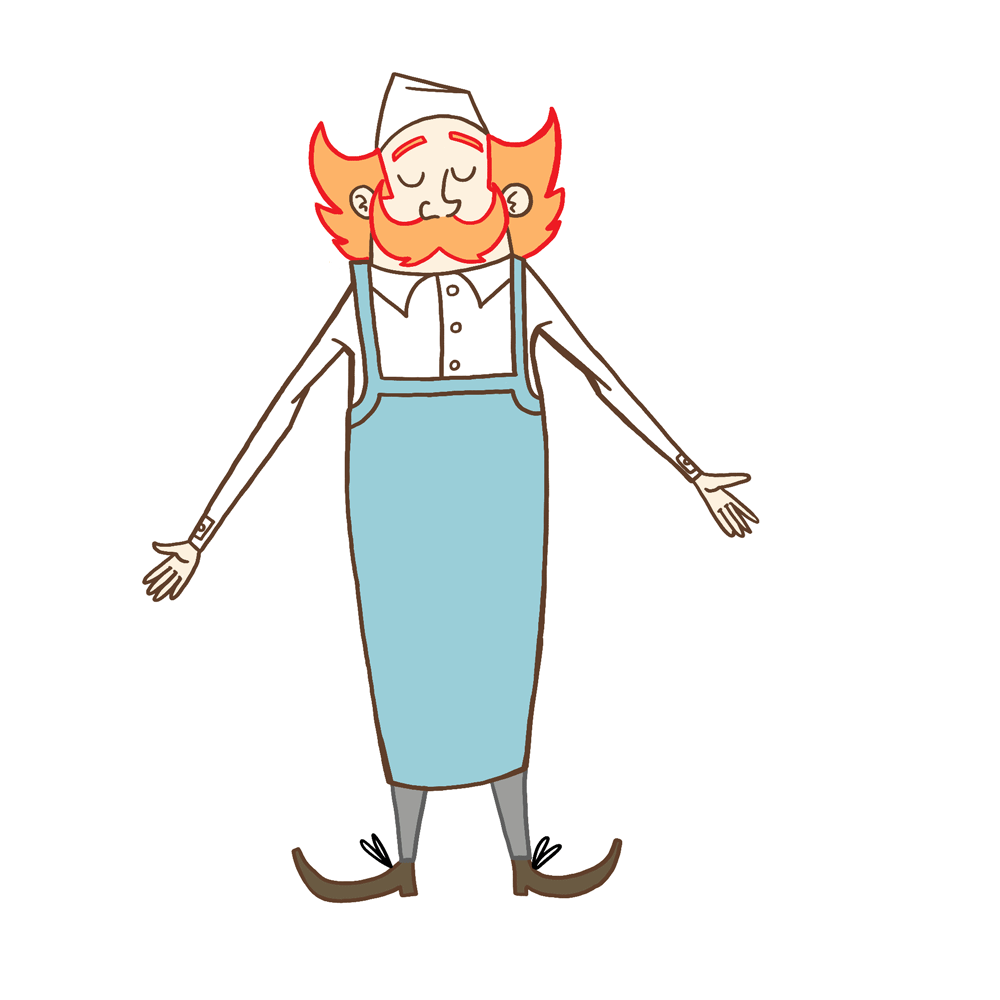
The design fundamentals for Monsieur Sausage didn't deviate too much from my initial sketches though I did experiment with different hats and aprons in order to decide what suited the design better.
My intent is to create a main character which is easy to animate and can communicate body language clearly and efficiently.
One element of Monsieur Sausage’s design which I feel most effectively communicates body language is the moustache, which acts as a sort of stand in for the character’s mouth, which is obscured by the size of the moustache, to indicate emotion. (E.g; a smile, frown etc…)
Face Sheet
The moustache also serves as point of secondary action which will emphasise movement more.
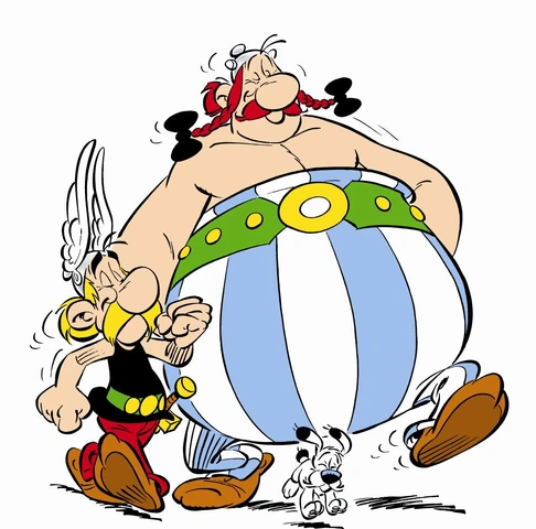
The inclusion of a moustache as one of the main focal points of the design was at least partially inspired by the characters Asterix and Obelix, themselves products of French culture.
In the beginning I was undecided on how to incorporate linework, torn between a more vector-based style and incorporating rough linework to emphasise primitive shapes. I did however, after much experimentation arrive at the conclusion that my neat linework is one of the strongest elements of my drawing practice.
In order to differentiate from my previous work and ensure a higher standard of polish I opted to colour certain lines and give character’s their own line colour motifs in order to better distinguish themselves from one another.
For example, Monsieur Sausage’s outline in the final film is brown, while the woman’s is blue, blue being the more neutral tone indicative of the power dynamic in the scene.) The final effect I feel plays to my core strengths as a character designer with its simplicity and emphasis on primitive shapes.
Character Walk Cycle
I created a test walk cycle and turnaround of Monsieur Sausage in order to get better feel for his mannerisms.
I like the idea of a character of Monsieur Sausage’s stature being very top heavy but with very thin legs, almost like a chicken, as I feel this emphasises movement a little more and is more fun to animate, as well as lending to the comedy.
One issue with the turnaround I did run into which was called into question during a group crit was the character’s apron, which I had unwittingly made tube-like, stretching all the way around Monsieur Sausage like a pair of dungarees.
I also spent a considerable amount of time developing the backgrounds for the animation as to further sell the settings. I want the layout of the scene in my animation to showcase the environment just as much as it showcases the character animation; in order to really sell the setting.
While I was in Annecy last summer I took numerous photos of architecture that could possibly serve as inspiration for the backdrop of my animation. Local landmarks such as the Church of St Maurice, which may indicate the setting are scattered around the backdrops of many pieces of concept art.
I tried to keep the colour scheme for the backgrounds to a minimum in order to not distract from the foreground action.
I drew some inspiration from children's illustrator Sara Ogilvie, particularly her book ‘Dogs Don’t Do Ballet’ which employs a similar colour scheme to backgrounds, allowing foreground figures to better stand out.
Page from Sara Ogivie's book
For the woman’s character design I looked to inspiration from classic French Cinema. The woman character in my animation is largely inspired (at least visually) by the archetype of the ‘Ingenue’ or ‘Femme Fetale’.
I looked to fashion trends in mid century French cinema in order to inform the look of my character, settling on a striped shirt motif, a staple of actresses in 20th century French cinema.
Initially, I intended to give characters a darker skin tone, however felt that for the sake of simplicity and practicality, it fit my film’s aesthetic more to leave the characters skin plain white. This served two purposes; cutting down on colouring when it comes to producing the finished animation as well as emphasizing key features of the characters design, for example; Monsieur Sausage’s moustache (important in indicating character’s body language) and the woman’s sunglasses (important in establishing to the audience the fact that the woman is blind).
As for the dog’s design, I turned to one of my mates to provide the groundwork as I have little experience in designing anthropomorphic characters. He produced a series of rough sketches for how the dog in my animation could look, testing out different breeds and drawing styles.
Initial Dog Sketches (By Daniel Goodman)
However, I instead opted for a simpler style as I felt his designs were not in keeping with the simpler style I was going for in my animation. I eventually ended up brainstorming a few ideas for how the dog could look in my sketchbook and put it down to a vote on one of the college’s communal whiteboards.
Dog character Sheet
For the design of the boy who serves as the waiter in the animation I wanted to draw from literary characters such as ‘Tiny Tim’ and ‘Oliver Twist’ to serve as the more empathetic audience stand in. It was important the character’s design to convey their backstory as a street-child in order to let the audience better empathise with them over the course of the events as they unfold.


