

Initial sketches/design ideas

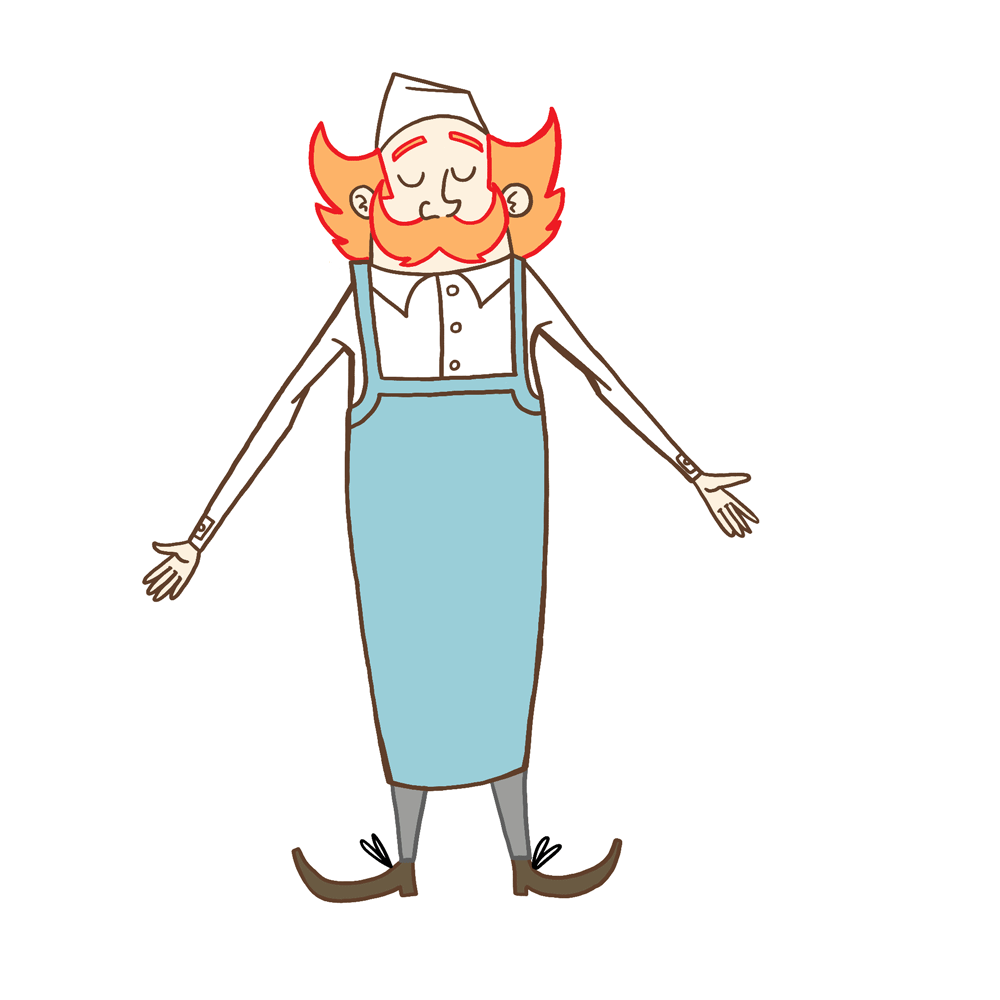
Monsieur Sausage Initial Sketches

Unnamed female character Initial Sketches
- I wanted to make sure I had a solid aesthetic foundation to build upon as I would be relying mostly on visual, no verbal storytelling to communicate my setting, story and characters.


- The design fundamentals for Monsieur Sausage didn't deviate too much from my initial sketches though I did experiment with different hats and aprons in order to decide what suited the design better.
- My intent is to create a main character which is easy to animate and can communicate body language clearly and efficiently.

- One element of Monsieur Sausage’s design which I feel most effectively communicates body language is the moustache, which acts as a sort of stand in for the character’s mouth, which is obscured by the size of the moustache, to indicate emotion. (E.g; a smile, frown etc…)

Face Sheet
- The moustache also serves as point of secondary action which will emphasise movement more.
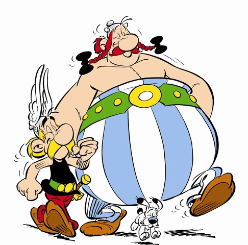
- The inclusion of a moustache as one of the main focal points of the design was at least partially inspired by the characters Asterix and Obelix, themselves products of French culture.
- In the beginning I was undecided on how to incorporate linework, torn between a more vector-based style and incorporating rough linework to emphasise primitive shapes. I did however, after much experimentation arrive at the conclusion that my neat linework is one of the strongest elements of my drawing practice.
- In order to differentiate from my previous work and ensure a higher standard of polish I opted to colour certain lines and give character’s their own line colour motifs in order to better distinguish themselves from one another.
- For example, Monsieur Sausage’s outline in the final film is brown, while the woman’s is blue, blue being the more neutral tone indicative of the power dynamic in the scene.) The final effect I feel plays to my core strengths as a character designer with its simplicity and emphasis on primitive shapes.

Character Walk Cycle
- I created a test walk cycle and turnaround of Monsieur Sausage in order to get better feel for his mannerisms.
- I like the idea of a character of Monsieur Sausage’s stature being very top heavy but with very thin legs, almost like a chicken, as I feel this emphasises movement a little more and is more fun to animate, as well as lending to the comedy.
- One issue with the turnaround I did run into which was called into question during a group crit was the character’s apron, which I had unwittingly made tube-like, stretching all the way around Monsieur Sausage like a pair of dungarees.
- I also spent a considerable amount of time developing the backgrounds for the animation as to further sell the settings. I want the layout of the scene in my animation to showcase the environment just as much as it showcases the character animation; in order to really sell the setting.

- While I was in Annecy last summer I took numerous photos of architecture that could possibly serve as inspiration for the backdrop of my animation. Local landmarks such as the Church of St Maurice, which may indicate the setting are scattered around the backdrops of many pieces of concept art.

- I tried to keep the colour scheme for the backgrounds to a minimum in order to not distract from the foreground action.
- I drew some inspiration from children's illustrator Sara Ogilvie, particularly her book ‘Dogs Don’t Do Ballet’ which employs a similar colour scheme to backgrounds, allowing foreground figures to better stand out.

Page from Sara Ogivie's book
- For the woman’s character design I looked to inspiration from classic French Cinema. The woman character in my animation is largely inspired (at least visually) by the archetype of the ‘Ingenue’ or ‘Femme Fetale’.
- I looked to fashion trends in mid century French cinema in order to inform the look of my character, settling on a striped shirt motif, a staple of actresses in 20th century French cinema.
- Initially, I intended to give characters a darker skin tone, however felt that for the sake of simplicity and practicality, it fit my film’s aesthetic more to leave the characters skin plain white. This served two purposes; cutting down on colouring when it comes to producing the finished animation as well as emphasizing key features of the characters design, for example; Monsieur Sausage’s moustache (important in indicating character’s body language) and the woman’s sunglasses (important in establishing to the audience the fact that the woman is blind).

- As for the dog’s design, I turned to one of my mates to provide the groundwork as I have little experience in designing anthropomorphic characters. He produced a series of rough sketches for how the dog in my animation could look, testing out different breeds and drawing styles.

Initial Dog Sketches (By Daniel Goodman)
- However, I instead opted for a simpler style as I felt his designs were not in keeping with the simpler style I was going for in my animation. I eventually ended up brainstorming a few ideas for how the dog could look in my sketchbook and put it down to a vote on one of the college’s communal whiteboards.

Dog character Sheet

- For the design of the boy who serves as the waiter in the animation I wanted to draw from literary characters such as ‘Tiny Tim’ and ‘Oliver Twist’ to serve as the more empathetic audience stand in. It was important the character’s design to convey their backstory as a street-child in order to let the audience better empathise with them over the course of the events as they unfold.


No comments:
Post a Comment