Monday 29 February 2016

Greenscreen Tutorial: Character Turnaround

As a part of our AV induction we were introduced to the Bluescreen. Originally we were supposed to use greenscreen for compositing our images, however as my character model is wearing green clothes, I chose a Bluescreen over a Greenscreen as to avoid any complications. When using a Bluescreen/Greenscreen it is important to make sure the lighting illuminates the background without casting any shadows. To ensure this we set up two studio lights to illuminate either side of the model and give the background as flat a colour as possible.


For the turnaround we used a piece of software called Dragonframe, often used for Stop Motion by studios such as Aardman and in feature films such as Coraline and Boxtrolls.  It allowed us to quickly take photographs using a computer hooked up to a DSLR camera without having to do it manually. The model was attached to a turntable and moved slightly each time I took a photograph. These images were then exported as a TIFF sequence and imported into After Effects as a composition.


Once I imported the TIFF sequence into After Effects I applied Keylight from the Effects Panel, applied the effect to the colour blue using the eyedropper tool and selected the Screen Matte option...


…this allowed me to view the video in Black and White. In B&W it is easier to control the threshold between what is being masked out by the Bluescreen and what isn't, allowing me to define the edges of my model.


Once my model was effectively spliced onto the Bluescreen I applied a mask around the edges to erase the stand which the character was standing on.


Once I had finished that I searched the internet for stock footage of fire so I could composite it into my turnaround. I wanted the fire to be both in the foreground and background in order to give the short turnaround a degree of depth. The fire in the foreground had to go through a similar process to the Turnaround, as the footage I was using included a greenscreen which had to be composited out. 

The result is what you see below.

Sequential Imagery: Satoshi Kon and Editing in Animation


Few directors working in Animation can boast the filmography of the late Satoshi Kon whose style of animation differed greatly from much of what came out of Japan as it dealt with more human relationships and as a result Kon gained a reputation for having a more filmic style than his contemporaries. Kon is held in high esteem for many reasons, but most notably his surreal and fast editing, which allows for his characters to transition between various states of consciousness in a simple  match cut or graphic match. 


Kon's Perfect Blue deals with an idol who decides to pursue an acting career before going through sort of crisis of self.

Kon's stories often dealt with characters undergoing various crisis of self or dealt with surrealist dream sequences and Kon liked to blur this line between reality and fantasy with his editing and fast cutting. During the storyboarding stage of production Kon has said he would always plan out a scene with the next scene in mind, allowing him to draw connections between images from scene to scene for his films to flow in a very calculated way. He would also use the medium to its fullest in ways that were impossible in live action. For example, as he was working in the field of animation a medium in which visual information can be condensed and simplified, he would often include very short inserts, approximately 6-12 frames, which would be impossible in Live Action, making his editing appear faster than anything being done in Live Action.


Storyboards for Kon's final film, a short film called 'Ohayo'.

Kon was very much a visual storyteller and could bring the audience into the mind of his characters in inventive ways, such as using an establishing shot only to reveal it was a character's Point of View with the following cut.

Sunday 28 February 2016

Character Design: The Echoes of Characters in Song of the Sea

Tom Moore's Song of The Sea is one of the most beautifully poetic 2D Animated Features to come out in a decade. Drawing heavy influence from Celtic folklore and the films of Studio Ghibli, Cartoon Saloon has crafted something really special here, more than worthy of the Best Animated Feature nomination it received at 2015's Academy Awards.


One of the most endearing and memorable aspects of the film in my opinion is the way in which character designs are echoed throughout our main character Ben's journey across the Irish countryside to return home to the sea. To understand this one must first gain an understanding of the main reading of the film, which is that a lot of the events are from our child character Ben's subjective point of view in dealing with the loss of his mother and his strained relationship with his grandmother.


Granny: Smaller beady eyes, but retains the brow and cheeks resembling an owl.


Macha: Almost the same as the Granny but with larger eyes with a yellowish tint.

Elements of the design or certain characters is reflected in the designs of other characters in Song Of The Sea, most notably the grandmother, who shares a resemblance with Macha, who acts as an antagonist in the story. Macha's design acts as a sort of bridge between the design of the Grandmother and the owls which feature in the story. Both characters retain the same silhouette, basic posture and the facial structure of both character's are almost identical save a few key differences most notably the eyes, which on the grandmother are small and beady while the eyes on the Owl-like Macha are much larger with a yellowish tint, paralleling the owls she commands to pursue Ben and his sister on their way back to the sea.  This similarity serves a thematic purpose in that both characters act as antagonists, whose goals are contrary to our main character's.

Ferry Dan: Wider, more curved beard, but retains the same facial structure.


The Great Seanachai: Longer beard and floppy moustache.

On the flip side, The Great Seanachai parallels a more friendly character, Ferry Dan, both versions of which act as a sort of bridge for our main character from the mainland to the sea, one literally, one on a more thematic level. Both characters retain similar features, such as their long white beards, but The Great Seanachai comes across, almost as a childlike exaggeration of the character of Ferry Dan with an extremely long beard that Ben uses to guide his way home. Ferry Dan doesn't get all that much play in the story, acting more as a piece of foreshadowing for The Great Seanachai and his purpose thematically, but coupled with the Macha and the Granny as well as the parallels that can be drawn between the design of the father and Mac Lir, one can discern that Song of The Sea tells an allegorical story from a deeply subjective and abstract point of view, and the character designs, through their reincorporation of elements help communicate this to the viewer to give them a deeper understanding of the story.

Thursday 25 February 2016

Sequential Imagery: Mad Max Fury Road and Point of Focus Directing

Mad Max Fury Road is a unique specimen in the realm of action movies. Built from the ground up from concept art and storyboards from renowned 2000AD artist Brendan Mccarthy, the film is very visually driven and arguably (and in my opinion) a masterpiece in the realm of visual storytelling. Director George Miller has stated in interviews that he set out to create a film where 'people wouldn't have to read the subtitles in Japan'.


Part of what makes the film so easy to follow compared to other action films is the way it directs the viewer. Every camera angle, camera movement and compositional decision made on the part of director George Miller is made with the purpose of directing the viewer's line of vision to the action on screen. The point of focus in a scene, 90% of the time is the centre of frame during the action scenes in Fury Road. This means the viewer doesn't have to adjust their focus on the frame, making for a more coherent scene. For example, in the scene where Max confronts Furiosa, the camera remains centred on the punches that are thrown and the points of movement on screen. This allows for the editor to make lots of different cuts to different camera angles to suit the pace/ flow of the scene without losing the attention of the viewer. This technique is a welcome change from the usual way Hollywood directors approach these close quarters skirmishes between characters, without the close up shaky cam that usually burdens the viewers experience with it's incoherency.


This point of focus directing is not only limited to static scenes however. Much of the film takes place on the move in extended car chases with hundreds of cars moving across the Namibian desert in pursuit of Furiosa's war rig, so to keep the action chase sequences coherent Miller incorporates this point of focus directing. For example, cuts between shots of vehicles moving almost always follow a single movement across the screen. This means a movement in one shot carries over to the next in subtle ways in a way that is coherent to the viewer. The point of focus in one shot is often the focal point for a movement in the following shot. An example of this would be when Max shoots out the window at a motorcyclist mid jump. The point of focus in the first shot is the end of Max's gun while the focal point of the following shot, where the motorcycle is in mid air above the war rig, is the starting point for the next motion, linking the two cuts together while creating a straightforward motion that is coherent to the viewer.


Character Design: The Characters of Inside Out

Pixar are renowned for their character designs. Unlike most other large animation studios, a lot of their human characters resemble real human beings with physical flaws and imperfections that move and behave realistically. While this is still true with the human characters of Inside Out, the characters which represent the emotions of our main character Riley are extremely simplified and exaggerated design-wise compared to their other Pixar counterparts.


Joy, Anger, Sadness, Fear and Disgust make up the main cast of Riley's brain and are in charge of her emotions. Each represents a different emotion, with a design and colour scheme that reflects this colour. For example, the character of Anger is short and stocky with a distinctive brow which highlights the eyes which are the primary way of conveying emotion for this character. The silhouette of the character is also made up of sharp angles, in stark contrast to the character of Joy, who the animators purposefully made have no right angles to express her more upbeat, happy personality. Joy's colours are also yellow and blue, with a constant blue glowing aura, which when combined give off happy connotations suggesting a bubbly personality, whereas Anger is a deep red, which combined with his design creates a angry, threatening aura.


This stylisation extends beyond the design of the characters to the movement of the characters. Inside Out's characters follows more of the conventions of tradition 2D animation, such as the work of animators such as Chuck Jones. The proportion of characters squash and stretch, more reminiscent of classic Looney Tunes characters than the more conventional techniques used in 3D animation and exaggerated gestures are punctuated with follow through and overlapping actions. The result is an aesthetic that is less realistic, more in keeping with a cartoon, but thematically appropriate.

Character Design: Venom Snake


The Metal Gear Solid series has a colourful cast of characters to say the least, but in my opinion no design comes close to Venom Snake. MGSV's Venom Snake is a reconstructed battlefield medic, moulded and manipulated to be the doppelgänger of series hero/antagonist, the legendary mercenary/ war criminal Big Boss. The series deals with a lot of heavy themes regarding the ethics of war, the nature of self and characters grappling with internal conflicts, leaving a lot which can be communicated visually.


Venom's design is a great example of visual storytelling through the design of a character.  Concept Artist Yoji Shinkawa has a real knack for tying the aesthetic of a character to their inner struggles and the overarching themes of the story they inhabit. Venom's horn, a piece of shrapnel wedged in the forehead of the character, serves a dual purpose. It is placed there to symbolise the character's fractured psyche and transformation into a 'demon' as they become more and more morally corrupted in the pursuit of revenge, as well as to symbolise the burden the character carries of his dead comrades. In fact it is stated in the game that the shrapnel is made up of hundreds of individual bone fragments, most likely from the character of Paz from Phantom Pain, whom Venom, as the Medic in Ground Zeroes, failed to save and is haunted by throughout the game.


Concepts such as anger and revenge are further highlighted in the colours incorporated into Venom's design thorough the colour red, which is prominent in the colour of his prosthetic arm and the blood which is splattered on him throughout the game.


Venom's status as a doppelgänger of Big Boss, while not explicitly stated until the end of the game, is hinted at several times, though there are clues in his design, such as the scars down the side of the characters' face which suggest facial reconstruction. Props are also used to hint towards this revelation ahead of time, for example the character's E-cigarette, an impersonation which, as the real Big Boss in the game states 'is not as good as the real thing'. This is a subtle and neat little way of conveying the true nature of the character discreetly without explicitly stating it to audience, allowing them to speculate and figure it out for themselves.

Character Design: Tank Girl and the works of Jamie Hewlett

One of the illustrators I base my own style of drawing off is Jamie Hewlett, the creator of Tank Girl, whose career spans almost three decades and a variety of different styles. Hewlett's designs from the Tank Girl comics served as the primary inspiration for my character in the character design brief in this module.

Tank Girl is the product of early 90s counterculture, rooted in the art of punk fanzines as well as anarchic and psychedelic imagery. The comics take place in a hyper-stylized post-apocalyptic Australia and follows the eponymous character of Tank Girl and her boyfriend Booga, who is a mutant kangaroo, as they outrun a multimillion dollar bounty. The narrative of these comics is sparse and often meandering to make room for the stylised trappings and psychedelic imagery.


Tank Girl's design relies heavily on intricate linework with high contrasting shadows and a lot of variation between thick and thin lines as well as washed out colours and combination of different media such as cut-outs and collage. Her aesthetic draws from a lot of the popular feminist/punk figures at the time, with her shaved head, dyed hair and disregard for traditional 'womanly values' which was reflective of the time, which was seeing an influx of sexually liberated female popular figures.  At the peak of her popularity Tank Girl became a sort of feminist icon, her character indulging in the sorts of sex, drugs and anti social behaviour that was relatively new to comics and much of pop culture at the time.


Tank Girls design spans a variety of different outfits, each with their own theme, each anything from generic. A lot of the comic is influenced by early 90s British pop culture, hence the tinted glasses, leather jackets, punk getup etc, but Hewlett gives them his own apocalyptic spin, often incorporating found objects and military hardware. Her design, while obviously heavily stylised, resembles that of  a real person with fairly realistic proportions and while the character is often sexualised, she is in control of her own sexuality and empowered by the illustrators restraint in depicting her through the male gaze.

Captain Character: Expression Sheet

After evaluating my previous expression sheet I decided to go back to the drawing board and redraw some of my facial expressions by hand. My previous sheet was developed digitally using a template from one of my previous drawings and as a result led to flat, robotic looking images. I scanned in sketchbook page of facial expressions and put them together into a formal model sheet in photoshop, where I coloured them and refined the line work. 


My final expression sheet addresses some of the issues I had with my previous expression sheet, namely the robotic nature of the expressions which was a direct result of using a single head as a template for the rest of my expressions. Here I tried to amend that by working on each individual head from scratch and using subtle gestures, such as a slight head tilt to compliment the facial expressions. The facial expressions themselves in this final model sheet are more exaggerated than in my previous sheet with more expressive eyebrows and a larger mouth. I simplified the design slightly also, giving the head a more angular design and a simplified hairstyle. Colour was also applied to give the expressions more polish and keep it constant with my other model sheets.

Set, Series Sequence: 24 drawings of cars

For this studio brief we were tasked with producing, using an array of different physical media, 24 drawings based around a word given to us at random out of a hat. According to the brief, these drawings should be a quick response, though not rushed, to the word in question. Once we have produced the 24 drawings we are to choose what we feel is the most successful one and produce a further 12 drawings to develop the concept of said drawing even further. These will then be adapted into a short 6-12 frame storyboard for the final part of the task. 

The word I was given was... car.


1)

Time Taken: Roughly 5 mins
 Media: Fineliner Pen/Coloured Pen

To start off with this first drawing was created using fineliner and red coloured pen, media I am comfortable with, and depicts a family sedan covered in blood. From this you can infer that some sort of horrible accident has happened, judging by the trail of blood left behind. For authenticity I provided the added touch of blood up the side windows, as that is the trajectory it would have been travelling. This relates to the word 'car' thorough associated concepts such as road-rage and reckless driving.


2)

Time Taken: 20 mins
Media: Fineliner Pen

For this drawing of the Deloreon from Back to The Future, I took a more technical approach and experimented a little with the perspective. I refrained from using a ruler but tried by best to capture the famous vehicle from on overhead perspective using images from the internet for reference. While I am happy with the body of the vehicle, the wheels, I believe are not consistent with the perspective of the rest of the vehicle. I also botched the pattern of the tires, which look more like rope than rubber tires, something I seek to amend in future drawings.


3)

Time Taken: >5 mins
Media: Fineliner Pen

Here is a quick profile-view drawing of a car I did in fineliner, purely from imagination. While the design is generally uninspiring, I feel it is important I get into the habit of nailing the basic shape of your average car from memory. 


4)

Time Taken: Roughly 20 mins
Media: Fineliner Pen

Here I wanted to reflect the personalities of the drivers in the designs of the cars to a comical and exaggerated degree, hence I decided to give this old rover a bowler hat and moustache. The parallels the archetypical Rover driver, a well groomed, formal type of gentleman from a very specific time period. I made this decision to anthropomorphize the car as the front looks somewhat like a human face. With the pen work I gave the outline a slightly thicker brush stroke in order to reinforce the shape of the car from the perspective I was drawing it form. Old Rovers have a very elegant curved shape, which I thought was important to get across as it is essential to the personality of the car.

5)

Time Taken: Roughly 10 mins
Media: Fineliner Pen

Here I decided on a simple 2/3 view of the car in order to add variety to the perspectives of my drawings. The design of the car itself is a simple, 50s inspired modernist design, going by the style of the body at the back. I gave the car thicker line work around the outside in order to define the shape and simple crosshatching on the windows to add a little texture to differentiate the windows from the body of the car.


6)

Time Taken: 10-15 mins
Media: Fineliner Pen

For this drawing I assembled a car out of numerous musical instruments to create a sort of on-man-band style design. Small things such as the exhaust ports being the pipes of an organ and the horn being a trumpet ensured that each design decision was motivated in some way by the idea of a car as a sort of one-car-band. 


7)

Time Taken: 30 mins
Media: Fineliner Pen

For this drawing I was inspired heavily by Brendan Mccarthy's designs for the cars in Mad Max: Fury road. The design is basically that of an old run down sedan but with objects attached to it in order to survive the post apocalypse. I wanted the design to be anarchic and cluttered in order to reflect Mccarthy's work, but at the same time give some logical reasoning behind the aesthetic decisions. Mcarthy's designs often have some sort of intention behind them, constructed from used parts and objects that tell stories about the world they occupy. I attempted this by incorporating a police riot shield with bullet holes in it chained to the windshield to protect the driver as this subtly conveys the backstory of the world through visual aesthetic. 


8)

Time Taken: >5 mins
Media: Fineliner Pen

A simple monster truck design with flames on the side transporting cargo which is tied down in the back. Not the most exciting design, but important in forming the basis for my next design...


9)

Time Taken: Roughly 20 mins
Media: Watercolour Paint

For this design I ventured into watercolour, trying to capture the texture of mud splattered up the side of a monster truck as it ascends a steep incline. I made sure the direction of the mud up the body of the truck is consistent with the direction the wheels are turning and with the direction the mud is being splattered. The narrative aim of this drawing was to convey that the truck was having trouble traversing the steep incline, which I believe it effectively conveys.


10)

Time Taken: Roughly 10 mins
Media: Red (Pink) Ink and Fineliner Pen

To change things up a bit I broke out the ink brushes to colour a simple profile fine liner drawing of a ferrari. While the ink I used was supposed to be Red, I did not apply enough of it, so when the time came to scan it into the computer the ink had faded, leaving me with this garish pink colour.


11)

Time Taken: Roughly 10 mins
Media: Watercolour Paint and Fineliner Pen

Another profile view of the rover design I drew earlier, minus the moustache and bowler hat. The intention here was to use green watercolour to give the illusion of a shiny finish to the body of the car, though I can harpy say I was successful in  doing this. The overall effect looks like something out of a hippy's wardrobe, a sort of tie-dye finish that is miles from the intended outcome. Next time in seeking to achieve this effect I will apply more paint with a different brush, more evenly distributed in order to achieve the indented effect.


12)

Time Taken: 5 mins
Media: Fineliner Pen

Going back to basics, here I went back to using simple fine liners on a smaller scale to depict a helmeted figure riding in a go-kart. I didn't want to overcomplicate the design, hence why the character has no discernible features besides the helmet. In a way this was kind of inspired by small lego men with their simple primitive shapes. The hands even resemble that of a small lego man, as I could not be bothered with drawing the individual fingers. 


13)

Time Taken: 25-30 mins
Media: Fineliner Pen

At the complete opposite end of the spectrum aesthetically I drew a giant bipedal car mech, inspired primarily by Metal Gear Rex from the video game series Metal Gear solid. I wanted to incorporate as many car parts and vehicular iconography as possible in order to differentiate it enough from the design that inspired it. The radome, a staple of Rex's design, is here replaced with a car tyre. I also gave my design a robotic arm similar to that of factory robots, specifically those which build car parts.


14)

Time Taken: 5 mins
Media: Graphite Pencil

For this design I used only pencil to draw a car design from imagination. The overall design of the car falls flat in my opinion due to lack of shading or gradient.  


15)

Time Taken: Roughly 10 mins
Media: Fineliner Pen

For this drawing I strayed away from simply drawing cars and decided to branch out the concept. Here I tried to depict road rage by drawing a character sticking their middle finger out of a car window at supposed passers by.


16)

Time Taken: Roughly 10 mins
Media: Watercolour Paint and Fineliner Pen

For this drawing I decided to think outside the box and explore ideas that revolve around cars but do not explicitly feature cars. The idea behind this drawing was 'invisible cars' and is inspired partially by old Wonder Woman comics where she would drive an invisible car. Personally I can see the absurdity of this drawing being a great fit for a storyboard or short narrative piece of animation.


17)

Time Taken: Roughly 10 mins
Media: Watercolour Paint and Fineliner Pen

Speaking of absurdity, for this drawing I decided to take the concept of a clown car and apply it to everyday commuters. This again, is a concept I can see myself exploring in greater detail in a storyboard or animation. 


18)

Time Taken: 10-15 mins
Media: Fineliner Pen

For this drawing I revisited a concept I explored a few drawings ago but at a completely different end of the spectrum. Often fast sports cars are associated with a certain lifestyle, that of the swaggering young adult who wears sports caps and fake plastic glasses at warehouse raves. 


19)

Time Taken: 15 mins
Media: Fineliner Pen

Another car drawing inspired by Brendan Mccarthy's revisualisations for Mad Max, this time from a front on perspective. Compared to other drawings of this style, this one is fairly simplistic though I think  on a technical level it captures the perspective view fairly well. 


20) 

Time Taken: >5 mins
Media: Fineliner Pen

A a quick profile shot of a car with a retrofuturist aesthetic in fine liner. The lines on this one are a little rough resulting in a drawing that looks somewhat amateurish.


21) 

Time Taken: 5 mins
Media: Fineliner Pen

For this drawing I further explored some of the concepts up until this point and combined the 'road rage' idea with the 'invisible car' idea. Upon reflection, these ideas seem to be a perfect fit for the 12 images and storyboard, so I will most likely be exploring these ideas further in the future. 


22) 

Time Taken: >5 mins
Media: Fineliner Pen

A quick fine liner drawing of a bumper car/ dodgem. A simple design, but I feel the perspective was effectively captured and that the outline gives the drawing depth.


23) 

Time Taken: >5 mins
Media: Fineliner Pen

A quick fine liner drawing of two people, both riding in bumper cars crashing into each other. The character designs are purposely simplistic, and the designs of the bumper cars are based off my previous design with the lighting bolt down the side of the door.


24) 

Time Taken: >5 mins
Media: Fineliner Pen

A quick profile shot of a car with a wooly hat drawn in fine liner. This further explores the concepts made apparent in previous drawings of personifying cars with human characteristics and clothing.

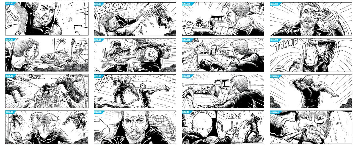
Of these 24 images, the ones I wish to further explore in my upcoming 12 images are numbers 16 and 17 as I feel the absurdity of the imagery has the most potential for a storyboard. For my upcoming 12 images I will try and explore a wider array of media, as I tended to stray a little too close to my comfort zone for these 24 responses. I will also try and incorporate colour more often as that is an often neglected aspect of my work I feel I can improve on.

Final Turnaround

After evaluating my previous turnaround I decided to redo the in-betweens using animation paper, as the quality of the in-betweens when I produced my turnaround digitally suffered due to the lower resolution in which I drew them. As I drew them in photoshop, the images could not be scaled as they were drawn usig bitmaps as opposed to vectors, which would have allowed the drawings to be scaled to the desired resolution. This was an error on my part and something I will make note of in my evaluation at the end of the project. 


My final turnaround displayed above fixes some of the problems regarding image quality and continuity that I had with my previous turnaround, but some issues still apply. The proportions of the character are still all over the place and the overall motion, due to poor planning on my behalf, is jerky and inconsistent. While I do not have time to redo the turnaround for a third time I feel it is important to highlight where I went wrong and what could be done in the future to amend some of these problems. For starters, when producing any kind of animation, though particularly traditional 2D animation, it helps to plan ahead of time using a timeline where the keyframes are to be positioned and how many in-betweens are to be used in-between the keyframes. In this turnaround, which as stated in the brief had to include at least 12 drawings, I drew 4 keyframes to use as a starting point which leaves me with two frames in-between each keyframe within which to animate. The problem is that I did not evenly space these out in the drawing process, resulting in a  jerky looking motion. 

As it stands now, while certainly an improvement over my previous turnaround, there is still room for me to grow and expand my skills as a 2D traditional animator.

Wednesday 17 February 2016

Amendments to Turnaround

After assessing the quality of my turnaround I have decided to re-draw the in-betweens for my turnaround. The four key poses, front view, back view and the two profile views, will be retained and used as a starting point for another turnaround which will be produced without the aid of digital media, using a Lightbox and animation paper. I have come to this conclusion to ensure each of the individual drawings in my turnaround is of substantial quality, as well as a way to branch out into unfamiliar territory. Usually with my animation I rely on digital media to assist me on in-betweens, so by removing that crutch I feel I am taking a risk which will hopefully pay off.


(First attempt at a Turnaround)

The final turnaround will hopefully be of a higher quality as I have identified what was wrong with my previous turnaround. Simple mistakes such as the lips disappearing should be amended, as well as larger issues, such as the proportional inconsistency should also be remedied through more experience and practice.