Storyboards
This week we created the storyboards for our animation. I was given two scenes to storyboard; the park scene and the final scene of the animation. I used blue and red colours to differentiate between the characters and the backgrounds/environments, which is useful when it comes to creating the final assets for the animation, as well as for the animatic.
Park Scene
In the script, the scene in the park is relatively short, consisting of a single wide master shot of Keith sitting on a park bench addressing the camera while ignoring a homeless person lugging a comically oversized bag to the edge of the frame. One of the rules of visual comedy I have picked up on is that physical comedy is best accommodated when played out in a wide master shot; a technique used by many physical comedians in the Silent Film era, such as Buster Keaton and Charlie Chaplin. There is an interesting video essay on the subject in Director Edgar Wrights work by Tony Zhou from every frame a painting (see below) which served as a great reference for staging visual comedy.
Every Frame a Painting: How to do Visual Comedy
Keith Addresses the camera as he attempts to wrap up his documentary
The final scene proved difficult to Storyboard, as in the script it is outlined as a single continuous shot in which the cameraman pivots in the scene, which is hard to achieve when not working in 3D space. As a work-around, in order to transition between these two perspective changes, the cameraman pans the camera towards his feet briefly before tilting the camera back up to a different angle.
Keith is surrounded by passers by
For the final scene I boarded, the main character of Keith goes on a ranting monologue at the crowd which has gathered around him, During his outburst, as outlined in the script, the comments of various internet commenters begin appearing on the screen, as the fourth wall is shattered and the fabric of the documentary begins to crumble. I plan on elaborating on the details of this aspect of the scene in an animatic, as I feel in it's current form, it's unclear to anyone who hasn't already read the script. I also plan on incorporating more key poses in the final animatic, in order to emphasise character through body language and posture. I will make sure to record temporary dialogue in the future to use as reference for the pacing of the character's key poses.
Keith rants at a crowd of onlookers
Keith walks off into the sunset, flipping off a homeless person
Background Reference
Before creating the background I went on a location scout to find suitable photographs to use as reference for creating the backgrounds in our animation. Referring to the storyboards I made a list of shots I needed for the animation and went around Leeds one afternoon to try and cover as much ground as I could, starting off in Hyde Park before walking down towards the city centre.
Hyde Park, Leeds
Leeds City Centre
Leeds High Street
After taking some reference photographs of Hyde Park, I decided to take elements from my reference imagery and created a quick background in Photoshop. I used the eyedropper tool to extract colour from my reference photographs in order to make the backgrounds look damp and overcast; with dull muddied colours. However after feedback from the group we decided a more scrappy-style was needed in order to allow the characters to properly stand out in the frame. There was also the issue of time, as it would have proved time consuming to produce around a dozen of these backgrounds to a more polished standard in the time we have left. Instead, Tess and Brogan have opted to use my photographs as reference for monoprint, which they will then composite with my original photographs in photoshop to create the backgrounds.
This week we prepared for our Group presentation where we would be presenting all of the work we have done on the project so far while outlining what we have left to do and gathering feedback from our peers as to how we can improve our work. While most of the feedback we received from the crit was positive, we didn't do the best job at explaining what our animation was about, with some people confused as to whether it was a documentary at all, There was also some criticism as to how much work we have done so far, as we've all been working on other modules as of late and left applied on the backburner while we try and complete those tasks. Much of the class was already at the animatic stage and we haven't even started on the finalised storyboards yet, which I put down to poor planning on our part. We had wanted to get started on the animatic by this point in the project, however we recently became bogged down in writing the script and just haven't had the time.
One key area of concern which came up during the presentation was the length of the animation. During the presentation we ran through our script on a scene by scene basis, which led to some of our peers, including our tutor, to question whether our animation will exceed the 2-3 minute mark, casting doubt that if that is the case we will even get it finished in time for the deadline. After reflecting on the script after the crit, we decided we needed to cut out some of the scenes so we don't surpass the 2-3 minute mark in our animation, and tweaked the script, cutting out some of the transition shots and longer narrator monologues.
Finalising the Script
This week, after taking into account feedback from the crit, we finished the script for our animation and began allocating sections of the script through colour coding to storyboard between the three of us. We each have around roughly a third of the script to create storyboards from over the next week. I have been tasked with storyboarding the final scene in the animation, which is the longest uninterrupted shot, so careful consideration must be taken when boarding the shots as to ensure it is doable.
Writing the Script
This week we wrote the bulk of the script for the animation. We went through a few drafts, passing it on to each other to update and rewrite until we were happy with it. Tess wrote the first draft of the script, crudely arranging the quotes we printed off in a coherent manner on a piece of paper then writing it up on the computer, before passing it on to me and Brogan. We then sat down and rewrote large portions of the non-dialogue parts together. It was important the script adhere to the conventions of scriptwriting, so while writing it I referred back to Charlie Kaufman's Eternal Sunshine of the Spotless Mind script. While our animation tonally has little in common with this script, Kaufman packs his scripts with a good amount of detail when setting a scene or describing a characters motivation, which I feel is important for the purpose of what we're doing, as our idea is not easily explained and we want audiences to get the point we're trying to make the first time they watch our animation. Its also handy to have a professional script on hand to know how to structure your script.
While Tess' script did have a coherent structure and implemented the dialogue very effectively, me and Brogan both agreed tonally it was a bit all over the place in regards to the narration and direction. So we made a few minor changes to the narration and the way in which scenarios play out to reflect a more dry humour sensibility. We rewatched some episodes of The Office as research for this, identifying how the direction captures the mundanity, arrogance and awkwardness of its cast of characters in a sort of understated fly-on-the-wall way. Another thing we identified from watching the office was the way in which the cameraman is sort of a character in and of himself, with his placement in the scene and the things he chooses to look at adding another subtle layer of comedy to the proceedings.
We also looked at examples of comedic character's as the centre of a mockumentary, such as Alan Partridge and Philomena Cunk. As for the narration, we made the decision to play the voice straight, without making any quips or jokes, as we wanted Keith to be the centre and focus of the comedy. Secondary characters also were written a little more straight-man-ish, as a way of placing greater emphasis on the absurdity of Keith as a character. This is a comedic technique thats been implemented in Philomena Cunk's documentary segments, so we're hoping to emulate that sort of style.
This week we had a group crit, where we showcased the work we had done so far and garnered feedback from our peers on other courses. As a group we complied all of the work we had done so far, including the edited audio clips, which we later showed during the crit. Most of the feedback we received was positive. We made sure to show each other's work alongside one another, to show how the styles, while different, still work together as a single brand due to their adherence to a lot of the same design principles and colour schemes as well as each style's relation to the subject.
Molly's character design takes a lot of visual cues from Bryan Lee O'Maley's Scott Pilgrim comics, and uses the reds and blues outlined in the brand guidelines. Molly chose this style in reference to Luke's interview where he compared planning how he approaches social interaction to planning a route in a video game, as O'Maley's style pays homage to that sort of video game culture.
Jay's style is reminiscent of Jaqueline Wilson and children's storybook styles, with emphasis on textured, child-like line work and more secondary colours. Jay chose this style as it has nostalgic connotations and her animation is designed to play out as memories in photographs on a wall which the camera pans along.
Our peers seemed to get what we were going for in regards to the branding and the social-media route we took in creating our own short animated documentaries with distinct styles rather than one large collaborative one. Most of the critical feedback we received was in regards to small continuity errors, such as in the screenshot below where there is a reflection of a window in the bubble on the side facing away from the moon, the prominent light source in the scene. There were also a few people who felt the Podington Bear track playing in the background of the audio clip was perhaps a little too loud and could be mixed a little better, which I suspect may have been due to my computer speakers being sub-par rather than the actual sound mixing.
I showcased some of the backgrounds I had been working on separate from the animation in order to get opinions on the background aesthetic, which I have been developing over the past week or so to include more moving parts (clouds, birds, water etc...), in order to make the scene more dynamic. My peers during the crit gave me advice as to how I should approach the animation, but for the most part everyone was on the same page and agreed that using a combination of Photoshop (for the asset creation/frame-by-frame animation) and After Effects (for compositing) was the best way to approach for the aesthetic I was going for.
Overall we all agree we found the crit insightful, highlighting a few small changes, but essentially reaffirming we're on the right track with this project. Moving forward, with the majority of the backgrounds now done, I just have to continue working on the character animation and compositing of the scenes in After Effects, which I am on track for finishing on time.
Selecting quotes and arranging the Script
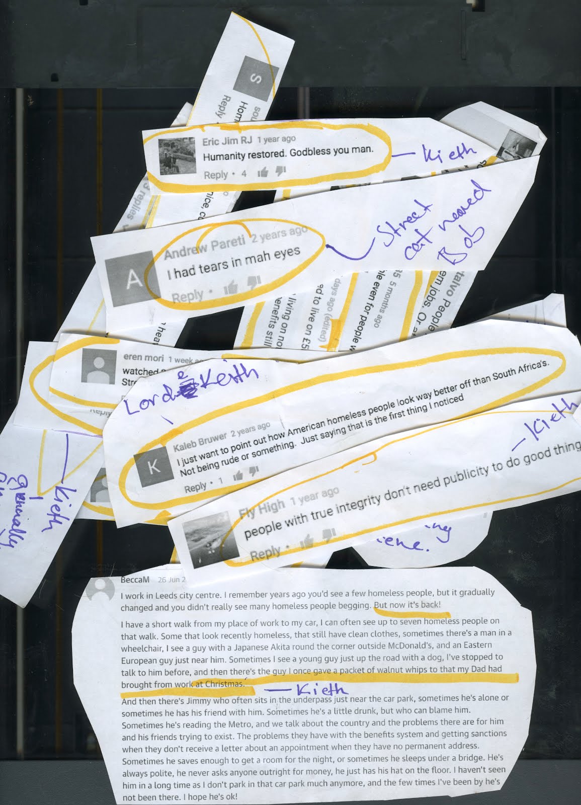
This week we started arranging the quotes we gathered off the internet into something resembling a script. This was a much harder process than we had anticipated, as we had to construct a loose plot structure with a definable lead character from a selection of quotes, which would work in a documentary format. We printed out each of the quotes and began circling parts we felt could be use for our animation while discussing scenarios we could construct around them so that they'd make sense in the context of our mockumentary.
For example, a comment such as 'theres one thing worse than having 'no where to live' in Bradford and that's having to live in Bradford' would fit the profile of the character of Keith fairly well, as we could imagine him making such a comment flippantly while addressing the camera. We tried to highlight as many sentences and phrases as we could. As the point of Keith as a character is for him to represent the embodiment of ignorant, bigoted internet comments, we're writing the script so that its is only Keith's dialogue which is taken from these internet comments, as to really hammer the point of our mockumentary home. Secondary characters and the narrator will have their own written dialogue, but as Keith is the star and thus the point of our documentary, we're trying to keep secondary characters to a minimum. Luckily this focus on Keith exclusively also plays to the personality of the character himself, as in universe he is narcissistically making this documentary about homelessness in order to shine a positive light on himself as a humanitarian.
Style Tests
(This test footage I filmed on my camera follows one of the thumbnail storyboards we came up with earlier in the project.)
Having taken some reference photographs last week, this week I produced a background test in order to test out the potential styles of our final animation. Wanting to experiment with more hybrid forms of animation I am very much fond of the idea of using fully live action backgrounds, so I took some reference video this week around the streets near my house to get a feel for how that might look. However, once I looked back over the footage I decided the footage I took was much too shaky to use and if we are to move forward with this we should use a stabiliser of some sort and a DSLR camera to ensure the highest level of quality and the lowest amount of camera shake, as that makes it more difficult to track the 2D assets (the characters) to the backgrounds in After Effects.
I also produced a style test using some of the pictures I took the other week, one of Tess' character concepts and a ton of Photoshop filters. For this concept I drew inspiration from the faded, printed look of skyline towards the beginning of The Beatles Yellow Submarine music video. I tried emulating this film-like aesthetic in Photoshop by adjusting the levels and colour saturation in Photoshop, then applying a fair amount of filmic grain and a slight amount of wear and dust scratches to the image to get that used look. If we do end up going with Live Action Backgrounds we will probably apply a similar process to the footage in After Effects to age it, or possibly rotoscope it akin to 'When the Day Breaks.'
After the recording process we had roughly an hour of audio to work with for our animated documentaries. Split between the three of us, we each have around 40 seconds to work with, totalling in at around 2 minutes, the maximum amount of time allowed by the D&AD brief.
I decided I was going to use Alex's conversation as I felt it dealt with a lot of interesting motifs and imagery and that her general tone suited the format and aesthetic I was aspiring to fairly well. I imported the WAV file into Premier and started by cutting out all the filled pauses, stutter and questions in order to condense the sound clip down as much as possible. This totalled in at around 5 minutes. While editing, I rewatched parts of 'Innerviews' to get a feel for how the conversation should be arranged into a monologue, paying specific attention to the space in between sentences, making judgements as to how long a line of dialogue should be given to breathe in order to set a consistent pace.
I eventually settled on a few little snippets which I arranged in an order I felt told a sort of visual story...
'Some days it feels like you're speaking an entirely different language that other people don't understand or that y'know other people have a different language that I don't understand so...'
'Its kind of like being in your own bubble sometimes that people can't get into and you can't get out of'
'I quite like my own space, I like being alone, like its nice to know other people are there if you need them but I am someone who spends a lot of time on their own'
'It is like being on a different planet'
To lend to the calm and ethereal tone of Alex's voice I also searched for some royalty-free music licensed under creative commons to go alongside the audio clip. After searching the Free Music Archive for a while I came across an ambient artist called Podington Bear and his track 'Sad Cyclops' which I felt had a beautifully ethereal tone which fit perfectly.
Podington Bear: Sad Cyclops
Lastly, before starting production I emailed Alex to show her what we had done so far and to garner any feedback she might have. It was important to me that she be happy with the depiction, as discussing ones experiences with aspergers syndrome is a deeply personal thing to do and implies a certain level of trust in the filmmaker that they will do your testimony justice. Luckily her feedback was positive, which gave us the go ahead to properly start production.
Developing Ideas
When making an animated documentary based of the fairly personal conversations of a real person, one must consider how said person should be depicted in the documentary itself, whether the caricature should reflect the real life counterpart or be an entirely original creation. I chose to meet somewhere in the middle on this, basing elements of the character design off some of real-life Alex's attributes, but with subtle changes for the sake of privacy and artistic liberty.
Initial Ideas
My interpretation of Alex for the sake of this animation is very much based off how she comes across in the audio recordings, quiet, reserved, yet confidently cool. I was conscious not to make my character too child-like by giving them a large head, as Alex is at University and probably would prefer to be depicted as such. Theres also the fact the brief requires us to focus on Autism in adults for this stage of the campaign, so to counteract this I made the character a little lankier, while still retaining the large-ish, circular head. I tried to build the character's silhouette from primitives as much as possible, with either smooth or sharp edges.
Sketchbook poses
While developing the character's design I was also considering the aesthetic I would be using for the animation. I was torn between using a vector style and a style with prominent linework. However, in my experience, styles with more emphasis on primitive shapes tend to be served better by a style which emphasizes this characteristic.
Early character concepts
I created some character lineups to compare styles and designs against one another, gradually developing my design until it resembled something I was happy with. I settled on a primary colour scheme of blues and red, as they contrast really nicely, I felt, with the colour purple which I was planning on using for the background; as a group we decided fairly early on we would try stick to the colour scheme outlined in the brief's brand guidelines as closely as possible.
Final Character Lineup
I gave the character a few accessories, such as a messenger bag and a pair of headphones in reference to the real-life Alex, who showed up on the day of the interview with a messenger bag and pair of headphones around her neck. She also made clear her love of music in parts of the interview which sadly had to be cut due to time restraints, however a way around this I felt would be to show this aspect of her character visually in the design.
Concept Art
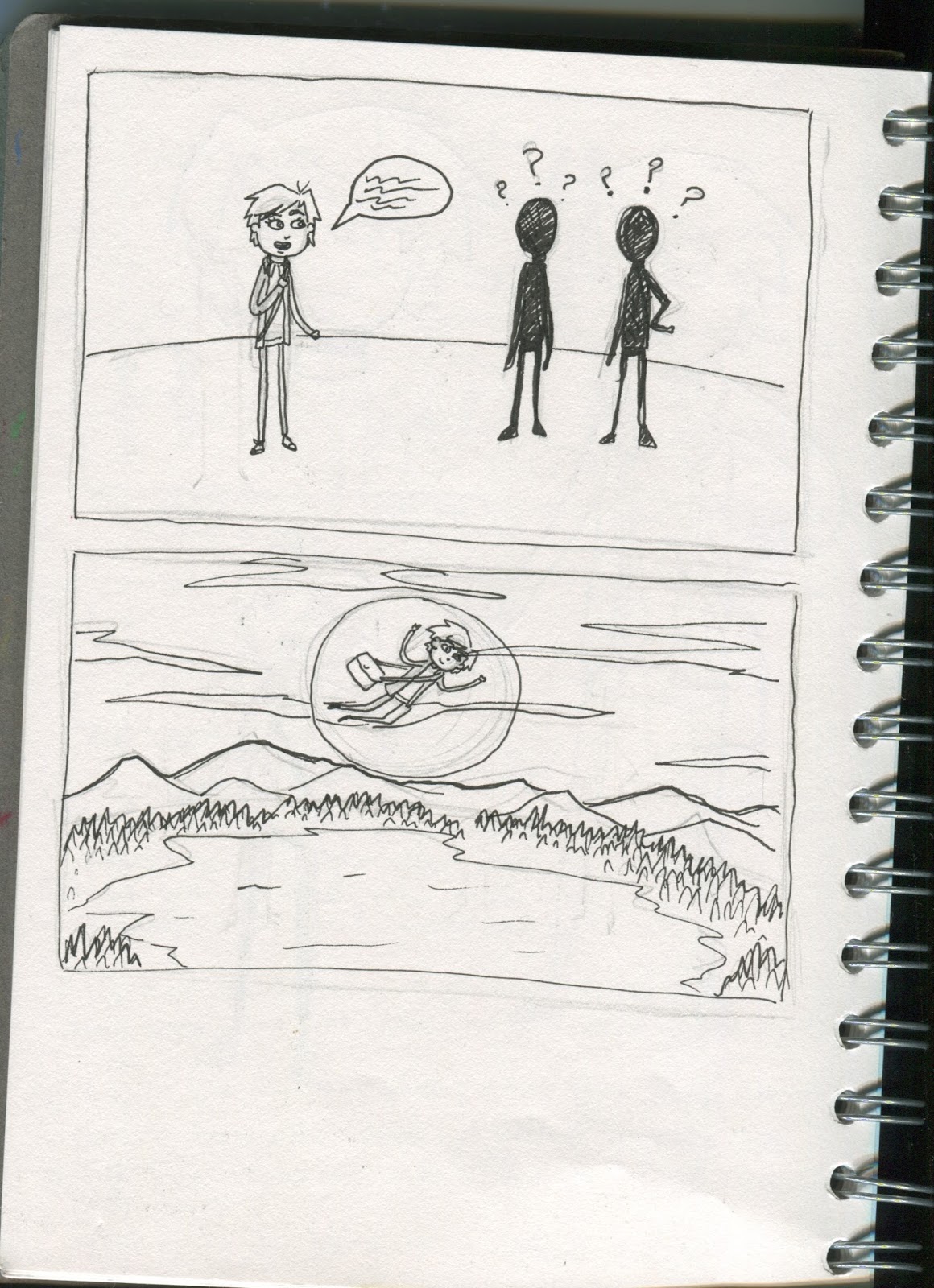
Next up, before starting on any storyboards, I drew up some concept art of visuals which I could use in the animation. Listening to the edited sound clip over and over again to get a feel for the mise en scene of this world. One moment which really stood out to me was the line comparing having aspergers syndrome to being on a different planet, which for me immediately conjured up imagery of a silhouetted figure standing on a grassy ball adrift in the vacuum of space. This image essentially lay the foundation for the visual motifs for the rest of the animation; separation from ones environment, with a beauty and appreciation for it as a passive observer.
For the backgrounds I drew significant inspiration from Genndy Tartakovsky's painterly backgrounds from Samurai Jack as well as the work of the artists at Cartoon Saloon, particularly on Song of the Sea. I'm a massive fan of Tartakovsky's visuals and have been using him as inspiration for a long time when it comes to painting backgrounds, and I felt his painterly digital style merged with Cartoon Saloon's emphasis on airbrushed foliage would be an ideal aesthetic for my animation to follow. I used some of Kyle T Webster's digital brushes to create the textured look of the backgrounds, using the pastel brushes for the broad-strokes (Moon, Hills, Bushes, Trees), the comic pen for the finer details (Grass, Fences, Twigs) and the grain brush to incorporate a sort of texture which gives the illusion of tangibility.
Tartakovsky's use of digital media to create painterly backgrounds is outlined in this behind the scenes video on Samurai Jack.
Rough Thumbnail Sketches
Due to the time restraints of this project, with the deadline being in just a few weeks and wanting to start animating as soon as possible, for the storyboards I created some quick rough thumbnails in my sketchbook; outlining the placement of object and characters in the scene and linking each scene to the next in a fairly simplistic way. While this is not ideal, they do serve a purpose to me in specifying how many individual unique assets have to be created and how to link them all together seamlessly in a visually appealing way.