I've had mixed feelings about the content of this module. Overall I do not think the work I produced in response to the set briefs was to the highest of my ability, partially through my own fault and inability to manage my time effectively, but also because of the structure of the module itself. I feel that I treated the brief's in this module as unrelated, often putting them on the back burner to focus on other things, and as a result in the rush to meet the deadline, the work suffered. I also spent a disproportionately long time on some of the brief's compared to others, such as the character design and environmental storytelling briefs, which I were completed to a reasonably high standard, but also unfortunately serve to highlight the dip in quality when it comes to my other study tasks. I feel that the Set, Series, Sequence task, which due to poor time management was left until the last minute, felt rushed and did not demonstrate me working to my full potential. The self imposed time restraints also didn't really allow me to experiment of explore different styles to the extent I had hoped after identifying that as an area for improvement in my last brief.
On the flip side, I think a lot of time went into the Captain Character brief, which upon reflection I am satisfied with, but a lot of time was wasted redoing character sheets and stressing over the design. The same can be said for the Turnaround task, which while I am happy with, had to be redone to meet my standards after I was unhappy with the original final product. My blog posts this module were also a mixed bag. A lot of the time I felt I wasn't really engaging with the subject I was writing about, blogging to meet the specified criteria and as a result I feel the writing itself was disjointed and suffered. Disjointed is probably how I felt about this module as a whole, as it felt like a series of disconnected studio brief's without some sort of through line holding it all together. It would have been nice if the briefs we had been working on related to one another somehow with an animation to work towards at the end.
One area which has seen improvement this module is my ability to take into account feedback to improve my work, as demonstrated by my blog posts detailing feedback and improvements to my character Turnaround. Towards the end of the module I also took steps to broaden the style of my output by using Illustrator for some of my Set, Series, Sequence in response to feedback I received criticising my overuse of certain media. These are areas which have seen improvement and hopefully will see more improvement in the upcoming modules. Time management is still an issue though and an area that I will continue to seek to amend.
In conclusion, this project has seen it's ups and downs and I'm glad to be moving on to other projects. While I feel the work I produced is satisfactory, I don't feel I really pushed myself with this module and will seek to take steps out of my comfort zone and experiment with different media in the CoP and Applied Animation modules before the end of the year.
Wednesday, 16 March 2016
Tuesday, 15 March 2016
John K on Life Drawing for Animation (An alternative perspective)
Legendary Animator John Kricfalusi, the mind behind the cult classic Ren and Stimpy is a vocal advocate of animators taking life drawing classes, however unlike a lot of the legendary Golden-era Disney Animators, John K takes issue with the fact that many animation schools see the two disciplines as 'mutually exclusive artforms'. On his blog Kricfalusi argues that skills gained from attending life drawing classes can be beneficial if they are applied to 'cartoon drawing', however he sees animation as having a separate visual vocabulary to traditional figure drawing.


This hypothesis is certainly the case in Kricfalusi's own work, with it's cartoonishly exaggerated proportions and characters which in the case of Ren and Stimpy, often injects animal characters with more human characteristics for comic effect. However, Kricfalusi has been known to use observational drawing as a part of his process, as he describes on his blog...
'When I do cartoons of real celebrities, I start by doing regular caricatures - semi- realistic ones to analyze the structure and specifics of the individual, Then I try to simplify that into animateable shapes.'
-John Kricfalusi on Life Drawing in Animation

John K semi-observational drawing of Bjork
John K is very much an advocate of bridging life-drawing with caricature, simplifying semi-realistic caricatures into more animatable characters. He says that it is important to 'let the subject of the caricature influence you' and not impose your style upon the model. In the mid-90s, Kricfalusi animated a music video for Bjork and details on his blog the process in which he went about creating the animated Bjork.
Character Sheet by John K developed from observational drawing
'Bjork is pretty, but not at all in a generic way. She is so amazingly unique that you can't take your eyes off her. The way she looks, the way she moves, her expressions, her timing, her singing are pure charisma. This is great inspiration for cartoon characters. In the end, we are looking to animate charismatic characters, not stock genericism. Aren't we?'
-John Kricfalusi on caricaturising Bjork
The Frank J Reilly Method of figure drawing
Frank J Reilly was an American painter and teacher who developed a method of Life drawing at the 'Art Students League of New York' in the 28 years he spent teaching there. Reilly's technique involves constructing a framework for figures from six basic structural lines. For this blog post I will be demonstrating the technique step-by step...

To start off with draw a centre line which will be roughly 8 heads high, marking the top and the bottom of the figure.

Draw a line in the exact centre of these two lines to mark the end of the figure's torso.


Once you have determined the size of the head, draw a circle at the top of the line just below your mark to represent the head.


Next, draw two lines, roughly the width of the head from the bottom of the head to the shoulder line, then draw a sort of bottle shape from the shoulder line to the bottom of the figure to represent the figure's hips and legs.

For the ribcage of the figure draw a circle reaching from the top of the triangle to roughly the centre, and an oval representative of the hips just below it with the bottom side aligned with the tip of the downward facing triangle.


Finally draw the ankles, which similar to the calves are a diamond shape and the feet, which are drawn as triangles.


Draw a line in the exact centre of these two lines to mark the end of the figure's torso.

As the figure is intended to be 8 heads high, next divide the line into quarters, marking the halfway points between the upper and lower half of the line. Then divide the quarters into 1/8ths, representative of the eight heads.

Once you have determined the size of the head, draw a circle at the top of the line just below your mark to represent the head.

Halfway between the head and the quarter mark, draw a horizontal line to represent the shoulder-line of the figure.

Once you have drawn the shoulder line, ensuring it is symmetrical, draw a diagonal line towards the next line marked on your centre line, around the centre point of the torso, giving a sort of triangle shape.

Next, draw two lines, roughly the width of the head from the bottom of the head to the shoulder line, then draw a sort of bottle shape from the shoulder line to the bottom of the figure to represent the figure's hips and legs.

For the ribcage of the figure draw a circle reaching from the top of the triangle to roughly the centre, and an oval representative of the hips just below it with the bottom side aligned with the tip of the downward facing triangle.

Next draw two diagonal lines for the shoulder muscles, echoing the curvature of the circle within the triangle.

The 3/4 mark on the centre line is then where you mark the base of the knees with two circles.

From the edges of the triangle, draw two circles representative of the shoulders, with lines coming off then reaching roughly 5/8ths of the way down the body.

Next we divide the base of the upper arm roughly a quarter of the way down the centre line
The lower arm is then drawn shaped like an elongated diamond.
The lower arm is then drawn shaped like an elongated diamond.

The wrists are a triangular shape drawn on an arc with the base of the torso and extend downwards roughly 1/8th.

The thighs consist of oval shapes that overlap with the hips.

After squaring off the knees, draw the calves in a similarly elongated diamond shape, the negative space between the two calves is also supposed to be diamond shaped too.

Finally draw the ankles, which similar to the calves are a diamond shape and the feet, which are drawn as triangles.
Drawing Practice: Basic Shapes
In order to effectively gain a proper understanding of the human anatomy in the context of observational drawing, one must know how to break a person down to their most basic shapes, such as triangles, ovals and rectangles. There are many advantages to using simple primitive shapes, most notably they allow the artist to block out posture and build character templates. In character design, a commonly accepted design theory is that form must take priority over function, so by designing a character from basic shapes, the audience is more likely to perceive the design as aesthetically pleasing, as primitives such as ovals and triangles are more visually straightforward.
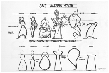
Constructing a character that needs to be replicated multiple times from primitive shapes can be also be advantageous for the artist and require less effort to accurately replicate from a variety of different perspectives. Primitive shapes give the artist reference when designing in third dimensions, streamlining workflow, which is particularly advantageous for drawing in the context of animation.
Drawing Practice: Principles of 2D Design
A piece of artwork can be broken up into four separate components; the subject of the artwork, the form/visual organization of the image, the meaning of the content depicted and the context in which the piece is depicted. The way in which we approach each of these determines how successful we are in producing a work of art. One of the most important component in creating effective art is the form which the artwork takes and the elements which make up the principles of design.
The Form of an artwork can be broken down into 7 separate elements...
Line: There are several ways in which Line can be considered, linearly with marks made by a pen or pencil which is good for technical precision drawing and non-linearly more loose forms of media such as paint/ink brushes.
Shape: A defined area of geometry, often defined by the line. It is important to take into account that all shapes create an area of negative space.
Direction: The direction of the line has an effect on the semiotics of the overall artwork. Horizontal lines suggest stability while Verticality suggests balance and formality. Oblique, diagonal lines can be used to suggest movement and action.
Size: The relationship of one area of shape in relation to another.
Texture: The surface quality of a shape, visual or tactile.
Colour: The Hue.
Value: The lightness or luminosity of a colour.
...and these design principles...
Balance/Contrast: The balance of an image relies on finding a state of equilibrium between two contrasting states. (Light and Dark, Symmetry and Asymmetry etc... ) According to John Lovett, 'balance in design is similar to balance in physics.'
Repetition/Rhythm: A repeating visual element (Line, Shape, Direction, Size, Texture, Colour, Value) such as a pattern that serves as a model for visual imitation.
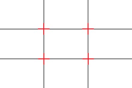
Focus/Emphasis/Dominance: the centre of visual importance within a composition. There are several ways in which an artist can draw a viewer's eye to a particular aspect of the scene, for example the 'rule of thirds', the process of dividing up the frame into a 3x3 grid, creating points of emphasis.

Scale/Proportion: The overall size of an object in relation to others.
Depth: overlapping forms, changes in scale, perspectives which suggest depth in the image.
The Form of an artwork can be broken down into 7 separate elements...
Line: There are several ways in which Line can be considered, linearly with marks made by a pen or pencil which is good for technical precision drawing and non-linearly more loose forms of media such as paint/ink brushes.
Shape: A defined area of geometry, often defined by the line. It is important to take into account that all shapes create an area of negative space.
Direction: The direction of the line has an effect on the semiotics of the overall artwork. Horizontal lines suggest stability while Verticality suggests balance and formality. Oblique, diagonal lines can be used to suggest movement and action.
Size: The relationship of one area of shape in relation to another.
Texture: The surface quality of a shape, visual or tactile.
Colour: The Hue.
Value: The lightness or luminosity of a colour.
...and these design principles...
Balance/Contrast: The balance of an image relies on finding a state of equilibrium between two contrasting states. (Light and Dark, Symmetry and Asymmetry etc... ) According to John Lovett, 'balance in design is similar to balance in physics.'
Repetition/Rhythm: A repeating visual element (Line, Shape, Direction, Size, Texture, Colour, Value) such as a pattern that serves as a model for visual imitation.
Focus/Emphasis/Dominance: the centre of visual importance within a composition. There are several ways in which an artist can draw a viewer's eye to a particular aspect of the scene, for example the 'rule of thirds', the process of dividing up the frame into a 3x3 grid, creating points of emphasis.
Scale/Proportion: The overall size of an object in relation to others.
Depth: overlapping forms, changes in scale, perspectives which suggest depth in the image.
Monday, 14 March 2016
Set, Series, Sequence: Storyboard
For the final part of this brief we were tasked with creating a storyboard consisting of 6-12 frames communicating an idea reflected in the development of out drawings so far based on our chosen word. For this I have chosen to depict the 'invisible car' idea in a storyboard of a short, comedic sketch depicting a man crossing the road in the pouring rain before being hit by a man driving his invisible vehicle. Each of these frames was created from scratch within Photoshop with an emphasis on the mood. I wanted to communicate the weather of the scene through the lighting and heavily desaturated colour palette to give the storyboard a certain mood and ambience, fitting for a darkly comedic comedy sketch. I used reference from the internet for the colour palette and everything, including the clouds and the raindrops was generated within Photoshop without any external sources.

1)Wide shot of commuter standing at traffic light in the rain with an umbrella...

2)...the commuter takes a step forward onto the road.

3) The commuter is struck at high speed by a driver driving an invisible car and swept to the right of frame.

4) The camera then zooms out once the frame is empty...

5)We zoom out to a long shot of the driver, who has now stepped out of his car to go to the aid of the man.

6)The driver pulls out his phone while a queue of traffic builds up behind him, all driving invisible cars.

Final Storyboard
Drawing Practice: Appeal
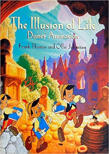
One of the most important 12 principles of animation, outlined by the writers of the animation bible 'The Illusion of Life' is the appeal of a character's design and the effect it has on the audience. Ollie Johnson and Frank Thomas state while 'live action has charisma, the animated drawing has appeal'. How a character is drawn can have a significant impact on how the audience interpret's their intentions in the story. Often designs that are overly complicated or hard to read lack appeal, as does weak drawing. Good appeal can be as simple as good drawing, according to Johnson and Thomas, but an understanding of the effect certain lines and pen strokes have on the audience is important when designing a character with appeal.
'In nature we see forms in balance, ready to move in any direction. Few fluid forms are completely symmetrical, and the contrast in form and shape makes an active type of balance. One side can be straight while the other bellies out with the relaxed weight, or they can both bend or stretch or twist or turn- it is always possible to make a drawing that is solid, round, pliable and in balance. We call these forms 'plastic' as opposed to 'static'.
-Excerpt from The Illusion of Life regarding Appeal
Examples
An example of a character design that lacks appeal. While the actual drawing is technically competent, the design lacks basic primitive shapes and the character's costume is cluttered with lots of different conflicting shapes with no logical consistency. The primary colour scheme is also overly complicated, as most characters usually only consists of one or two colours, while this design has 3 primary colours, each with various different tones.

Carl from up is constructed almost entirely form primitive shapes with rounded edges, from his comically oversized nose and square glasses to his sticky-out ears which lend an air of ridiculousness and charm to his character. His square head with rounded edges suggests a friendly persona despite how we may first perceive him and while the other character relies mostly on small facial expressions to get a idea for how they're feeling, we can read Carl's facial body language and gesturing due to the exaggerated proportions of his design.
Drawing Practice: Thinking about drawing
Veteran Golden-Era Disney Animator and author of 'The Illusion of Life' Ollie Johnson has suggested in the past that hand drawn animation is as much about thinking through the process of drawing as it is executing the technical aspects of animation. Johnson stresses 'Don't illustrate words or mechanical movements, illustrate ideas or thoughts, with attitudes and actions'.

Animation is as much about expression of emotion through the art of drawing as it is the technicalities of the form. Johnson suggests that animation is 'as much about seeing, recalling, proposing performance and delineating concepts as it is about the drawing itself'. There is a complex language of expression to drawing, the purpose of which is often processed in one of three ways...
Journalistic: an act of reportage.
Documentary: an attempt to capture the observed as realistically as possible.
Experiential: imbuing the person or object with the established conventions of art.
Observational drawing, and by extension, traditional animation is Experiential, therefore all about capturing the feel of a moment, and not necessarily capturing a moment as realistically as possible. It is about capturing the essence of an object or person through gesture and posture and in animation, these things during the passage of time from a set vantage point, from which we the viewer observe this fictional world of sign and symbols, representative of something observed and interpreted.
Set Series Sequence: 12 Development Images
The second part of our Set, Series, Sequence brief was to take one of the ideas from our initial 24 image responses to our chosen word and produce a series of 12 responses to that response to take forward and develop into a storyboard. For this task, in response to feedback I received saying I needed to expand my use of styles and media, I have opted to use Illustrator and explore some of the digital paintbrushes in Photoshop.

1) This first response was created in illustrator in the style of some of Saul Bass's poster designs for several Alfred Hitchcock films such as 'Anatomy of A Murderer' and 'Vertigo', depicting a businessman commuting in his invisible car. This vector-based drawing style was my attempt to broaden my output for this brief and explore different forms of media.

2) In keeping with this vector style, I created a more figurative vector-based illustration depicting a similar character type. I used my usual drawing style as a template for this design, hoping to prove that the style was transferrable to a more vector based drawing style. As is the nature of the pen tool in Illustrator, my character is defined by its sharp edges and I tried refraining from using the curve tool.

3) As many of my drawings so far have been on plain white backgrounds, I thought I would try and incorporate scenery and a background into some of my responses. Taking inspiration again from Saul Bass's vector-based style, here I have depicted a driver in a cowboy hat driving what is implied to be an invisible motorbike across the desert at sunset. The colour scheme is reflective of the setting, with one or two simple warm hues, slightly desaturated as to allow the silhouette of the character and the cactuses on the side of the road to stand out.

4) Here I reverted back to my standard drawing style, applying tone to the character with pencil. The linework was done using fine liners, with thicker lines used to emphasise the proportions and bodily shape, and with thinner lines used for some of the finer details such as facial features and the character's beard. What makes this drawing different from the rest conceptually is that I have chosen to include the steering wheel in the drivers hand.

5) This line drawing depicts two street racers, racing their invisible cars. Like the previous drawing, the characters are holding the steering wheels to their invisible cars in their hands...

6) Here I expanded upon the idea I had earlier of a cowboy-like character riding an invisible motorcycle. However, instead of giving the character a cowboy hat I instead chose to give him a leather jacket and a pair of sunglasses, with a cigarette hanging form his mouth, a more modern take on the sort of American cowboy motif I was going for with this design.

7) Here I attempted another vector drawing, this time in an even simpler style, breaking down the different elements of the character into simple primitive shapes. Facial features such as the characters nose were simplified into basic shapes, for the nose in particular, I used a slightly warmer hue skin tone colour to differentiate it from the rest of the face.

8) Inspired partially by the Fettle Animation style, here I opted for an raster-based alternative to the vector based drawings I have been doing up until this point. For this drawing I used some of the custom paintbrushes in Photoshop which I feel gives the flat colours a level of texture absent from the vector drawings. I tried to keep the designs of the character, contrary to my previous vector based drawings, curved in nature as this adds to the bumbling ridiculousness of the character, especially a character with a bald head.

9) Continuing the raster-based graphic style of the previous drawing, here I chose to depict an old woman, using her walking stick to steer her invisible car. To emphasise the age of the character, I included wrinkles on the woman's face in a slightly warmer skin tone.

10) This vector based drawing builds upon some of the Saul Bass's drawings I did earlier, this time depicting a rocker type dragging a cart full of musical instruments behind him while smoking a cigarette. I didn't want to overcomplicate the design of the character, so I chose only to give him long 'grungey' hair and a pair of sunglasses, as I feel these accessories are the simplest way of communicating this.

11) This drawing depicts a driver who has lost control of his vehicle. Here I wanted to really exaggerate and caricaturise the facial expressions of the character for comic effect. This was achieved partially through the use of wrinkles to punctuate the wide eyed, open-mouth facial expressions.

12) This final drawing was created with fine liners and depicts an office worker trying to outrun a driver, who has lost control of his vehicle and is about to run him over. This drawing was sketched out in pencil before I went over it in fineliner which I feel really brings out the detail in the facial expressions, through use of thick and thin pen strokes.
Sunday, 13 March 2016
Capturing Motion in Observational Drawing
Life drawing, contrary to popular belief, is not about creating the most realistic drawing possible, but is instead more about capturing the essence and personality of a person in as simple and effective a way as possible. In Life drawing motion can be implied through the posture of a model and the media in which the artist chooses to interpret them.


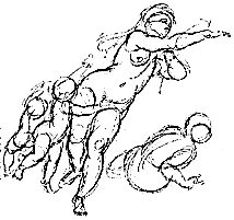
Some of my Life Drawings which communicate movement
Media can be a deciding factor in whether a drawing communicates motion, for example, by using more loose media such as charcoal sticks and graphite pencils with their less defined, sketchier lines, the artists can more effectively communicate a sense of movement in their observational drawings, when coupled with dynamic poses. Media such as charcoal has a certain impermanence and texture to it, something that is lost when using more permanent media such as ink pens, and this impermanence gives a sort of illusion of movement through a space when coupled with unrefined scratchy lines.

Another factor that can give life drawings the illusion of motion is in the posture and body language of the model. Obviously, its impossible to capture movement in a model if they're just standing statically, but movement can be implied through posture and gesturing. It is estimated that up to 30% of communication is non-verbal, communicated through body language and gestures, so in order to communicate movement effectively, one must observe the more subtle nuances of motion and the way parts of the body react during movement. For example, some of the principles of Animation can be implemented in this context, such as squash and stretch as well as secondary motion. It is important to keep in mind every movement in the body has an equal and opposite reaction, such as when one shoulder is raised, the other moves downwards.
Glenn Vilppu: The importance of Life Drawing in Animation

As Animators it is important we gain an understanding of how the human anatomy is constructed, as well as gain a broader understanding of how the body looks in a range of poses. Drawing for life is vital as it allows the artists to capture a more three dimensional portrait of the subject, with all the imperfections that entails, something drawing from a two dimensional reference photo or video does not allow

Extract from Glenn Vilppu's series of drawing manuals
According to Glenn Vilppu, who runs a series of online drawing course, big animation studios working on large productions involving traditional 2D animation aren't looking for cartoon caricatures or copies of their studios work and in fact look towards hiring those with a set of traditional, classical figure drawing skills and an ability to communicate movement and personality through still images. Traditional animators also need the ability to consistently draw the same character with the same bodily proportions while communicating personality and motion through a series of images.
Renaissance Style Drawing by Glenn Vilppu
Vilppu states that one of the ways to gain a greater understanding of these skills is to study Renaissance Drawing and Painting. These painters, Vilppu's states, were amongst the first visual storytellers, practically inventing the visual arts and Animation, he argues, is the closest thing we have to this type of Renaissance Painting today.
Sequential Imagery: Scene Transitions
Scene transitions are an important element in insuring the narrative of your film flows. In most films and Animation Directors will typically follow the tried and true formula of simply cutting from one scene, to an establishing shot setting up the following scene and go from there. While this is functional, there is an often overlooked art to the transition of a scene. Directors such as Edgar Wright, Satoshi Kon and Michel Gondry, all known visual storytellers use techniques such as match cuts, whip-pans and making use of negative space, to transition between scenes.
Match cuts are often used by directors to draw a parallel between two images. Probably the most famous example of a match cut being used to transition between scenes is in Stanley Kubrick's 2001 'A Space Odyssey' when the neanderthal uses a bone as a tool for the first time before throwing it into the air. The camera follows the bone as it rises and falls in slow motion before cutting mid-air to a similarly shaped space station thousands of years later, an editing choice mean't to symbolise man's advancement in our use of tools and the progress we've made technologically.

In Eternal Sunshine of the Spotless Mind, director Michel Gondry whose background in Music videos gives him level of literacy in this area of Visual Language, stages a lot of the scenes almost as if they were a stage production, with our character shifting from one background to another with almost dreamlike grace. One scene depicts Jim Carrey's character leaving a scene while the lights in the room go off one by one, before he walks thorough a doorway into another scene entirely, symbolising the character's despair in giving up. These transitions, while they may seem flashy, in most cases have some sort of thematic reasoning for their inclusion and are always motivated by some directorial decision.
Friday, 11 March 2016
Sequential Imagery: Colour Scripts as story treatments

Pixar is an Animation Studio that excels in it's visual storytelling. While their writing is indeed top notch the most immediately noticeable and memorable aspect of any of their film's is the striking visuals and I believe this is partially due to how well they plan their stories thorough the use of colour scripts.

Most studios, when working on a feature film will start off with a written story treatment, a short summary of the film's events which informs the creation of the script and storyboarding stages of pre-production. While this is still the case at Pixar, alongside the traditional story treatment artists will create a visual summary of all the events in the film for the artists and director to use as inspiration when storyboarding and constructing scenes. These colour scripts, when shown in succession resemble a sort of illustrated storybook which summarises the outcomes and core conflicts and focus of key scenes in the film. Each film Pixar has used this process with has adopted a different approach in style for this too, for example, in keeping with the 1950s modernist aesthetic, reflective of golden age comic book superheroes, The Incredibles adopts a vector based, almost Saul Bass-like style for it's colour script, while a film like Ratatouille uses more traditional media in keeping with the aesthetic of the Parisian setting.
Subscribe to:
Posts (Atom)