Showing posts with label OUAN505. Show all posts

Tuesday, 16 May 2017

Studio Practice: Weekly Production Diary- Applied Animation Week 15

Compositing

After finishing the character animation for the park scene, I was tasked with compositing all of the shots (which the other members of my group had posted as PSDs on our shared Google Drive Folder) in After Effects in order to make them look more like a documentary. This mostly involved creating a 3D camera layer in After Effects and shaking it about to simulate a documentary style of shaky cam. I was conscious of not just shaking the camera randomly using some sort of plugin, as I feel each movement, every pan and every zoom, should be motivated and the audience should have some feel for what kind of character the cameraman is.


I looked to shows such as the Office for inspiration and noted that the cameraman in those shows is always reacting to a situation slightly after it happens, meaning an event or action happens and the camera lags behind as the cameraman adjusts to film it. This is where a great deal of the visual comedy from these shows comes from; classic moments such as Martin Freeman looking awkwardly at the camera in the office, which I hoped to emulate in my animation. By moving the focus of the camera, this did wonders for the staging in our animation. For example, in the park scene, when the entire scene plays out in master, it can be a little confusing as to what is supposed to be funny about it, however by panning and whip-zooming on certain visual cues such as eye movement, this diverts the audiences attention from one element of a scene to another and emphasizes the comedic element in a subtle way which would have been lost had it just played out in a static master shot.


In order to simulate this camera movement in After Effects I converted the composition into a 3D workspace and erected a sort of diorama, with the characters at the front against a backdrop which I could then zoom in and our and move around as if it were a 3D space. By limiting myself to certain axis and not pointing the POV beyond the boundaries of the composition, it maintains an illusion of camera movement in which I can zoom, pan, tilt, realistically as if it were a camera in 3D space. I can also apply a depth of field effect to the camera lens to simulate focus pulls


First Scene (Stage)


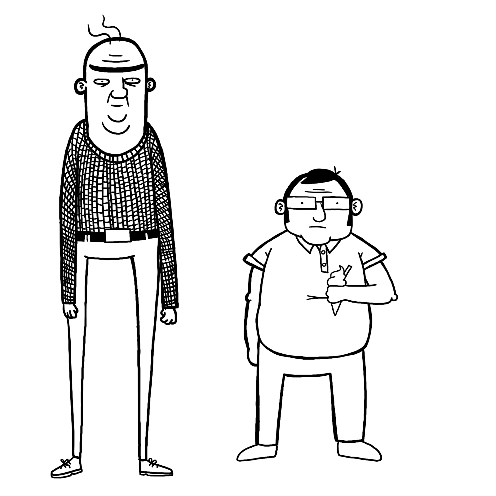
Camera starts off with its POV focused on the homeless person sitting in the doorway of the derelict shop.


As Keith emerges from the right of the frame, the camera adjust to focus on him. 


The camera zooms in, but not in synch with it lining up to focus on Keith. This is something I've noticed a lot in Fly on the Wall documentaries, the cameraman is always slow to focus on an event or action, so I tried to reflect this in the animation.


Focus pull, character in foreground is slowly brought out of focus...


... as the reflection is brought into focus; the bird poop on the window aligning to form a tear under Keith's eye.


Editing the Final Animation for Submission

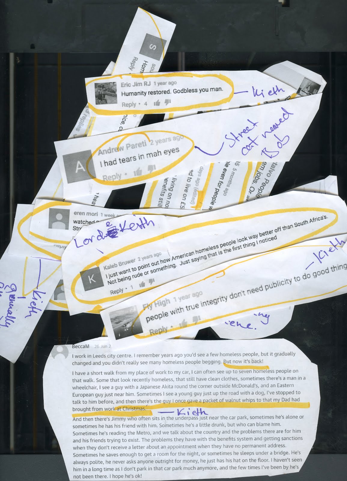
After compositing each of the shots in After Effects I uploaded them to the shared Google Drive Folder for Tess to put together in Premier with the sound she had been collecting. I trusted Tess with the final edit, as I had seen she had proven herself in taking the lead with the voice direction and script writing; she knew what she wanted out of the animation more than anyone, so I let her take the lead and have the final say in the editing stage, something I usually like to have control over. The final edit I am incredibly happy with and feel works really well on a comedic as well as a storytelling level, despite the feedback we received from some of our peers regarding the clarity of the inciting incident which induces Keith's rant at the end. This is something we hope to address and clear up in the future after submission.

Press Kit

For module submission I created a Press Kit to promote 'Gentlemen Of The Road' at potential film festivals and events. I worked closely with Brogan who was developing the DVD cover and sleeve to ensure that both products followed similar stylistic conventions, using the same fonts (Germanika) and synopsis which appears on the back of the DVD cover. 

Monday, 8 May 2017

Studio Practice: Weekly Production Diary- Applied Animation Week 14

Animation: Final Scene

With the knowledge that there is no way we will be able to fully animate the final scene of our animation in time for the deadline in two weeks,  I created an animatic in Photoshop for the final scene of our animation where Keith lashes our at a crowd of onlookers, in frustration with how his efforts to address the homeless situation have gone unappreciated. In the rough animatic, this scene lasted around a minute and a half, while one of the shots, the shot in which Keith rants at the crowd in one uninterrupted take, lasts around 30-40 seconds and includes a lot of lip synching. Wanting to try and communicate the crux of this scene in a way that didn't require lots of time-consuming lip synching, in time for the deadline I opted to create an animatic consisting of 40+ individual and unique poses, in order to visualize Keith anger and frustration through body language, as well as to lay the groundwork for the animation which we will finish after submission to submit to festivals.


In the rough animatic I created, the scene in which Keith rants at the crowd of passers by consisted of around 6 poses, which really lacked the energy and momentum present in the dialogue, so I opted to create 40+ individual key poses in order to emphasize a certain level of physicality to Keith rant; to show his anger and frustration visually in order to compliment the audio side of things. The result I am fairly proud of. Key frames have never been a strength of mine, but with this scene I feel I definitely hit my stride, worrying less about staying on model and more about drawing lots of unique poses for Keith. I had a lot of fun and learned a lot about key framing in the process.


Colouring Tess' shots


This week Tess also finished some of the shots from the beginning of the animation before asking me to colour them for her before I am due to composite them for the final animation early next week. She gave me the PSD files on Google Drive and I coloured them on a separate video layer, using her previous pieces of concept art as reference for the colour palette. In keeping with our newfound scrappy aesthetic I wanted the colours to boil along with the lines. For this I used a watercolour brush from the Kyle T set which I had used for my character designs, with a large brush, not worrying too much about remaining within the lines in order to keep that scrappy look. However, Tess was not happy with my colouring, feeling it was a little too messy and redid parts of the coat which I had coloured, including a tartan pattern which she applied using a mask layer. I also coloured two other shots, one in which Keith picks up a Walnut whip wrapper to inspect it and one in which he is feeding birds in a wide shot.


Monday, 1 May 2017

Studio Practice: Weekly Production Diary- Applied Animation Week 13

Animation: Second Interview/Change of Course/Reflecting upon production so far

This week we showed our tutor some of the work we have done so far; mostly animatic and unfinished animation consisting of uncoloured keyframes. Steve really liked the scrappy look of our animatic, which he said was appealing enough on a purely aesthetic level on its own without having to colour. He suggested, as we only have a few weeks left, and are behind schedule with the project, to focus on polishing up our animatics;not to worry about getting everything finished in time for the submission as long as we communicate what we want to communicate with our rough animatics. While initially hesitant, as a group we did come around to this idea, as various illness and poor time management has left us in a position where none of us could see ourselves finishing the animation to the standard we expected; with the different textured brush strokes, colour and full lip synch, in time for the deadline.

We decided instead to embrace the roughness of the work we had produced up until this point. Working on top of our pre-existing storyboards and animatics, focusing on communicating the staging and key poses of our characters as simply and effectively as possible without the need to re-colour and re-animate large segments of the film. The newfound scrappiness of our animation also worked in favour of addressing some of the issues we had been having up until this point in keeping the shots we were individually working on to the same style/model. The three of us each have very different, unique styles of drawing; while I tend to have quite a strong emphasis on polish and tight line work, Tess and Brogan are a lot more loose with their lines and defined in their character's form. By embracing a scrappy aesthetic, the difference in our three styles seems a little less jarring. Coupled with the background designs Tess and Brogan have been working on the past few weeks, this seems like a more viable course of action to take the rest of the project; though we intend on polishing the animation up after submission so we can submit to festivals.


Monday, 24 April 2017

Studio Practice: Weekly Production Diary- Applied Animation Week 12

Animatic/Animation: Park Scene

This week I started animating some of the scenes allocated to me from working on the storyboards. I started off with the park scene as that had the most lip synching, which I had anticipated as being the most labour intensive process. I am not all that accustomed to lip synching in 2D Animation, having only really had prolonged experience working on 3D character rigs as a part of responsive, so going into this shot I was expecting some sort of challenge.


I started off with a fairly simple animatic, outlining the key poses and timings in Photoshop which I would then use as reference for the final character animation, which I would also create in Photoshop. However, my peers gave me feedback on my animatic before I moved on ahead with the final animation. Tess had qualms about the homeless man carrying the large bag over his shoulder. She thought this was too comic, and that Keith should be the focus of the comedy, with the characters and world around him playing the straight man in order to emphasise his ridiculousness as a character.  After some reflection and initial resistance to the idea, I eventually agreed with her. She suggested something a little more subtle and in the background, so I came up with the idea to have the silhouette of a homeless man in the background of the shot picking up rubbish; a sort of sad reminder. The homeless man picks up what looks to be a can from the ground and inspects it, taking a swig to see if there is anything left inside it. His body posture suggests there is not, and the man, now defeated by his predicament, resigns to his knees helplessly. This all plays out in the background of the shot in 4-5s, while the main character Keith is addressing the camera.


As for Keith animation, I used the Kyle T brushes for the line work and colouring, which took much longer than anticipated due to having to switch between different coloured lines and different sized brushes. I also encountered problems with the size of the Ultimate Pastel Brushes, as the brush seems to have a problem rendering lines below 12px, which I suspect is due to the sample texture used for the brush being around that size by default. To address this I used a slightly different brush to the one outlined in the style sheets, opting for the Pastel Palooza brush over the ultimate pastel. The differences between these brushes isn;t too apparent, but the one I ended up using definitely has a rougher, coarser texture to it, which I feel lends to the aesthetic. For colour I used some of Tess' concept art as reference, using the eyedropper tool to extract colors. 

Monday, 17 April 2017

Studio Practice: Weekly Production Diary- Applied Animation Week 11

Amending the Script/Dialogue Recording


As we only have a month left to finish the project, this week we made some amendments to the script in order to get it below the estimated 4-5 minute mark, down to a more manageable 2-3 minutes; working out to around roughly 1 minute of animation per person in the group. We cut several minor scenes, such as transitionary shots, as well as some of the filler during the narrators segments; not wanting to effect the comedic timing on some of the larger set-pieces such as the rant at the end of the animation.

We enlisted Max to play the part of Keith in our final animation, as he has some experience voice acting, having voiced the majority of the class' animations at some point in his three years at LCA. Max also nailed the Matt Berry/ Alan Partridge voice we wanted for our animation, channeling the personality of a poncey, aristocratic British person in a hilariously caricatured way. In the week leading up to the recording we went through the script with Max so he could get a better feel for the character, clarifying a few things which were unclear and asking for any input he had in order to flesh out the character to be more three-dimensional.

Our main recording session with Max lasted around 40 minutes, in which Tess directed Max from the script and I was in charge of the recording and organising the sound files in Audacity, Me and Tess were fairly back and forth with suggestions for how Max should approach the reading, though Tess seemed to have a better feel for his performance n the context of the animation as a whole, so I trusted her word the few times we did voice disagreements over certain emphasis and intonation in Max's performance.

After recording Max's voice and editing his lines into the animatic, we enlisted some other people off our course to play the passers-by in the crowd scene of our animation. In the script we didnt have much to go by, as they're just throwaway lines designed to move the plot forward, so we enlisted some of our friends who had distinctive voices. We got Ollie and Rosie to read for both parts so we could decide in the editing process who was best for each part. I booked the sound booth for half an hour one afternoon and recorded three takes of each of them reading each of the lines. Recording only took around 10 minutes.

For our final animatic, we ultimately ended up keeping some elements from our Temp audio recording such as my narration, which Tess argued fit well and I had the right voice for, and Brogan's 'no' as Steve, which was so dissonant it was too funny not to keep.

Monday, 10 April 2017

Studio Practice: Weekly Production Diary- Applied Animation Week 10

Secondary Character Designs

This week I created some character designs for the interview scene in our animation. Over the course of my time on Ba (Hons) Animation at LCA I have felt a little constrained by my art style, so on this project, working collaboratively, I have tried to develop my style to incorporate more elements of caricature; simplifying my designs to an extend for ease of animating. In the script, there is not a detailed description of the two interviewees whom Keith speaks to, so I based my character design off my lecturer; caricaturing his key features and exaggerating proportions for comic effect.


Elements of my character design were based off Tess' design of our main character Keith, with emphasis on pear-like body shapes and a straight posture. With many of my character designs in the past, I feel overcomplicating has been my downfall, particularly when it comes to frame by frame animation, so for this character design is was focused mainly on keeping the character simple and easy to animate. I also tried taking into account the way I approached the line work; not wanting to overcomplicate the stitching on Steve's clothing I tried to think of solutions for how to approach animating a jumper. I considered creating a pattern in Photoshop for the character's jumper however I decided an easier solution would be to just limit the extent to which my character moves in the scene, which shouldn't be too much of a problem as the scene he appears in is short and the characters are stationary in a master shot.


After creating a basic character sheet for mine and Brogan's character, whom I interpreted in my own style, I tried out some of the Kyle T brushes which we're going to be using in the final animation, to work out the best way to interpret our characters with the toolset available. I opted for simple, complimentary colour schemes, limiting the palette of each character to no more than 2-3 colours, in order to not overcomplicate the colouring process, which can be time consuming. I wanted the colouring on the characters to be tangible, but also consistent with the character sheets/designs Brogan and Tess have produced so far, so I opted for the Ultimate Pastel pack for the line work and a watercolour brush for the colouring. I made sure to make the colouring imperfect to lend ot this sense of tangibility.

Monday, 3 April 2017

Studio Practice: Weekly Production Diary- Applied Animation Week 9

Recording temp Audio
In order to put together an animatic, we need to know where certain audio cues in the animation are, so we recorded some temporary audio in the sound-booth, voicing the characters ourselves, in order to get a feel for the timings when editing our rough animatic. Tess portrayed Keith, as well as directing the dialogue and I was tasked with playing the narrator. For this I put on a more neutral sounding BBC accent, the sort of voice you'd hear from a radio announcer or somebody presenting the one show. I had never voice acted before, so even putting on a more neutral version of my own voice proved challenging, as one must take into account intonation and emphasis on certain words. Tess was impressed by my performance as the narrator and asked me to provide the voices for the final animation, as I had the right kind of voice, on the condition that I re-record some of my lines for the final cut, as I did trail off at the end of a couple of sentences.

For the final scene, where Keith's character is revealed to be the product of various internet commenters, me and Tess both recorded takes of us as Keith which we could intercut between in order to illustrate the breaking of the fabric of reality in the animation. We wanted to sound bland and distant in order to reflect the commenters, however after listening to the takes back again when editing our animatic, we're probably going to have to find another solution for the final animation.

Rough Animatic/Tests
Having finalised our storyboards, next we arranged them into a rough animatic in Adobe Premier in order to get a good feeling for the timings before starting on our animatic. I was tasked with arranging the scenes I had storyboarded, mostly the latter third of the animation in which Keith rants at a crowd of onlookers, into a rough animatic with the temporary audio we recorded in the sound booth.

While editing I realised that the scene was running a bit too long, pushing the animation as a whole past the four minute mark. I thought this may be a problem, as it is important we keep certain timings in order to achieve the desired comedic effect, but the scene I was working on was looking more and more like it was going to be be upwards of a minute and a half long, which for a brief for which we are expected to produce a 1-2 minute animation, may prove difficult to finish on time. After consulting the group, we agreed a rework parts of the script to make the animation shorter, which would involve cutting out some of the unneeded transition shots we used to pad out the narration.

Monday, 27 March 2017

Studio Practice: Weekly Production Diary- Applied Animation Week 8

Storyboards

This week we created the storyboards for our animation. I was given two scenes to storyboard; the park scene and the final scene of the animation. I used blue and red colours to differentiate between the characters and the backgrounds/environments, which is useful when it comes to creating the final assets for the animation, as well as for the animatic.

Park Scene

In the script, the scene in the park is relatively short, consisting of a single wide master shot of Keith sitting on a park bench addressing the camera while ignoring a homeless person lugging a comically oversized bag to the edge of the frame. One of the rules of visual comedy I have picked up on is that physical comedy is best accommodated when played out in a wide master shot; a technique used by many physical comedians in the Silent Film era, such as Buster Keaton and Charlie Chaplin. There is an interesting video essay on the subject in Director Edgar Wrights work by Tony Zhou from every frame a painting (see below) which served as a great reference for staging visual comedy.


Every Frame a Painting: How to do Visual Comedy

Keith Addresses the camera as he attempts to wrap up his documentary

The final scene proved difficult to Storyboard, as in the script it is outlined as a single continuous shot in which the cameraman pivots in the scene, which is hard to achieve when not working in 3D space. As a work-around, in order to transition between these two perspective changes, the cameraman pans the camera towards his feet briefly before tilting the camera back up to a different angle.

Keith is surrounded by passers by

For the final scene I boarded, the main character of Keith goes on a ranting monologue at the crowd which has gathered around him, During his outburst, as outlined in the script, the comments of various internet commenters begin appearing on the screen, as the fourth wall is shattered and the fabric of the documentary begins to crumble. I plan on elaborating on the details of this aspect of the scene in an animatic, as I feel in it's current form, it's unclear to anyone who hasn't already read the script. I also plan on incorporating more key poses in the final animatic, in order to emphasise character through body language and posture. I will make sure to record temporary dialogue in the future to use as reference for the pacing of the character's key poses.


Keith rants at a crowd of onlookers


Keith walks off into the sunset, flipping off a homeless person

Background Reference

Before creating the background I went on a location scout to find suitable photographs to use as reference for creating the backgrounds in our animation. Referring to the storyboards I made a list of shots I needed for the animation and went around Leeds one afternoon to try and cover as much ground as I could, starting off in Hyde Park before walking down towards the city centre.


Hyde Park, Leeds


Leeds City Centre


Leeds High Street


After taking some reference photographs of Hyde Park, I decided to take elements from my reference imagery and created a quick background in Photoshop. I used the eyedropper tool to extract colour from my reference photographs in order to make the backgrounds look damp and overcast; with dull muddied colours. However after feedback from the group we decided a more scrappy-style was needed in order to allow the characters to properly stand out in the frame. There was also the issue of time, as it would have proved time consuming to produce around a dozen of these backgrounds to a more polished standard in the time we have left. Instead, Tess and Brogan have opted to use my photographs as reference for monoprint, which they will then composite with my original photographs in photoshop to create the backgrounds.

Monday, 20 March 2017

Studio Practice: Weekly Production Diary- Applied Animation Week 7

Group Crit/Presentation


This week we prepared for our Group presentation where we would be presenting all of the work we have done on the project so far while outlining what we have left to do and gathering feedback from our peers as to how we can improve our work. While most of the feedback we received from the crit was positive, we didn't do the best job at explaining what our animation was about, with some people confused as to whether it was a documentary at all, There was also some criticism as to how much work we have done so far, as we've all been working on other modules as of late and left applied on the backburner while we try and complete those tasks. Much of the class was already at the animatic stage and we haven't even started on the finalised storyboards yet, which I put down to poor planning on our part. We had wanted to get started on the animatic by this point in the project, however we recently became bogged down in writing the script and just haven't had the time.

One key area of concern which came up during the presentation was the length of the animation. During the presentation we ran through our script on a scene by scene basis, which led to some of our peers, including our tutor, to question whether our animation will exceed the 2-3 minute mark, casting doubt that if that is the case we will even get it finished in time for the deadline. After reflecting on the script after the crit, we decided we needed to cut out some of the scenes so we don't surpass the 2-3 minute mark in our animation, and tweaked the script, cutting out some of the transition shots and longer narrator monologues.


Finalising the Script 
This week, after taking into account feedback from the crit, we finished the script for our animation and began allocating sections of the script through colour coding to storyboard between the three of us. We each have around roughly a third of the script to create storyboards from over the next week. I have been tasked with storyboarding the final scene in the animation, which is the longest uninterrupted shot, so careful consideration must be taken when boarding the shots as to ensure it is doable.

Monday, 13 March 2017

Studio Practice: Weekly Production Diary- Applied Animation Week 6


Writing the Script
This week we wrote the bulk of the script for the animation. We went through a few drafts, passing it on to each other to update and rewrite until we were happy with it. Tess wrote the first draft of the script, crudely arranging the quotes we printed off in a coherent manner on a piece of paper then writing it up on the computer, before passing it on to me and Brogan. We then sat down and rewrote large portions of the non-dialogue parts together. It was important the script adhere to the conventions of scriptwriting, so while writing it I referred back to Charlie Kaufman's Eternal Sunshine of the Spotless Mind script. While our animation tonally has little in common with this script, Kaufman packs his scripts with a good amount of detail when setting a scene or describing a characters motivation, which I feel is important for the purpose of what we're doing, as our idea is not easily explained and we want audiences to get the point we're trying to make the first time they watch our animation. Its also handy to have a professional script on hand to know how to structure your script.


While Tess' script did have a coherent structure and implemented the dialogue very effectively, me and Brogan both agreed tonally it was a bit all over the place in regards to the narration and direction. So we made a few minor changes to the narration and the way in which scenarios play out to reflect a more dry humour sensibility. We rewatched some episodes of The Office as research for this, identifying how the direction captures the mundanity, arrogance and awkwardness of its cast of characters in a sort of understated fly-on-the-wall way. Another thing we identified from watching the office was the way in which the cameraman is sort of a character in and of himself, with his placement in the scene and the things he chooses to look at adding another subtle layer of comedy to the proceedings.


We also looked at examples of comedic character's as the centre of a mockumentary, such as Alan Partridge and Philomena Cunk. As for the narration, we made the decision to play the voice straight, without making any quips or jokes, as we wanted Keith to be the centre and focus of the comedy. Secondary characters also were written a little more straight-man-ish, as a way of placing greater emphasis on the absurdity of Keith as a character. This is a comedic technique thats been implemented in Philomena Cunk's documentary segments, so we're hoping to emulate that sort of style.

Monday, 6 March 2017

Studio Practice: Weekly Production Diary- Applied Animation Week 5

Selecting quotes and arranging the Script
This week we started arranging the quotes we gathered off the internet into something resembling a script. This was a much harder process than we had anticipated, as we had to construct a loose plot structure with a definable lead character from a selection of quotes, which would work in a documentary format. We printed out each of the quotes and began circling parts we felt could be use for our animation while discussing scenarios we could construct around them so that they'd make sense in the context of our mockumentary.


For example, a comment such as 'theres one thing worse than having 'no where to live' in Bradford and that's having to live in Bradford' would fit the profile of the character of Keith fairly well, as we could imagine him making such a comment flippantly while addressing the camera. We tried to highlight as many sentences and phrases as we could. As the point of Keith as a character is for him to represent the embodiment of ignorant, bigoted internet comments, we're writing the script so that its is only Keith's dialogue which is taken from these internet comments, as to really hammer the point of our mockumentary home. Secondary characters and the narrator will have their own written dialogue, but as Keith is the star and thus the point of our documentary, we're trying to keep secondary characters to a minimum. Luckily this focus on Keith exclusively also plays to the personality of the character himself, as in universe he is narcissistically making this documentary about homelessness in order to shine a positive light on himself as a humanitarian.


Style Tests

(This test footage I filmed on my camera follows one of the thumbnail storyboards we came up with earlier in the project.)

Having taken some reference photographs last week, this week I produced a background test in order to test out the potential styles of our final animation. Wanting to experiment with more hybrid forms of animation I am very much fond of the idea of using fully live action backgrounds, so I took some reference video this week around the streets near my house to get a feel for how that might look. However, once I looked back over the footage I decided the footage I took was much too shaky to use and if we are to move forward with this we should use a stabiliser of some sort and a DSLR camera to ensure the highest level of quality and the lowest amount of camera shake, as that makes it more difficult to track the 2D assets (the characters) to the backgrounds in After Effects.


I also produced a style test using some of the pictures I took the other week, one of Tess' character concepts and a ton of Photoshop filters. For this concept I drew inspiration from the faded, printed look of skyline towards the beginning of The Beatles Yellow Submarine music video.  I tried emulating this film-like aesthetic in Photoshop by adjusting the levels and colour saturation in Photoshop, then applying a fair amount of filmic grain and a slight amount of wear and dust scratches to the image to get that used look. If we do end up going with Live Action Backgrounds we will probably apply a similar process to the footage in After Effects to age it, or possibly rotoscope it akin to 'When the Day Breaks.'

Style Test