Characters, while they do maintain their volume and on-model, rarely signal any gestures beyond holding out the palm of their hand while Macfarlane exclaims 'what the hell' in the same three or four voices. There is no easing in and out of actions and as a result motions seem too fast, which while sometimes played for comic effect gets old after about five minutes. This is done with no overlapping action or follow through, no anticipation or squash and stretch, which may have given it some credibility in physical humour, leading to stiff, animatronic-like motion.
From a distance, facial expressions are almost unrecognisable, often constituting a circle with a line through the middle. Without any other expressive features like eyebrows to communicate emotion or more than one mouth shape, characters come across as robotic leading to a lot of the supporting cast becoming hard to differentiate.

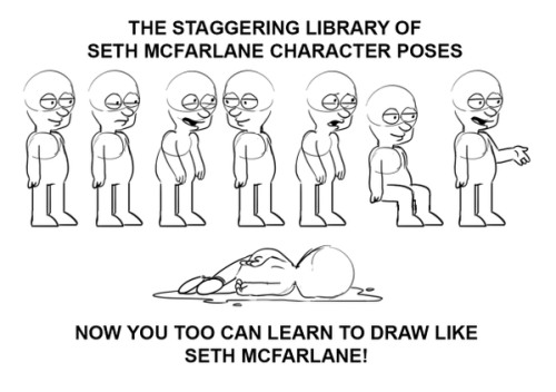
Another thing Family Guy and other Seth Macfarlane shows suffer from is in staging. 90% of the time in any given episode I will guarantee characters will be standing in a long shot, against a static background, in profile, resembling the staging of an old multi-camera sitcom. While this may work for the sort of comedy Family Guy is going for, it is limiting in a medium in which staging options are literally limitless and not restrained by the limitations of live action. Other shows, such as South Park and The Simpsons have a more diverse visual language and as a result are more visually striking and memorable. As an animated show, without even getting in to it's style of writing, Family Guy (as with all other Seth Macfarlane shows) is lifeless, forgettable and boring.
All is not lost however. Over the past few years Adult Swim has been producing a number of successful and critically acclaimed animated shows which allow the creators more room to experiment, one of which is the anarchic Rick And Morty, the love-child of Dan Harmon (writer of Community) and Justin Roiland (creator of Doc and Mharti).

Rick and Morty shares a lot in common with Macfarlane's output in terms of art style, but where Family Guy is lackluster, Rick and Morty puts the effort in. Rick and Morty demonstrates a knowledge of the visual language through its animation and in particular, staging. Unlike Family Guy, Rick and Morty uses the medium to enhance it's comedy and utilises the fundamental principles of animation. Characters move with a weight to them, with a variety of poses and physical gestures to compliment the voice performances. Character designs are also imaginative and vary from simple human characters to more monstrous, alien figures. Generally, Rick and Morty has more in common with classic animated sitcoms such as The Simpsons and Futurama, making imaginative use of the medium while still retaining a relatively simple and (in terms of workflow) manageable aesthetic.
No comments:
Post a Comment