OUAN503- Responsive: Project Report
Introduction
For me, Individual Practice this year has been an opportunity to experiment with different forms of animation; to find and mould a creative form of practice moving into my third and final year of the course. For me it has been where I have taken the most risks and tried new things. While not always successful in my endeavours I feel Responsive, though Individual practice in particular, has given me a direction in which to take my professional practice moving into next year. On the whole I would say that I have become more confident in my ability to respond to briefs in creatively interesting ways, though the way in which I manage my time between modules could still use some work, as twice during this module I found myself dropping a project due to missing the deadline.
Going into this project I didn’t really know what to expect, I outlined in a blog post shortly after the briefing that I was interested in experimenting with 2D Rigging, Motion Graphics and modelling in Maya; all bases which I have touched upon at some point during the module, though with some not to the extent I had hoped in the beginning.
From the outset the Collaborative part of the module piqued my interest, as the prospect of working across courses over a period of two months to respond to a live competition brief seemed ideal in developing my skills as a collaborative practitioner, which is where I see myself getting a job in industry, at least in the beginning of my career. Not knowing what to expect and not wanting to tether myself to one idea or another I was very open to working with both Illustrators and Graphic Designers on a project of social importance, which is why I ended up working on the D&AD National Autistic Society brief.
Individual Practice
LoopDeLoop-Breakfast
Fresh off the heels of the internship at Paper Owl Films where I had been working over the summer, at the start of Individual Practice my main area of interest was 2D Character Rigging. On my internship I had spoken to industry professionals (including my Uncle) who had shown me the After Effects plugin DUIK, used for character rigging and animation on numerous children's television programmes as well as web animation. Emboldened by this I decided I wanted to experiment with using DUIK for some animations this year and Individual Practice seemed like the perfect outlet.
LoopDeLoop is a monthly online animation competition where participants from all over the world submit short, shareable looping animations based on whatever word is given that month by the Organisers. Part of what attracted me to this brief was the freedom it allocated me in terms of subject matter and medium. Scouring through previous entries submitted by fellow animators there was a great deal of variety in terms of how the themes had been interpreted which I found encouraging. I was attracted to LoopDeLoop mostly due to the flexibility it affords its participants. As long as the content you produce isn’t terribly off-colour or offensive, basically anything goes and experimentation is encouraged so that your submission stands out in the timeline amongst all the others.
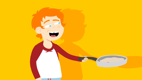
For ‘Breakfast’ I chose to focus on character, as this would allow me to hone my DUIK skills and experiment with 2D character Rigging. Childrens animation was also an area of interest following my internship, as the show I was working on ‘Pablo’ was being commissioned for Cbeebies, so I tried to cater the design of my character both to the tools I was using (DUIK) and the intended audience of children. Catering one’s animation style to the tools at their disposal during the animation process, limiting them if need be, is an important factor when it comes to creating commercially viable animation as tight deadlines and brand guidelines tend to be the norm.
For the design of my character I tried moving away from my Hewlett-inspired comic style of character design in favour of a more Pendelton-Ward-esque style, making use of more primitive shapes and simpler forms to accommodate the DUIK tool in the design process. Simple arms with less curvature and form I found from working on this project are far simpler to animate and the overall style just seems more aesthetically pleasing in motion. This style, born out of necessity which I first experimented with on this brief is something i would go on to develop later in the year on later projects.
As for the looping animation itself, the process of making was fairly straightforward. I opted to create the assets in Photoshop as I prefer using Photoshop’s brushes over Illustrator’s pen tool; it just feels more natural for drawing and is more flexible for me to use, though I do recognise the merit of using Vectors, particularly for Motion Graphics animation. I created two rigs for this animation, one short and one taller one with lankier proportions. In the end i ended up going with the shorter model as I felt the lankier model looked too old for the character I was trying to convey, who was supposed to be modelled after my six year old brother. The arms were the main points of articulation on the finished model, made up of two counterclockwise three-layer IK chains, rigged using the puppet pin and DUIK’s bone tool. For the character’s facial expressions I created separate hidden layers in the PSD which I would swap out to swap out facial expressions in the Pre-comp.
Overall, I am happy with the finished product, though I do have a few reservations on the use of motion blur in the final export. For the more vector-y style I was going for I feel the motion blur detracts overall as it draws attention to the fact the character is rigged in After Effects and would have been better served without the blur effect enabled. Aside from that I would have liked to explore and implement more texture as well as perhaps add leg movement, which I had initially planned on doing but had to cut back on due to time constraints and preoccupation with other modules.
LoopDeLoop-Cute
I initially approached this brief from the perspective of wanting to experiment with Maya. I had briefly tried my hand at the modelling process in previous modules but had never modelled, rigged and animated my own character. Around the time I was developing my initial ideas in response to this brief I had been binge-watching David O’Reilly videos and was fascinated with his approach to minimalist 3D animation and sought to emulate his low-poly aesthetic for this brief. Part of the reason I chose to do LoopDeLoop again this month was the generous amount of time afforded to me to respond to this particular brief. Initially I thought a month would be long enough time to learn character rigging in Maya with the help of online tutorials, however with this I greatly overestimated my ability at time management.
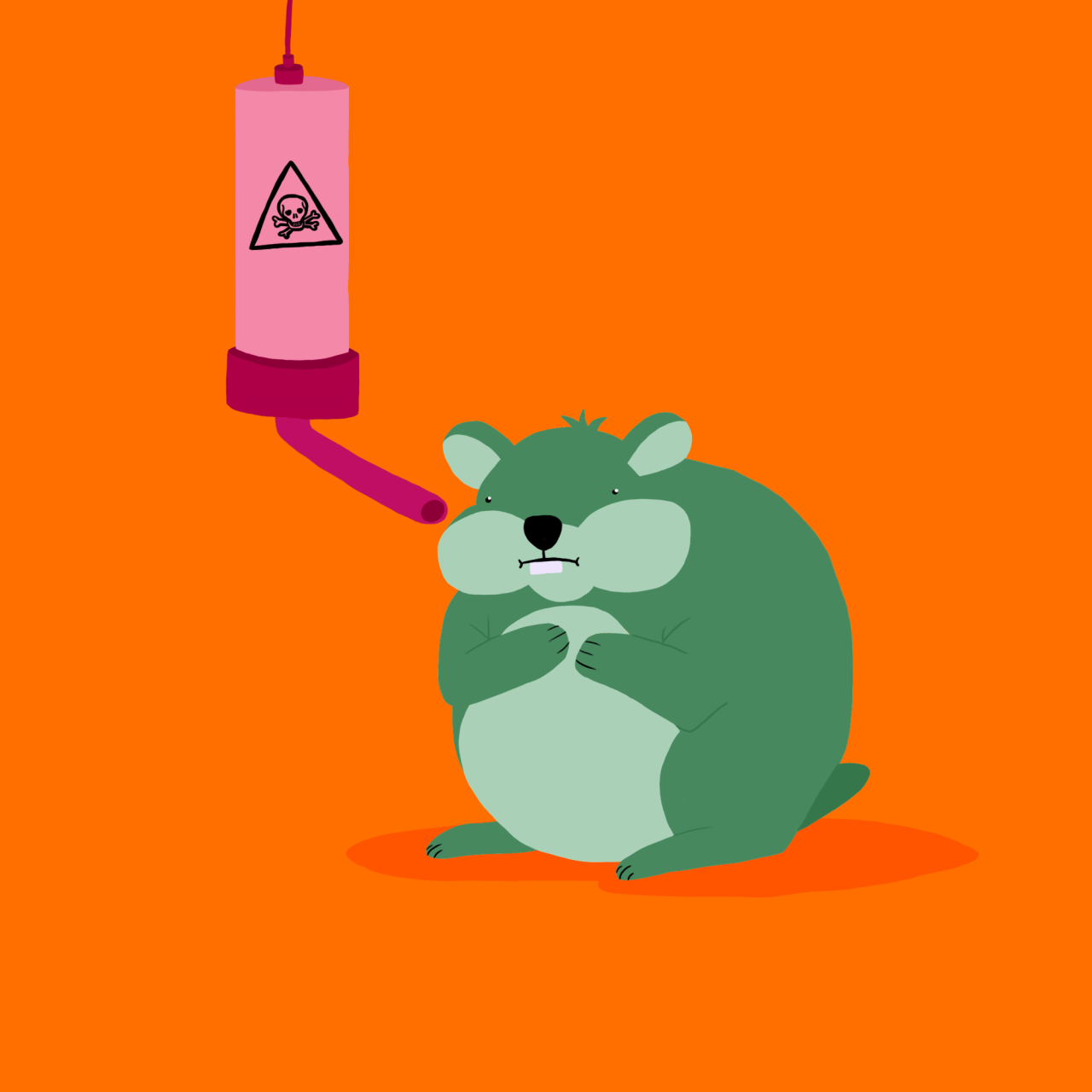
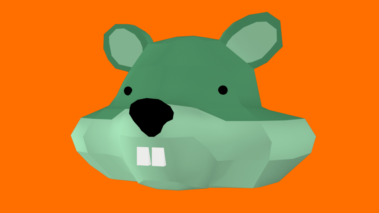
I started out with a concept drawing in Photoshop of a Hamster at a feeder with a toxic/poison sign on the front, intended to be a tongue in cheek subversion of the theme for this month which was ‘Cute’. I then used this drawing as the basis for my 3D model, which was my first misstep. Reference is important when it comes to 3D modelling, however you need multiple angles to reference if you’re creating a coherent character model and to put it bluntly I didn’t really know what I was doing, so I improvised, which proved my undoing. I managed to model the head of my Hamster character, but I had created too many subdivisions for my wireframe and made the rigging process much more difficult for myself to the point that the model was virtually unusable.
With the deadline for LoopDeLoop fast approaching I opted to scrap what I was working on in Maya and to create another quick graphic animation using DUIK, based off my initial concept image. Similar to the ‘Breakfast’ animation I opted to create the assets in Photoshop and then import the PSDs into After Effects as a composition so I could rig them in DUIK. The animation itself was fairly subtle, with a few minor details to add to it’s authenticity. The hamster rolls slightly on his back when he drinks from the feeder, which is on it’s own IK chain. The bones at the end of the hamster’s arms were parented to the feeder, which was in turn parented to the hamster’s arm layer, to give the impression the hamster is holding on to the end as he is drinking from it. Similar to how I created the character’s face in my ‘Breakfast’ animation, to create the face of my hamster I used a pre-comp, swapping out layers with other pre-made assets so as to make the character blink on occasion.
Ultimately I was slightly disappointed with the outcome of this brief as I had wanted to use it to explore the 3D modelling and rigging process more in depth, only to be shackled by my own poor time management and modelling efficiency. I did learn a lot from this brief however and do intend to explore 3D animation in a more meaningful way some time in the future. For now however I cannot help but feel a little bit disappointed in how I handled this brief and how safe I played it in terms of final outcome. There’s nothing necessarily wrong with the finished product, in fact I would say it’s on par with more professional motion graphics in terms of aesthetic and rig construction, but I feel I relied too much on a pre-existing skillset for this brief rather than honing new skills and taking risks on Maya animation. This disappointment in myself is what lead me to undertaking my next brief...
11 Second Club
Disappointed that I hadn’t had a proper chance to animate a character in Maya I decided to attempt that month’s 11 Second Club brief. 11 Second Club is another monthly animation competition in which participants animate an 11 Second sound clip taken from a film (this month it was Ocean's 11), usually using pre-made 3D models available on their website. Wanting to at least attempt 3D character animation, I downloaded a Moom Rig from E-studio as well as 50 or so David O’Reilly’s rigs from his short film The External World which he has made available on his website.
At the time I saw this brief more as an opportunity to fit in some practice around 3D animation in Maya, as it interested me but I did not have the time to learn to model and rig a character on my own. By using these pre-made rigs, this allowed me to focus more on the animation aspect of 3D, particularly the lip-synching and character gestures. Moom is a fairly flexible and accessible rig to animate with meaning I could focus on communicating body language through gesture and facial expression; skills that would not only serve as improving my 3D animation, but also cross over and affect my other forms of animation as well.
For maximum comedic effect and due to the fact that many of O’Reilly’s rigs were impenetrable to a newcomer such as myself, for the secondary character I opted to use what can only politely be described as his ‘breast monster’ character rig. This rig had fully articulable arms as well as breasts and could change the shape of it’s pupils by changing the values in the action window.
I definitely enjoyed animating with Moom. I had never done proper lip-synching up until this point and I found the process of animating facial expressions using Maya’s graph editor rewarding and easy to use. I picked up numerous subtleties of 3D character animation when working on this brief, notably the importance of maintaining eyeline between two subjects in the stage, as well as animating idle poses for when the character’s aren’t talking or are only partially on-screen.
While not perfect, I feel for a first timer the final animation was fairly well put together and effectively communicated character in a verbal as well as a visual manner. A problem arose however when it came to exporting the finished scene. The David O’Reilly rig I had used for the second character, the one I had previously dubbed the ‘breast monster’, did not have compatible shaders with the version of Maya I was using and thus, when it came to render, the model had no shaders; which looked terrible. On top of that, on the renderer which I could use to render the shaders, this affected the Moom rig, who started suffering numerous visual glitches, such as pupil disappearing and screen tearing. Not wanting to submit a subpar animation I quietly dropped the project for the time being on the day of the deadline.
While this was disappointing for me, I still found the experience of working on this brief rewarding in it’s own way, pushing me in future to explore Maya a bit more in depth and one day model, rig and animate my own character. I feel like I picked up a lot in terms of 3D animation principles as well, principles which can be applied to any animation I may do in the future.
Do It In Twenty- Utopia
My next undertaking was a little more ambitious. With some time freed up after finishing Character and Narrative, before starting on my collaborative project for Responsive, I attempted to complete the website Show Me The Animation’s new ‘Do It In Twenty’ competition, which for the month of February and March revolved around the world Utopia. I saw this as an opportunity for a larger undertaking, as up until now I had been creating what were essentially simple animated GIFs. Wanting to take the brief in a more narrative driven direction after being disappointed with the way my Character and Narrative turned out last Semester I brainstormed an idea based around a sort of dystopian future where humans are highly evolved yet due to their intelligence highly medicated and emotionless drones.
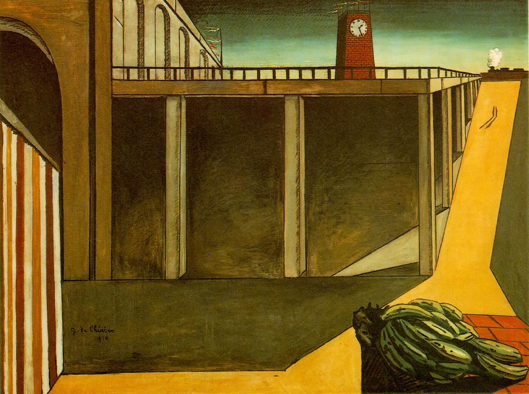
Most of my inspiration came from visual artists I was interested in at the time. I had recently gotten really into Genndy Tartakovsky’s background artwork for Samurai Jack. What drew me to this style was his emphasis on texture in digital painting as well as his strong emphasis on simple shapes and form. His style for some reason reminded me of the metaphysical Italian painter Giorgio De Chirico and his almost dystopian landscapes, so I drew up some backgrounds based off a couple of sketches I did in my sketchbook of sort of cyberpunk/retro-futurist architecture. Tartakovsky’s style also owes a lot to traditional Japanese painting just as much as it does to contemporary graphic design, so communicating that sense of tangibility in my own work was important.
I drew up a few sketches in my sketchbook of storyboards and character designs and began working on the first few shots in Photoshop. I did contemplate creating a 2D rig in DUIK again, however I thought I’d take the opportunity to try my hand at Frame-by-frame again as I had recently bought myself a cintiq. I composited the first shot in After Effects as a style test, complete with camera blur effects, D.O.F and a lens flare.
Ultimately however I didn’t finish the project. I had to put it on the backburner once I started my collaborative brief and ended up missing the deadline for the end of march despite having almost a month to finish it. I put this down to poor time management and just generally poor planning on my part. I do intend to finish the animation at some point in the future in my own time and blog about it as a part of Personal Professional Practice as I feel the idea is strong enough and funny enough on it’s own to sustain perhaps a slightly longer animation. When I do eventually finish the animation I intend to rework a couple of things I wasn’t happy with; the character design for example which I feel could have been simplified to consist of more primitive shapes and the main character’s colour scheme, whose muted tones I felt clashed with the backgrounds just a little too much.
LoopDeLoop-Six
Having tried and failed to complete several of my modules before their respective deadlines, this final brief was undertaken towards the end of the module just over a week before the deadline as a way of making sure I had completed at least three of the briefs. While this brief was partially taken for convenience sake, I did feel a form of artistic drive when making it. I had been listening to the Molly Nilsson song ‘Hey Moon’ in the early hours of one morning and after hearing what the theme for this month’s LoopDeLoop was, the idea hit me.
I decided I wanted to create more of a mood piece, a sort of animated GIF set to music for the viewer to soak in and tune out to based off my mother’s experience of dealing with younger siblings at six in the morning. I approached this more as an illustration project, emphasizing detail and texture over movement, using real photographs as reference, paying particular attention to the patterns on the bed covers and cushions. I created the bulk of the illustration in Photoshop using frame-by-frame animation techniques. However I did use the puppet pin tool in After Effects on the bed covers in order to simulate the characters breathing under the covers. The distortion on the mesh of the bed covers is subtle, but I think it works well nevertheless.
Feedback I received on this was mixed, with some people praising the mood and atmosphere of the piece and others criticising the reliance on the music; while some saw the lack of motion as an intentional, adding to the piece, others saw it as motionless and lazily animated. Personally, while the lack of significant or sudden motion is intentional, there are a few small details I feel I could have added had I more time that would have improved the piece as a whole; details such as having the mother move her head slightly or take a drink from her mug. Some things that people pointed out as being continuity errors, such as the fact the clock doesn’t change at all over the 6 minute animation, but these were intentional; essential in establishing a sense of place outside of time, something I feel lends to the medium of looping animation in a profound way.
Collaborative Practice- D&AD New Blood Awards National Autistic Society
Selecting a Brief/Getting into groups
For the Collaborative portion of the Responsive module we were required to undertake a cross course collaborative project with Illustrators and Graphic Designers; choosing a minimum of 3 competition briefs from YCN or the D&AD New Blood Awards and getting into groups based on our mutual interests in the subject matter and our practice in general. I knew from the start that I wanted to create something socially conscious, a campaign for a charity or to raise awareness for a cause/condition. The three main frontrunners which were up for my consideration were the Hasbro brief, Respect for Animals and the National Autistic Society.
I was initially attracted to the Hasbro brief due to the prospect of making a board game aimed at young adults akin to something like Cards Against Humanity, as this applied to my darker comedic nature, however at the same time part of me was leaning more towards creating some form of animated documentary to raise awareness for a charity campaign. While Respect for Animals aligns closely with my own personal beliefs on a certain level, the message of the brief for The National Autistic Society resonated more with me on a personal level due to my experiences with friends and family who have various forms of Autism. Having researched into the subject somewhat, checking out the first stage of the NAS campaign with a short film they made about sensory overload as well as Tim Webb’s short film ‘A Is For Autism’, which visualises a series of conversations by autistic people discussing their experiences, I decided I wanted to create something that instilled empathy in an equally effective way for my project.
After reading through the brand guidelines on the NAS website and setting my mind to the sort of thing I wanted to achieve with this brief, we went searching for groups. After a lengthy showcase of everyone’s work in the lecture theatre in the form of Pitcha Pitch Slides I eventually founded a small group with two illustrators, both of whom had some experience with Autism before.
Initial Ideas
After some early brainstorming sessions we established a friendly, laid back and most importantly collaborative group dynamic from the get go. With similar artistic inspirations yet aesthetically different styles we were able to approach the brief from the same perspective. We all shared similar visions as to how we should approach the brief, wanting to shine a spotlight on the various forms of Autism in adults, but particularly in women, as we all came to the realisation that most media depicting Autism does so from a predominantly male perspective. Exploring new perspectives and gaining a mutual understanding of the condition was key to our collaborative effort.
We created a joint Pinterest moodboard and brainstormed ideas for concepts and imagery that appealed to us which we felt could be used to explore the topic of Autism in a tasteful and respectful manner. In order to come up with ideas we consulted the brand guidelines so as to know our limitations on this project. The brief stated that we were required to create 1-2 minutes of animation as a part of the next stage of their campaign. This is where we got the idea to create three separate, short-form, shareable, social-media ready animations exploring Autism from different perspectives in the form of animated conversations with real life people who have or have experienced the condition with friends or family; to explore the brief with three separate animations falling under the same broad stylistic convention.
We looked to documentaries such as Interviews, Tough and Life Animated for inspiration as to how we could visually explore the topic, how conversations are visually interpreted for animated documentation and what we could do differently to ensure we stood out from the crowd. The one-sided nature of the conversation in ‘Inner Views’ proved to be the general consensus as to what format our documentary should be; a simple visualisation of the conversation taking place where the visuals tell you just a little bit more than the audio would on its own.
Conducting Interviews
Documentaries by their very nature are dictated by their factual content, so it was important for us to gather research material and content we could then use to create our documentaries. We put up posters around college and posted on social media to reach out to people who were willing to discuss their experiences at length for the purposes of our documentary. Within a matter of hours we had organised around half a dozen interviews with fellow LCA students and staff, so we booked a room to record in the next week and planned for what we were going to say during the interviews.
It was important to us the interviewees not feel like they were being interrogated, not just out of decency but also for the sake of our documentary. Many animated documentaries of this ilk are edited down to monologues almost, with the speaker painting a pretty clear picture without the aid of an interviewer’s voice. It was important to us then that the conversation unfold naturally with the interviewee driving the conversation forward. We tried asking deliberately vague, open ended questions which would spark conversation and for the most part the interviewees were talkative enough for this to work. We interviewed around half a dozen people, a mix of people with autism and people who had experience with somebody who had autism, for roughly 15 minutes each.
At the end of the day we listened back through some of the conversations we had conducted, listening carefully for segments where we could turn an interesting anecdote of quotation into something visual. We bounced a couple of ideas off one another and at the end of the day had each set our minds on a subject we would like to depict in each of our documentaries.
Development
After the recording process we had roughly an hour of audio to work with for our animated documentaries. Split between the three of us, we each have around 40 seconds to work with, totalling in at around 2 minutes, the maximum amount of time allowed by the D&AD brief.
I decided I was going to use Alex's conversation as I felt it dealt with a lot of interesting motifs and imagery and that her general tone suited the format and aesthetic I was aspiring to fairly well. While editing, I rewatched parts of 'Innerviews' to get a feel for how the conversation should be arranged into a monologue, paying specific attention to the space in between sentences, making judgements as to how long a line of dialogue should be given to breathe in order to set a consistent pace. I eventually settled on a few little snippets which I arranged in an order I felt told a sort of visual story, setting the final audio clip to some royalty free music from Podington Bear to set an ethereal mood.
When it came to character design I chose to further develop the style which I had been honing since my first LoopDeLoop for Individual Practice, that of the simplified caricature with pipe-cleaner like arms and legs for ease of animating. For the sake of Alex’s privacy I also didn’t want my character to too closely resemble her real life counterpart, so I took some artistic liberty to paint a picture of a character defined by the things they say in the short 40-second snippet of conversation we’re using for the documentary.
For the actual animation I toyed with the idea of using DUIK, however, having never finished my Do It In Twenty brief I opted to do it frame by frame, aiming for a sort of clunky, tangible, almost cut-out aesthetic which I definitely think came across in the final product. There were a few things I was unhappy with, mostly in regards to how lifeless the character’s face could appear at times, which speaks to the extent to which I need to improve my frame-by-frame character animation. While I feel my art direction is definitely on point in this project, it could use a little more motion to give it more life; things such as secondary and overlapping action could really lend more weight and presence to the characters in the scene.
Another area I feel I could have improved with the collaborative animation is in the way it was storyboarded. Due to the time constraints of having roughly three weeks to produce three 40 second animations, some corners had to be cut and unfortunately one of those was the storyboards. Instead of creating fully rendered colour-scripts to properly lay out my animation I relied heavily on some very rough thumbnail sketches which didn’t give any proper indication as to colour scheme or timing; an animatic would have also proven useful for determining the timings instead of doing what I did and leaving it until the compositing stage.
While I feel overall the creative partnership was useful in building professional bridges and learning what its like to be a part of a collective collaboration, part of me feels that I didn’t make the best of this opportunity by working on a single large project together. While I am satisfied that everyone brought their A-game, I feel it would have made for more of a cross-pollination of ideas relating to our specific practices had we all been working on the same animation with the same art style. Part of what put me off this was experiences with collaboration in the past where the group dynamic has lead to fundamental disagreements as to the direction of the project. In hindsight I feel there would have been little chance of that happening with the two illustrators I was working with as creatively we had the same sorts of ideas as to how to go about the project from the very beginning. Even so, fundamental disagreements and how you work your way through them are an essential part of any collaborative practice, and by depriving myself of that I feel in some way I have deprived myself of a valuable learning experience, to a degree.