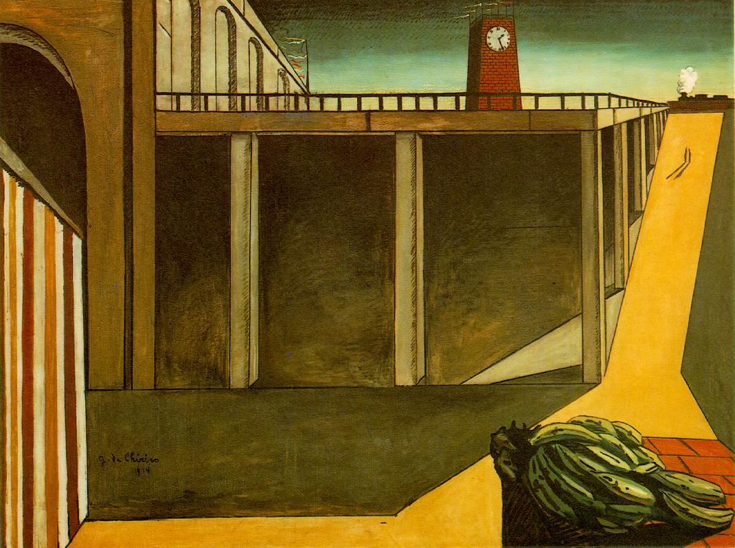
Immediately the theme of Utopia planted the seeds of an idea revolving around the aesthetic of surrealist, metaphysical Italian painter Giorgio de Chirico. Theres something about the derelict, surrealist desert landscapes, juxtaposing architecture with a wide landscape that reminds me of supposedly utopian modern cities such as Dubai. My idea is to portray the dark side of an uneasy, imperfect utopia.
I started off with a few thumbnail sketches and character designs in my sketchbook. The character I want to portray a future where human beings have evolved to be super-intelligent, evident by their visibly large throbbing brains. I feel this is a clear, visual and humorous way of portraying this idea, which is vital in communicating the 'bit', as the animation is only going to be twenty seconds long. I created rough thumbnail storyboards in my sketchbook which rough out the composition of shots and the longevity in relation to the rest of the animation.
Another thing I wanted to communicate through the character's facial expression is the suppression of emotion, though I haven't decided yet whether that would best be communicated through a fake, force smile of a vacant facial expression. After creating several variants in my sketchbook, I created a more finalised version in Photoshop using my Cintiq.
As well as character designs and thumbnails, I also created a few rough fine liner sketches of possible buildings and landmarks to use in the background of some of my shots. In preparation for the new series in March, I have been watching a lot of Samurai Jack recently, and have long been a fan of creator Genndy Tartakovsky's backgrounds, so for this animation I am attempting to emulate this style to a degree while also putting my own spin on it. Simplicity seems to be the key to Tartakovsky's striking vistas, owing just as much to contemporary vector based graphic design as to traditional Japanese painting. I created my backgrounds (pictured below) in Photoshop using some of Kyle T Webster's brush presets, most notably the pastel and oil paint presets which have a more tangible texture to them.


No comments:
Post a Comment