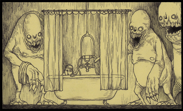
One of the aims of this brief for me was to pay homage to the visual aesthetic of one of my favourite illustrators, Don Kenn, in an animation that captures the mood of his pieces in the context of an animation. It was important to me that defining visual aspects of his work, such as the texture and intricacies of the linework make it in to the final animation. In order to maintain the 'handmade feel' I also plan on employing line boil to the characters to give the illusion of constant motion and life and not just a static image. Texture can be accomplished by giving the image on screen a slight yellowish tint as Kenn is known to work on yellowish post-it notes for his drawings. More than merely emulating the visual style, this mean't juxtaposing the innocent and childlike with the horrific and otherworldly, something Kenn does in his illustrations brilliantly.

I created this image in photoshop using pre-existing character and background assets shortly before starting production on my animation to use as reference for what I wanted the overall aesthetic of the animation to be. Though not entirely a direct emulation of Kenn's style I feel I have effectively merged elements of that design aesthetic with my own to create an effective and unique style for my animation.

Characters:
Boy
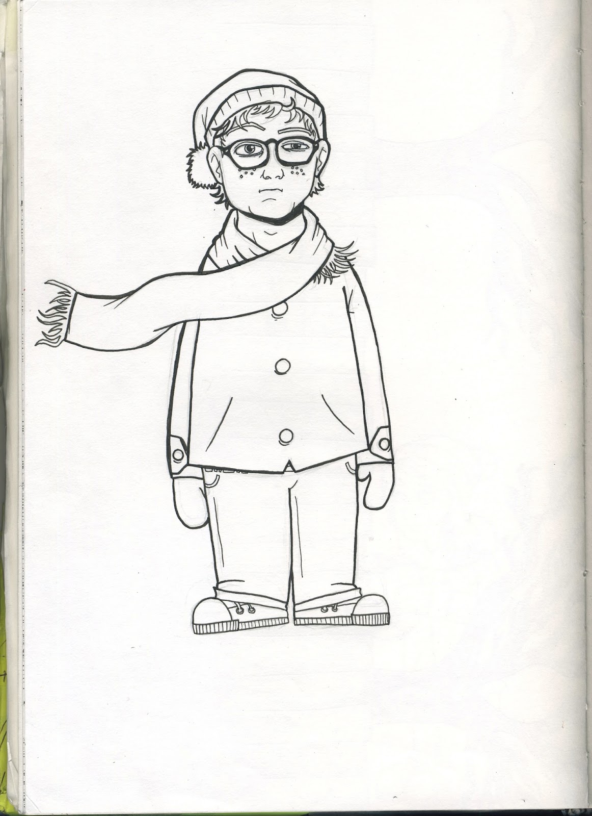
The design of my main boy character was heavily inspired by the character of Sam from Wes Anderson's 2012 film 'Moonrise Kingdom'. I was very impressed by the child actor's performance in that film, with my main takeaway from the character was the thick-rimmed glasses. These were included in my design in the later stages of development for my characters, but I feel the addition of glasses makes the design more childlike and allows for more expression to be conveyed through the face, which is important, as there is no dialogue in my animation. My design does differ slightly from Wes Anderson's character with the inclusion of freckles, longer hair and winter clothing as opposed to Sam's scout outfit.

Girl
The design for the girl character in my animation is supposed to reflect elements of the boy character's design with a few modifications. Both characters wear wooly hats with a bobble and a scarf which blows in the wind. The facial structure and tonal schemes of both of the characters are also the same to convey a sense of belonging and show a potential connection between the two characters visually.

As with the design of the boy character I took some design cues from another character from the film Moonrise Kingdom, specifically Suzy, the female lead, though to a lesser extent than with the other design. Elements I borrowed from this character include the shape and prominence of the eyebrows as well as the shape of the hair, though most of the other design decisions were made to reflect and parallel elements of my boy character's design. (For example, the mole on her cheek was designed to parallel the freckles on the boy's face.)


The design for my monster was inspired by the creature designs of director Guillermo Del Toro and illustrator Don Kenn. A common motif with both artists is the Lovecraftian, with both drawing influence from the work of H. P Lovecraft with the use of tentacles and distorted proportions. While my design takes more inspiration from the style of Kenn, I did find Del Toros sketches a helpful source of inspiration of creating disturbing imagery.

One of the main design aspects behind the design of the creature in my animation was the lure on the monster's head which resembled the fleshy growth which an Angler fish uses to lure it's prey.

No comments:
Post a Comment