Showing posts with label Telling Stories. Show all posts

Friday, 9 October 2015

Studio Brief: Nursery Rhyme Storyboarding Process


The process in which I came about producing my storyboards can be attributed to this Youtube video by RubberOnion, which outlines the process of rearranging sketches on small post-it notes to form a coherent narrative and working from there. This allows for flexibility and experimentation in the early stages to ensure the visual language is on point and communicates the intended message.


Initial post-it note stage

I garnered feedback from my tutors in this early stage of production to ensure I didn't move forward with my storyboards without a coherent narrative. This allowed me to make changes based on the feedback I received. For example, one of my tutors was concerned I was using too many profile shots and not fully utilising the verticality of the setting I had chosen and hence suggested I use more high angle shots to impose upon my main character, painting him as more of an underdog. Creative processes like this are a collaborative process, even if it just involves garnering feedback from your peers and tutors.


Watercolour painting w/ linework

After carefully planning out the sequence of storyboards I would be working with I began working on the actual panels which I would be refining into my final storyboards. For this, first I sketched it out in pencil on a piece of watercolour paper and then began painting it with watercolours. The watercolour is there so that I can plan out which areas of the frame are which tone, I chose the colour blue because it has cold connotations and will help me envision the atmosphere of the world. Fine-liner pens where then used to bring out elements in the world and add dimension to the characters and scenery. It also allows for me to imply motion through the angle in which certain elements, such as the snow are skewed, which is important when working in a medium such as animation.


Final frame composited and refined in Photoshop

Upon completion of the line-work I then scanned the images into the computer using the EPSON scanner and began refining the lifework and tonal elements in Photoshop. To simulate snow I used a noise layer. refined the levels and used the screen blending mode to blend it with the background, creating a snow-like effect, subtly skewing the layer to simulate a blizzard. I applied a gradient to the background in order too simulate night time and used layer masking to ensure scenery in the background (such as the icicles) was illuminated enough to be visible and everything consistent with the overall lighting.


Wednesday, 7 October 2015

Storyboard Research: Mad Max Fury Road

Traditionally, production on a feature film begins with a screenplay, but with Mad Max: Fury Road director George Miller (director of Babe: Pig in the City and the original Mad Max films) and artist Brendan McCarthy (well known for his work on Judge Dredd and 2000AD) approached the production differently. Concept art and storyboards largely informed the early phases of production, which really shows in the final product. To put it simply, the film is a 2 hour car chase, complete with just about every action movie staple you can think of. Fury Road received a lot of praise on release for thriving in it's simplicity.


Before he even had a script, Miller had the whole film planned out visually.

Where Fury Road succeeds is in every aspect of it's visuals, particularly in the way scenes were storyboarded to create exciting and coherent action scenes, which is important in a film which relies heavily on said scenes. Miller has stated in interviews that it was important not to shoot too much of the film in profile, instead working on a sort of Z-axis, which adds more dimension to the film. This really shows in McCarthy's storyboards, with their dynamic camera angles, reminiscent of 2000AD comic book panels. The film also faithfully abides to the visual style set out in Brendan McCarthy's storyboards, replicating the grimy, used-future aesthetic of 2000AD.


McCarthy's storyboards owe a lot to their 2000AD roots.

This aesthetic also owes a lot to a lot of the post-apocalyptic fiction that came in the wake of the original Mad Max, which has influenced a wide range of popular culture, from comics to films to video games. The character designs, particularly of arguably Fury Road's most enduring character; Furiosa owe a lot to Jamie Hewlett's 90's post-punk feminist action heroine Tank Girl.


The overall aesthetic owes a lot to works inspired by the original Mad Max films.

Composition is key to the success of Fury Road in the visual department, and for the film to succeed in the visual aspect it must be working from the strong foundation of a storyboard. The lack of dialogue in the film, which earned it scorn from some critics is compensated for with it's clear and concise visual storytelling. There is no confusion as to the orientation and motion of the action sequences because of how scenes are framed. The director and storyboard artists are well aware of the visual language and don't try to deviate too far from these established conventions. The 180 degree rule is an important part of this, in creating easily to follow, coherent action scenes For scenes which utilise lots of quick cuts in succession, the Director of Photography on Fury Road, John Seale used centre framing to maintain an audience's point of interest. He explains this is so that the viewer doesn't need 3-4 frames to figure out where to look. 


In many ways Fury Road is the antithesis of the modern action blockbuster, swapping shaky-cam and CG action sequences for intricately choreographed sweeping vistas, pyrotechnics and practical stunt work. It's a film that's gained a large amount of respect from people working in the creative industries for it's uncompromising translation from storyboard to screen and a rarity in a cinematic landscape increasingly saturated with derivative works and endless sequels.

Finished Storyboards


1) Fade in from white to an Establishing Shot of mountainscape during snow storm. A grapple hook appears centre frame from the other side of the cliff.


2) Mid shot of icicles in the foreground hanging off edge of cliff. There are two ropes in the right third of the screen tugging in opposite directions as if to imply weight is being put on it.


3) Long shot of a man ascending a mountainside. The framing puts into perspective the scale of the mountain compared to the size of the climber.


4) Close up shot of climber as he climbs up onto ledge. Hands in the foreground, with the face slowly rising up into centre frame while the storm rages on in the background.


5) Extreme close up of rope being strained, to demonstrate tension in the scene. The snowstorm in the background also begins to intensify, mirroring the tension being put on the rope, an example of pathetic fallacy.


6) Extreme close up of icicle breaking, to parallel the snapping of the rope.


7) Extreme close up reaction shot of the mountain climber as he realises his fate. (Eyes open, Dolly zoom.)


8) POV Shot of mountain climber falling. Holds hands out as he looks up at cliff, just short of the summit. Cut to black upon impact with ground.


9) Fade in from black to long shot of silhouetted man at the top of the mountain.


10) Mid Shot of mountain climber looking down off edge of cliff, proud of his achievement.


11) Cut back to POV angle from before, this time with mountain climber looking down. He then turns around and disappears into the blizzard as if he was a hallucination, implying that the climber didn't actually make it to the top of the mountain.

Sunday, 4 October 2015

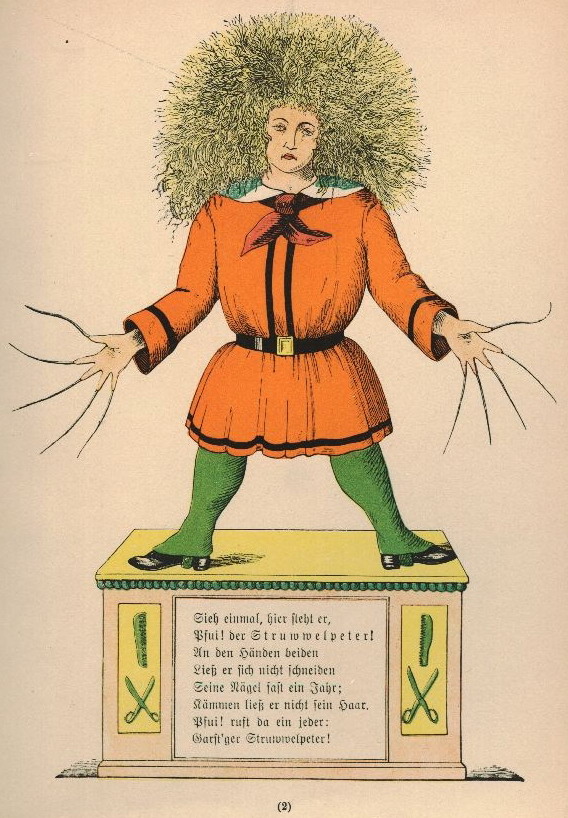
Storyboard Research: The Work of Heinrich Hoffman (Der Struwwelpeter)


Shockheaded Peter

Just Look at him! There he stands,
With his nasty hair and hands.
See! His nails are never cut;
They are grimed as black as soot;
And the sloven, I declare,
Never once has combed his hair;
Anything to me is sweeter
Than to see Shock-headed Peter.

In researching old children's nursery rhymes to adapt into a storyboard I was pointed towards the work of German Psychiatrist Heinrich Hoffman, whose stories often depicted children misbehaving and the resulting consequences. I feel his work would make for an interesting storyboard, due to the bizarre and often dark imagery of his writing.

Nursery Rhyme Studio Brief


Our first brief for Level 4 Animation is to visualise a nursery rhyme of our choice in the form of a 12-18 frame storyboard. For mine I have chosen to reinterpret the rhyme 'Incy Wincy Spider', giving it my own unique metaphorical spin. I broke down the narrative to it's most basic form and decided to work from there; a character overcoming adversity and failure. 


My narrative follows a mountain climber (who for the purposes of this explanation represents the spider in the rhyme) as he ascends a steep cliff during a blizzard. This parallels the 'incy wincy spider' who 'climbs up the water spout'.  The depiction of an 'incy wincy' character is reflected in the use of camera angles, high angles (looking down from the top of the mountain) and long shots (in which the mountain takes up a good 2/3 of the frame) which really communicate the scale of the mountain versus the man.


In developing my storyboards I used watercolour paint to create tone, though the process has proved time consuming, meaning I will likely opt for a less demanding default style for future storyboarding projects. Nevertheless, I wanted to limit the colour palette as much as possible in my storyboards so I could concentrate on tone and communicating a particular sombre mood.