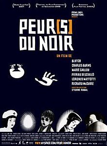
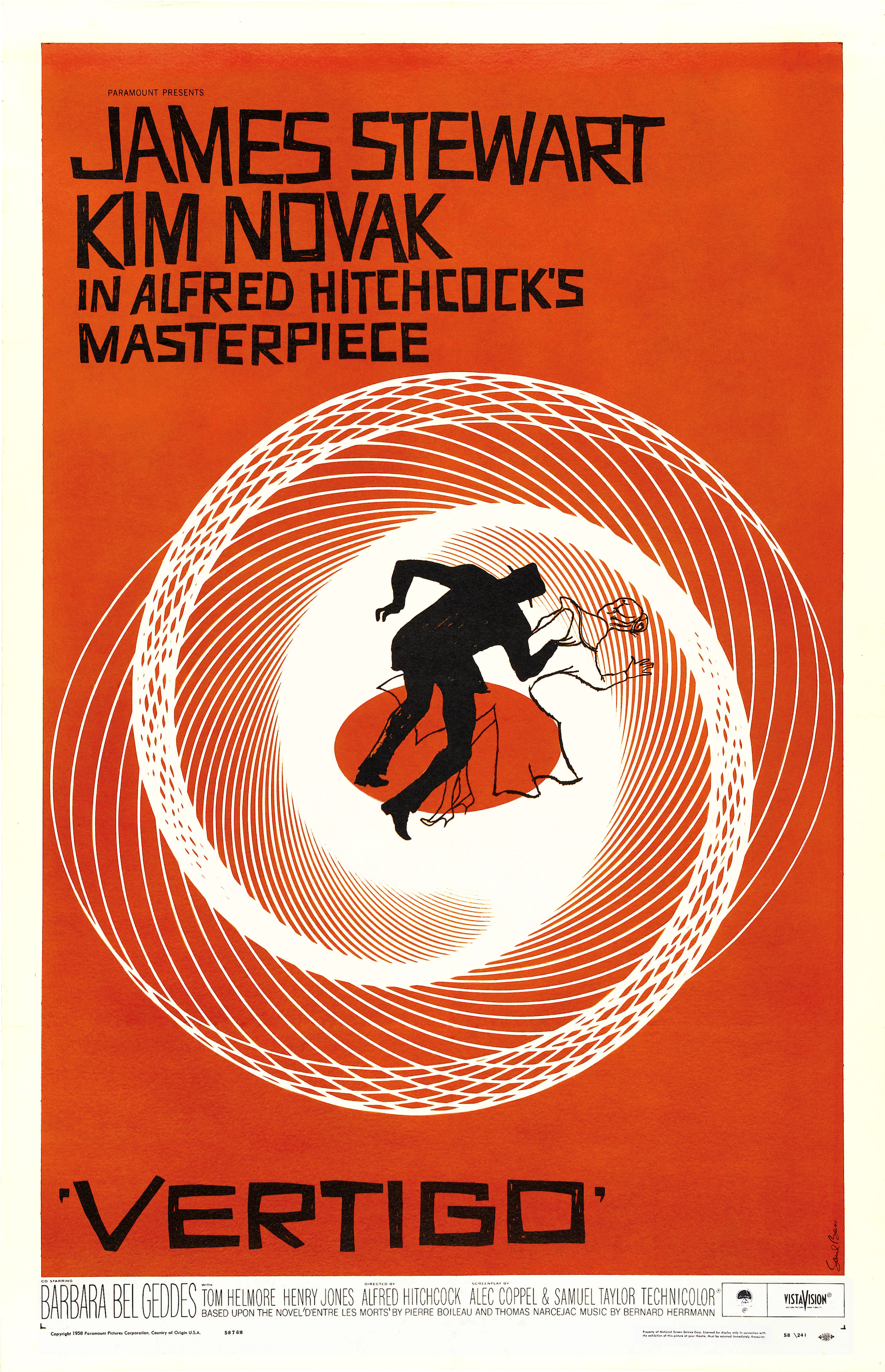
The title sequence for this film is simple and minimalistic relying entirely on the typography and the accompanying soundtrack to communicate a grim, dreadful mood. What appeals to me about this typeface is how it is simultaneously uniform and modern and at the same time distorted and edgy. It reminds me of the typefaces used by Saul Bass on posters for Hitchcock films such as Vertigo and North By Northwest. While my title sequence is of a different genre, I feel that it is appropriate to borrow a few stylistic tropes and devices from people like Hitchcock, whose often described as being the 'master of suspense' in order to lend an air of dread to my title sequence.
In order to create my own Saul Bass-inspired typeface I created each individual letter as a vector in Illustrator before rearranging them into the order of words and exporting them as PNGs to be imported into After Effects. The type in my animation abides by the same black, red and white colour scheme most of the rest of the title sequence follows, with the names of the people in the credits highlighted in Red for emphasis.
The title card I created incorporates this colour scheme as well as the key imagery of an apple with a bite taken out of it. I went through several variations of this design before settling on the final design with the text inside of the apple. I chose this because the apple provides a red background for the text which allows for the white and black heading and subheading respectively to stand out and be highlighted.


No comments:
Post a Comment